Skip to content
// UI KITS

Ready-made components. Copy in and ship.

Buttons, forms, cards and navigation — designed and coded. Skip the blank canvas. Pick a style and build on it straight away.

// the short version

What is a UI kit?

A curated set of components in a consistent style. Download the source, drop it into your project, and you are building within minutes. Responsive and accessible throughout.

  • 62 kits to choose from
  • 8 distinct styles
  • From -12 SEK — one-time payment
  • Commercial licence included
Style
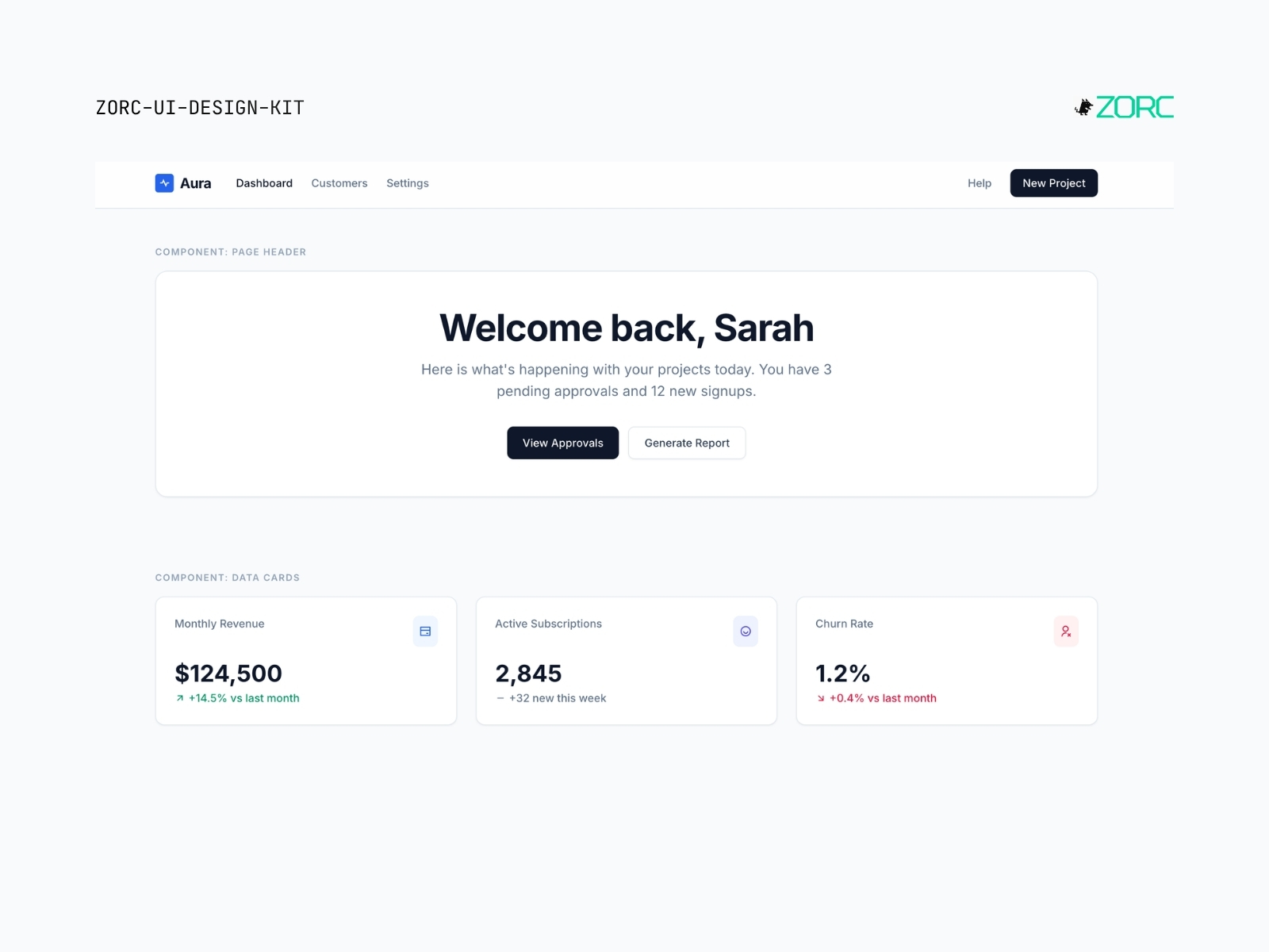
Aura SaaS Light – Minimal UI kit Light
Minimal

Aura SaaS Light

Bright, clean SaaS look with slate and blue. Like classic Stripe/Linear — white surface, soft shadows, modern Inter.

5 components
50 SEK
View →
UI design by ZORC with a focus on simplicity and beauty, includes components for web applications and design inspiration
Minimal

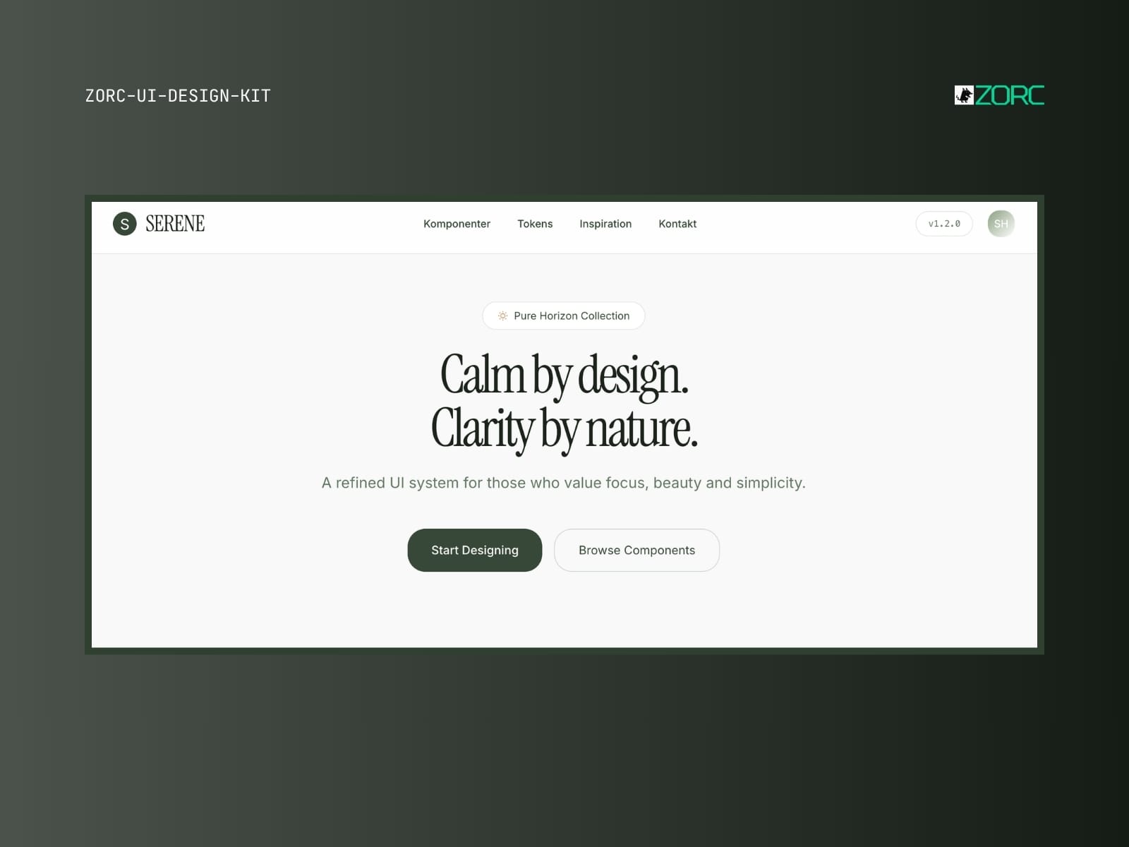
Serene Pure Horizon

Calm, minimalist sage-green aesthetic with Instrument Serif. For wellness, journals and soft products.

5 components
50 SEK
View →
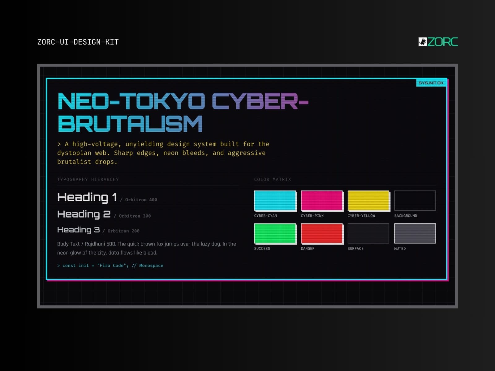
ZORC design system for Neo-Tokyo Cyber-Brutalism with neon colors and typography for web development and design Hot
Neon

Neo-Tokyo Cyber-Brutalism

Cyberpunk brutalism with neon pink, terminal green and glitch effects. Built for bold products that want to stand out.

10 components
50 SEK
View →
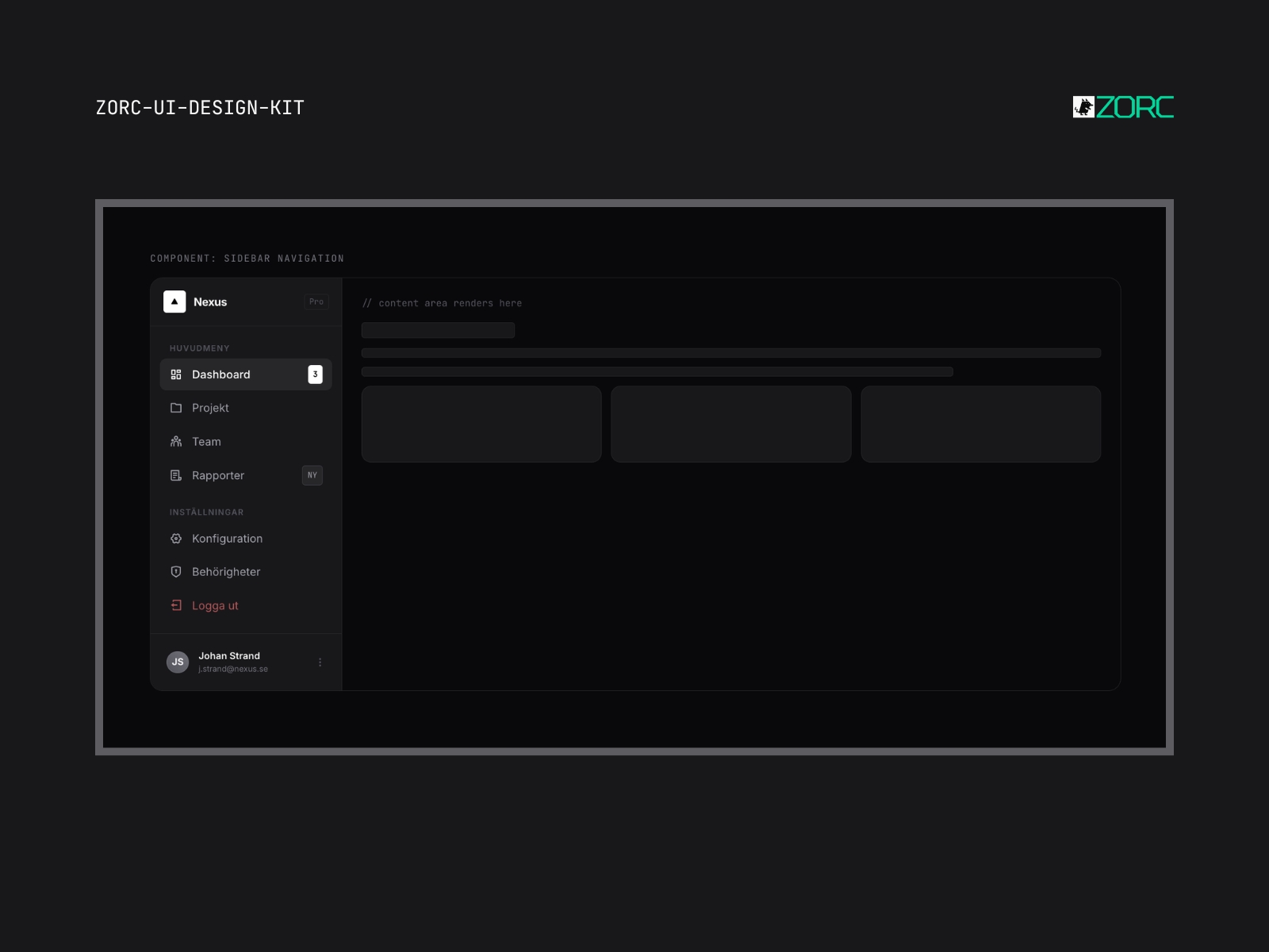
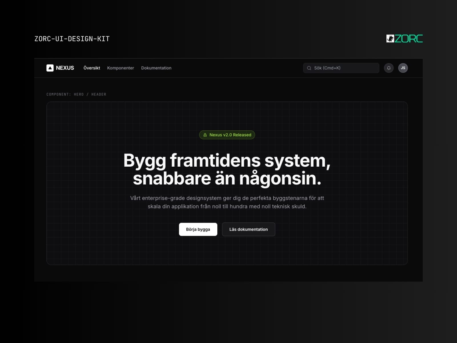
Side navigation module in ZORC UI design kit with all important sections like Dashboard and Projects Pro
Minimal

Nexus Advanced Extended

Expanded enterprise system with 40+ components. CRM, ERP, project management — build everything with the same DNA.

6 components
50 SEK
View →
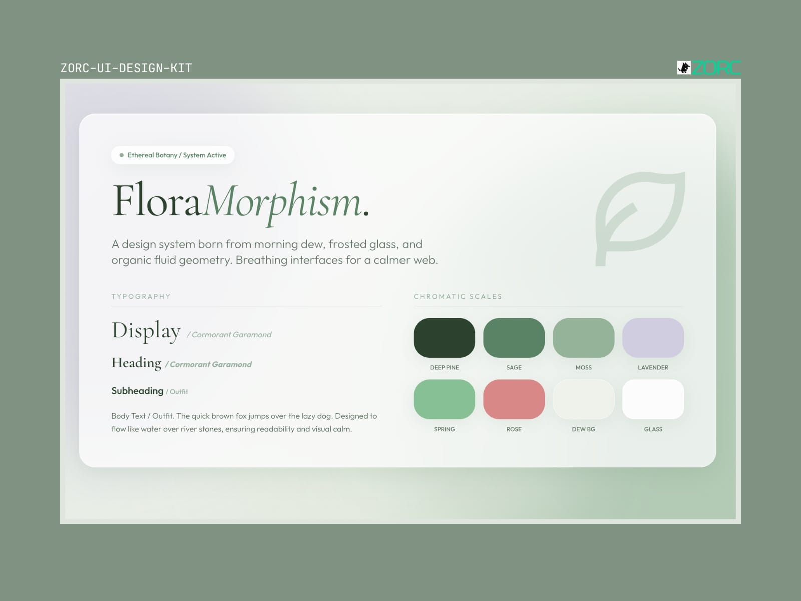
Nexus Ultimate God Mode – Neon UI kit God Mode
Neon

Nexus Ultimate God Mode

The ultimate enterprise template. All components, all designs, all edge cases. For when AI has to build an entire product.

8 components
50 SEK
View →
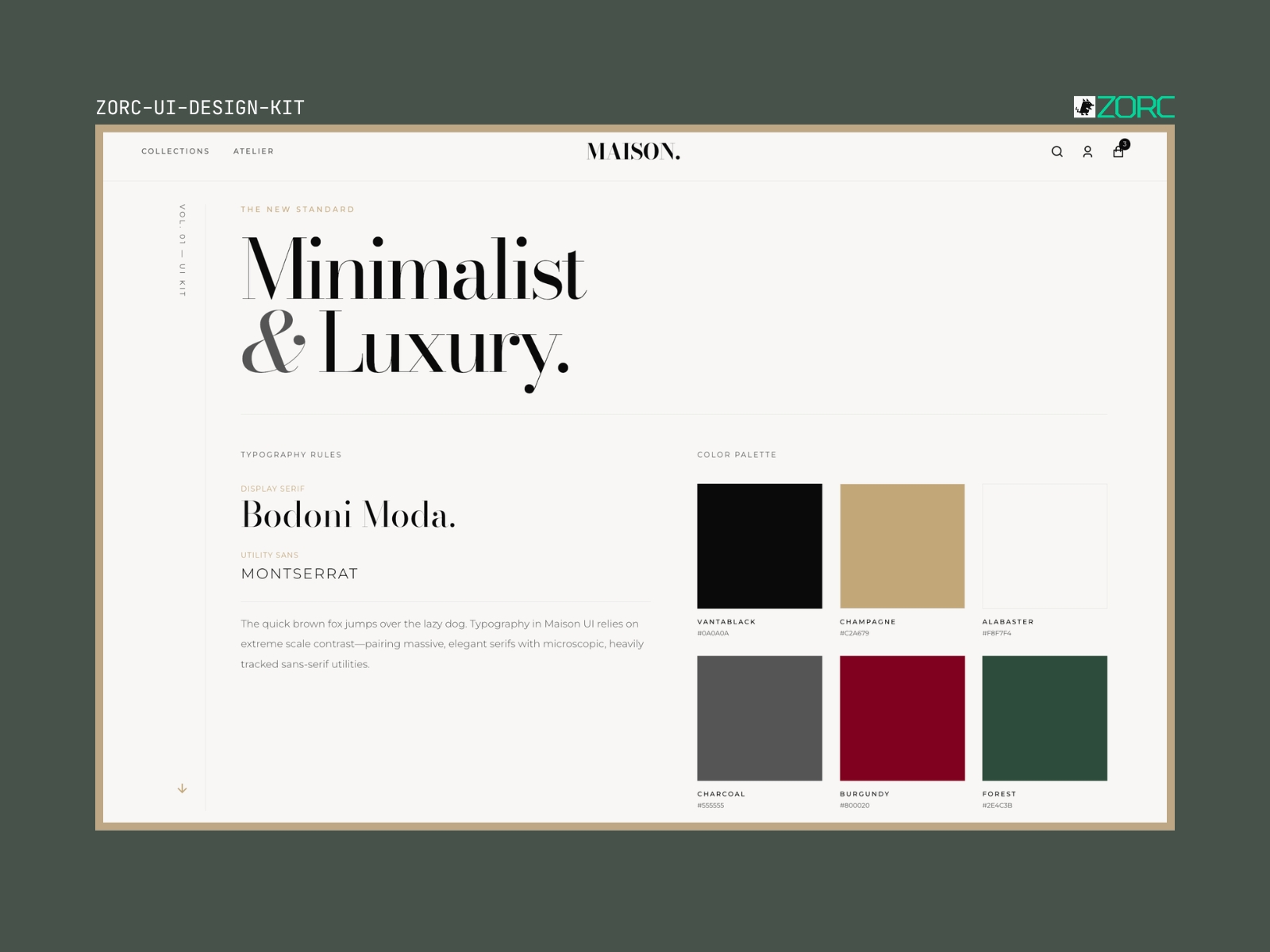
The FloraMorphism design system focuses on harmonious typography and color palettes for web development and app design with AI elements from ZORC New
Neumorphism

Ethereal Flora-Morphism

Organic, botanical design with Cormorant Garamond and sage green. Like a digital herbarium meets modern design system.

5 components
50 SEK
View →
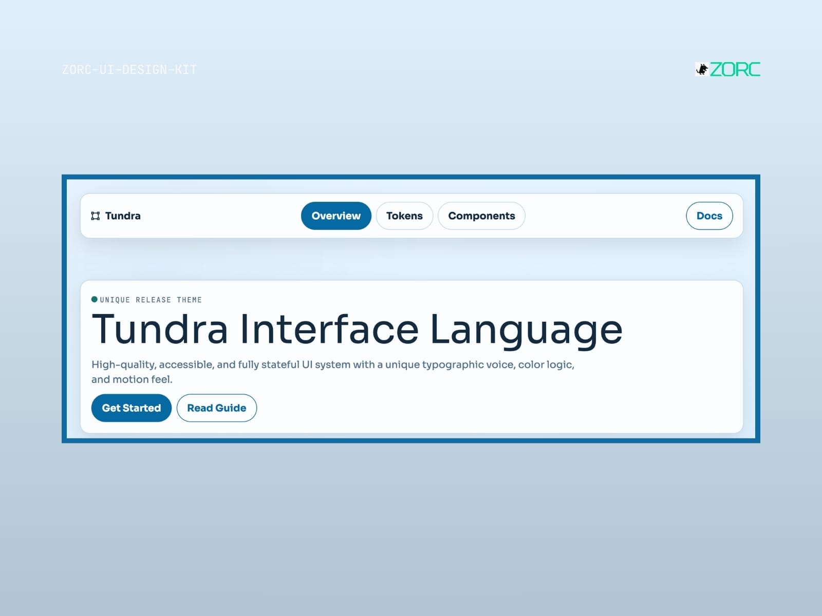
Minimalistic and luxurious design with typography and color palette from ZORC's UI design kit New
Minimal

Maison UI

High-fashion editorial design system with Bodoni Moda and Montserrat. Like Vogue, Dior and The Row — in code.

6 components
50 SEK
View →
Tundra Interface Language by ZORC, a modern UI design with a focus on color logic and typography for web development and apps
Minimal

Tundra

Tundra-style design system for AI-driven development

10 components
25 SEK
View →
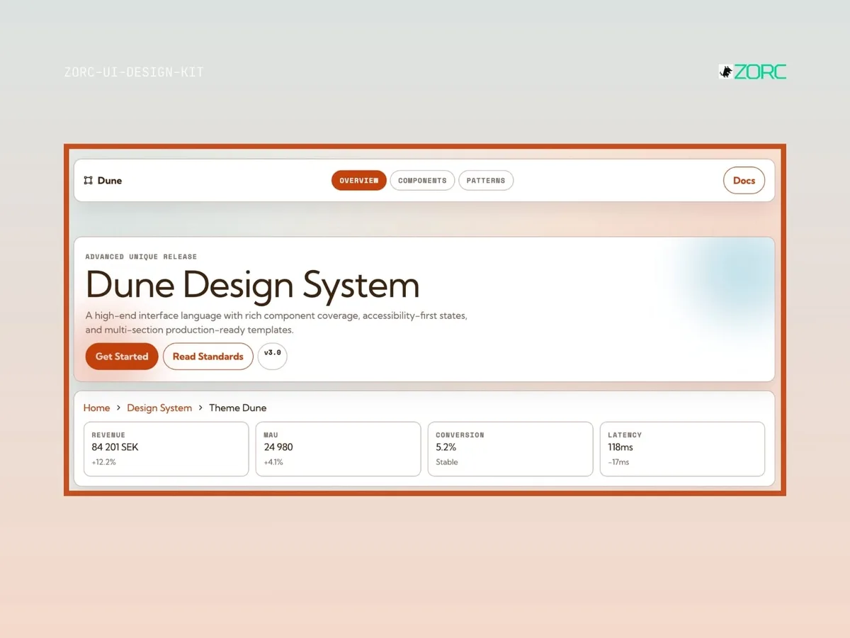
Dune Design System from ZORC with components, statistics and templates for web development and design
Minimal

Dune

Dune-style design system for AI-driven development

10 components
25 SEK
View →
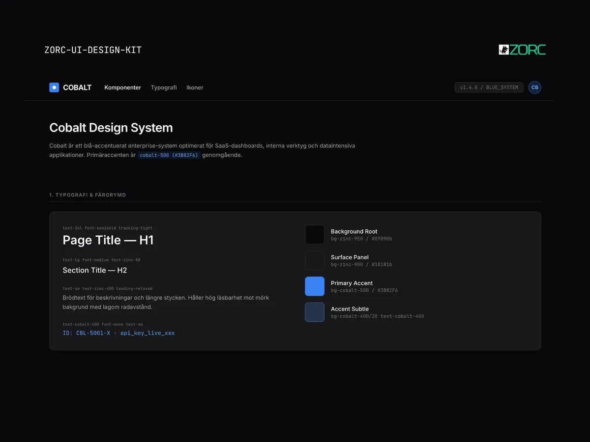
Cobalt – Enterprise UI kit
Enterprise

Cobalt

Cobalt-style design system for AI-driven development

10 components
25 SEK
View →
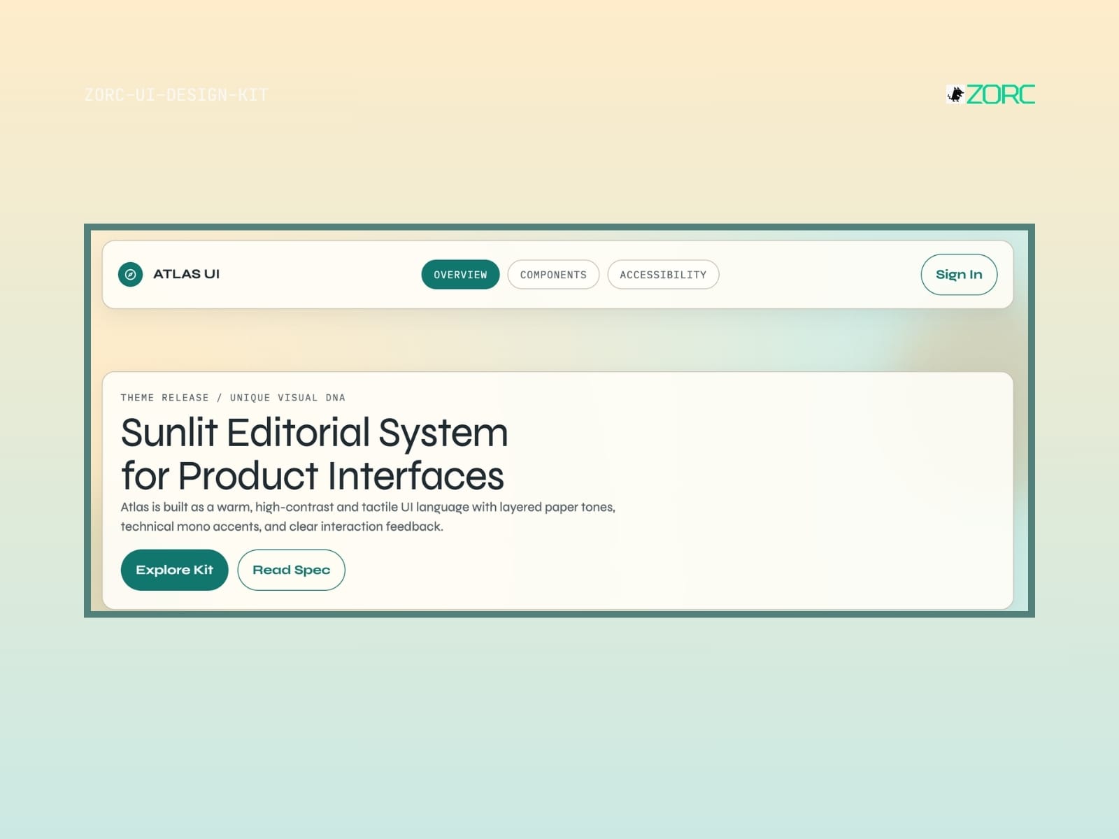
UI design for Sunlit Editorial System, part of ZORC's design kit for web development with a focus on high contrast and ease of use
Enterprise

Atlas

Atlas-style design system for AI-driven development

10 components
25 SEK
View →
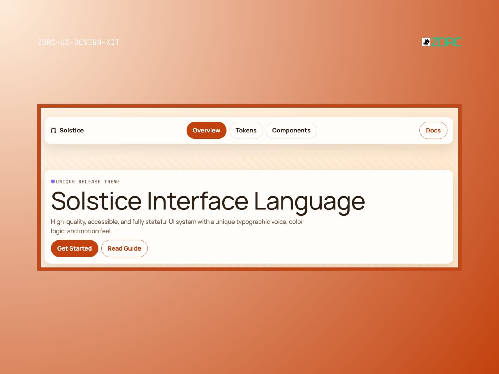
Solstice interfaces with a new UI design and features for web development and app design from ZORC
Glassmorphism

Solstice

Solstice-style design system for AI-driven development

10 components
25 SEK
View →
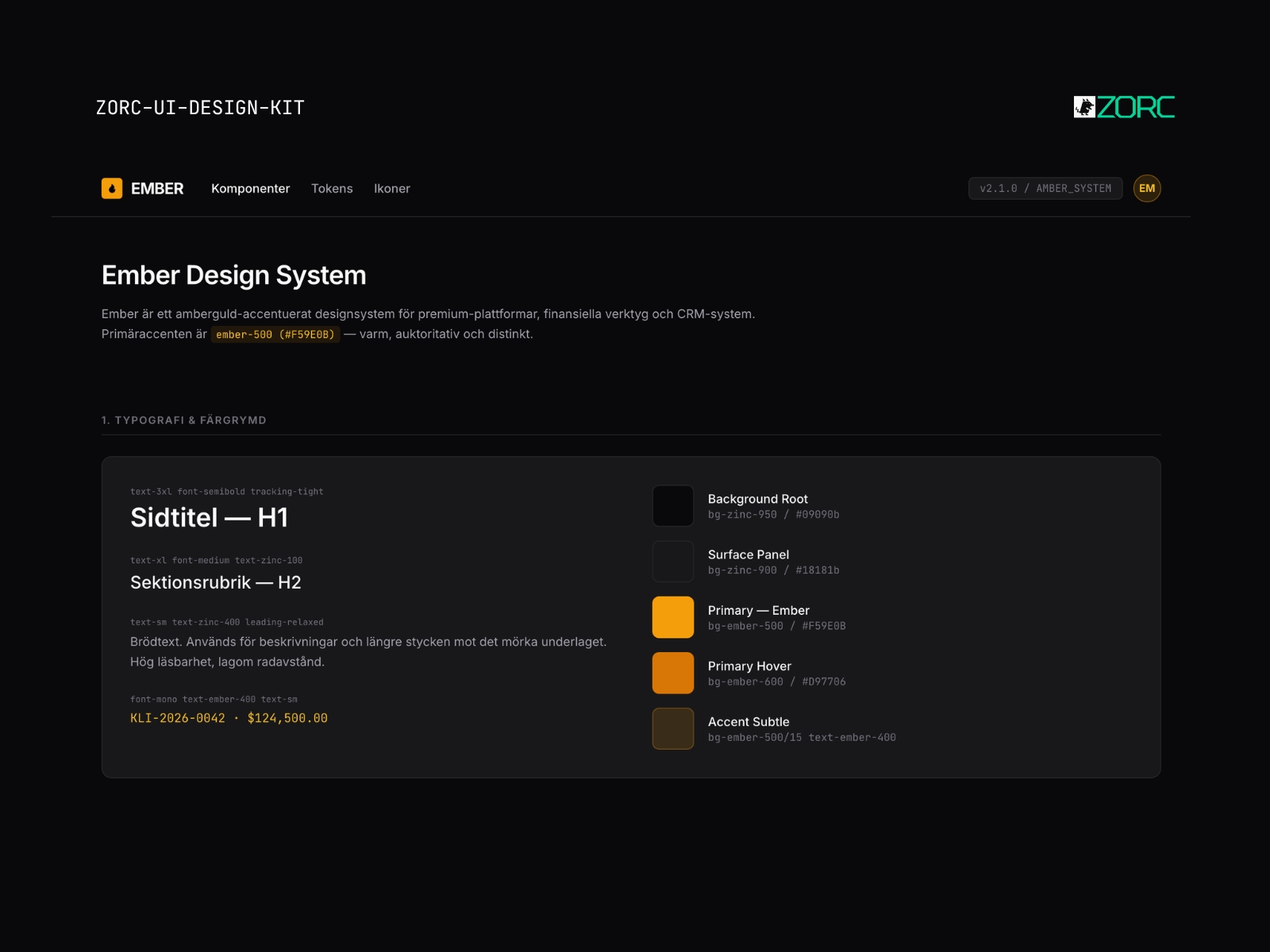
Ember – Dark UI kit
Dark

Ember

Ember-style design system for AI-driven development

10 components
25 SEK
View →
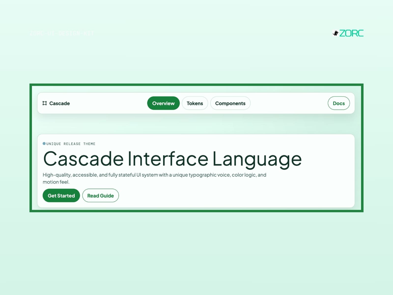
Cascade Interface Language in ZORC's design kit with high-quality UI components and typographic elements
Minimal

Cascade

Cascade-style design system for AI-driven development

10 components
25 SEK
View →
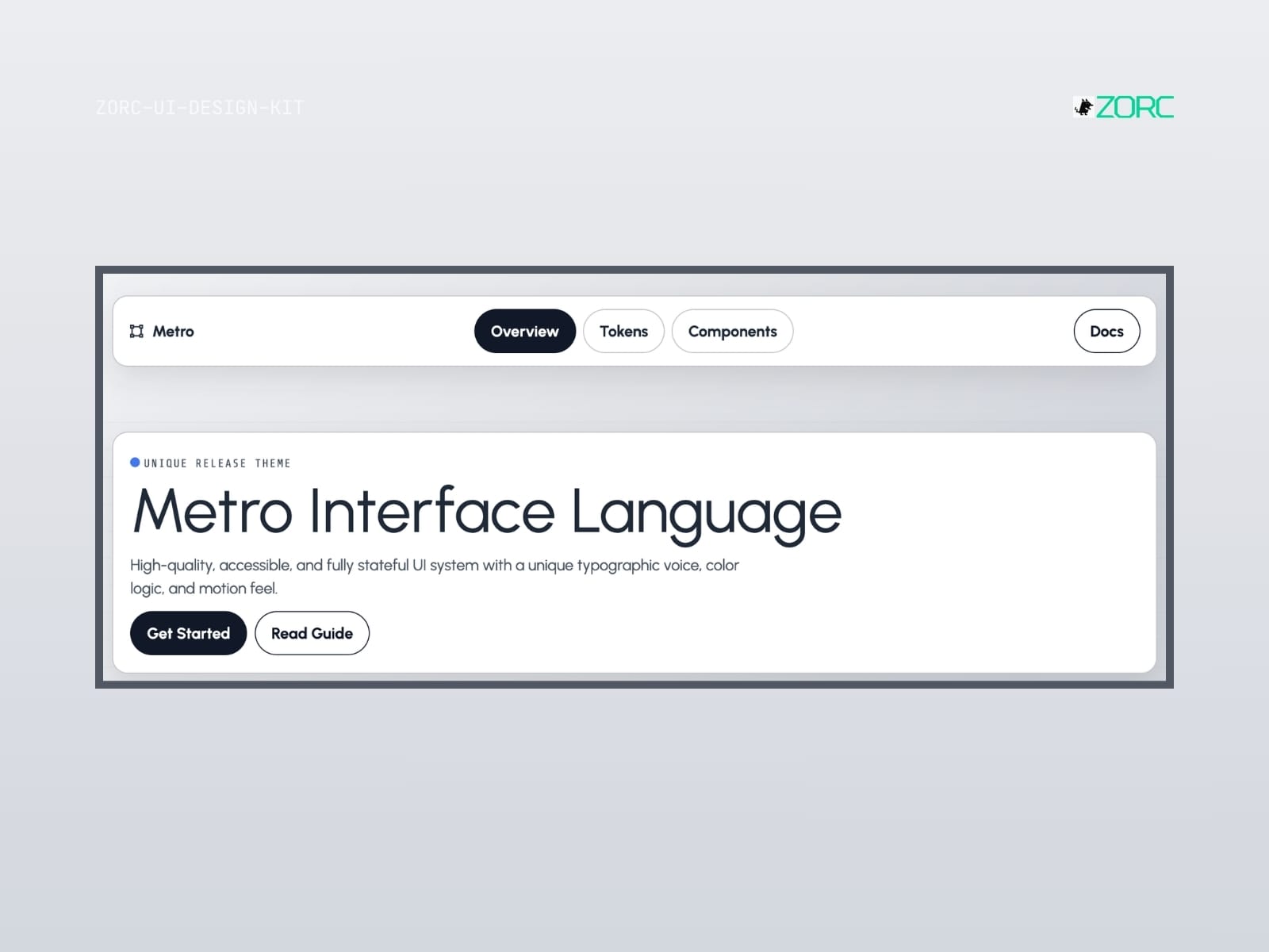
Introducing Metro Interface Language, an innovative UI design for web development with ZORC quality standards
Minimal

Metro

Metro-style design system for AI-driven development

10 components
25 SEK
View →
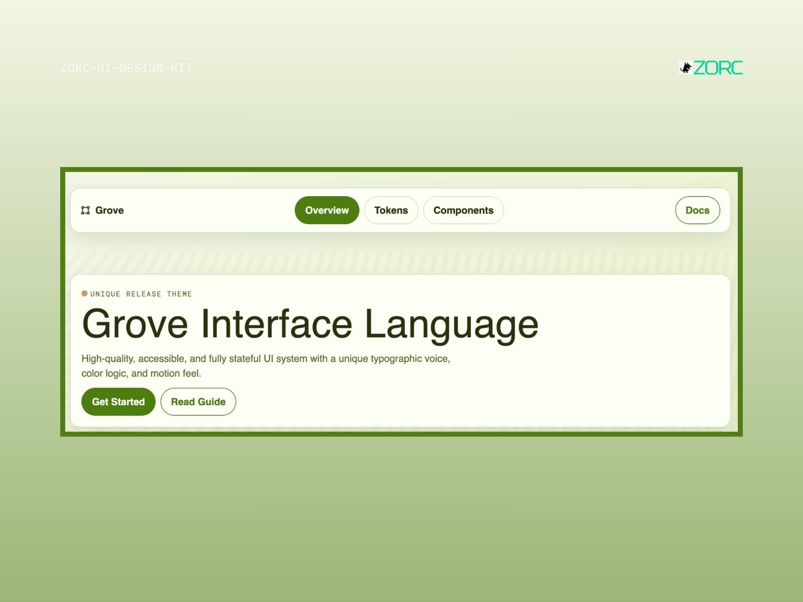
Grove Interface Language, a UI design solution from ZORC with high quality and accessibility
Minimal

Grove

Grove-style design system for AI-driven development

10 components
25 SEK
View →
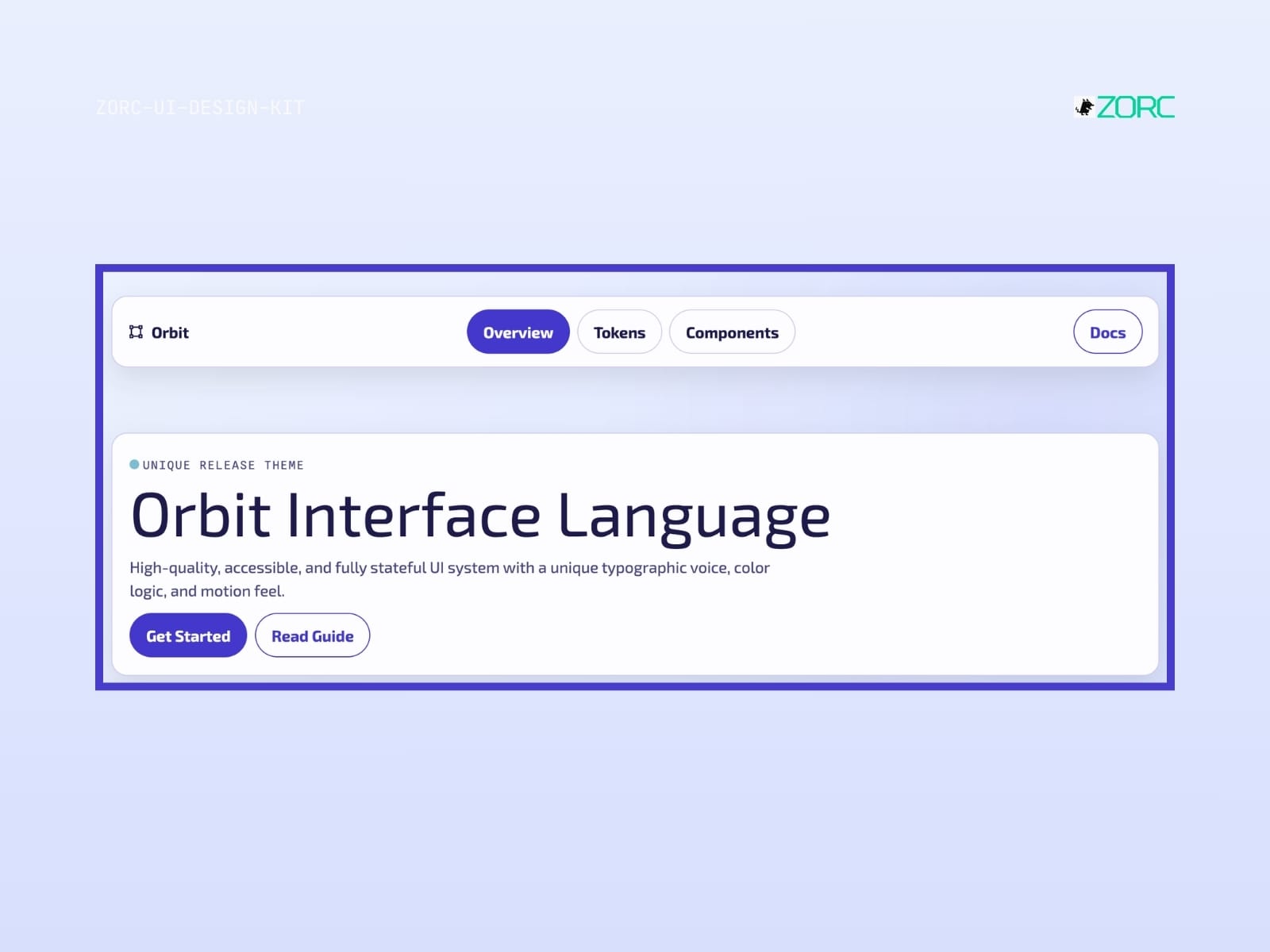
Overview of ZORC's Orbit Interface Language with a focus on design and ease of use for web development and applications
Glassmorphism

Orbit

Orbit-style design system for AI-driven development

10 components
25 SEK
View →
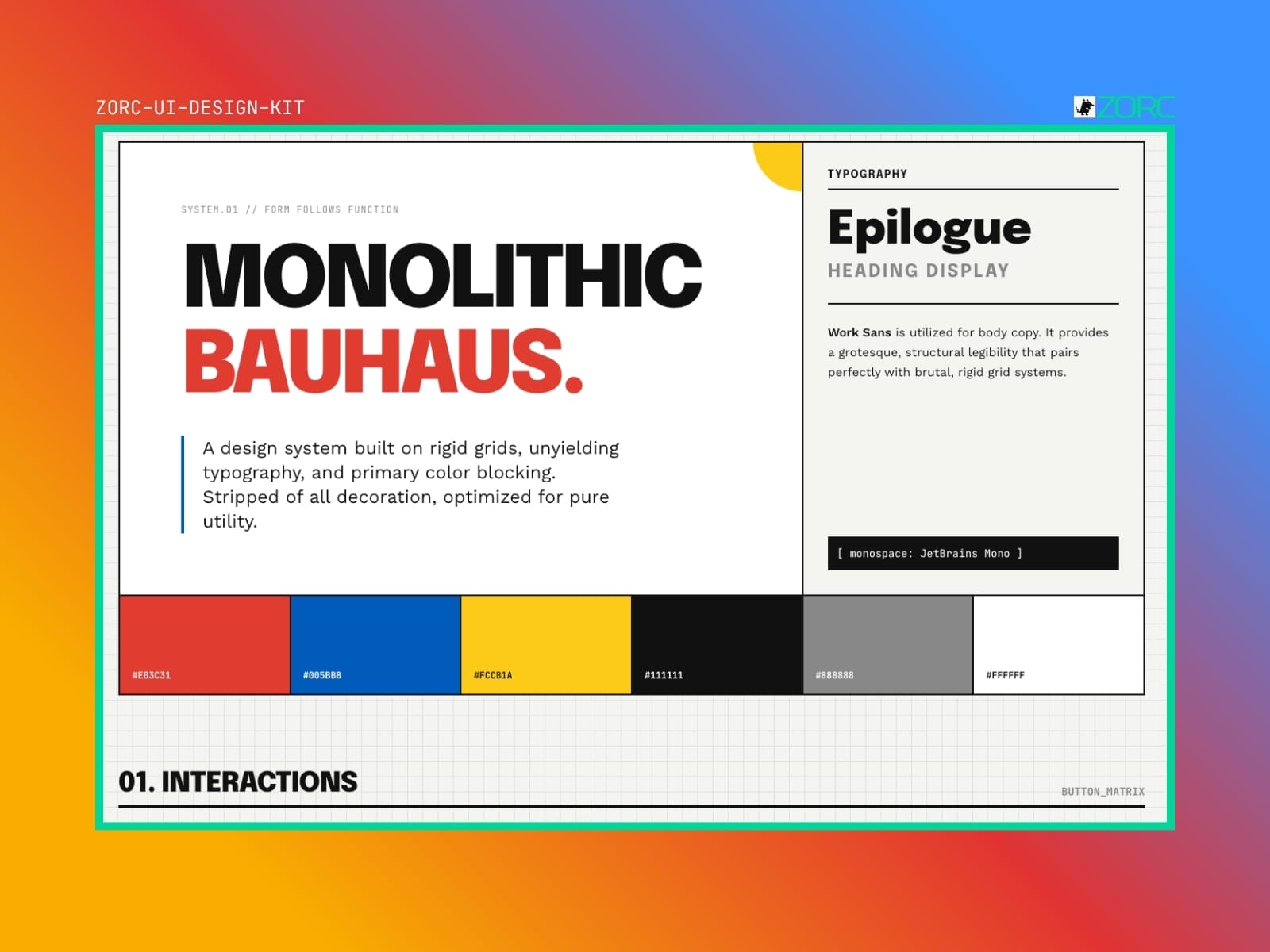
Bauhouse – Minimal UI kit
Minimal

Bauhouse

Bauhouse-style design system for AI-driven development

10 components
25 SEK
View →
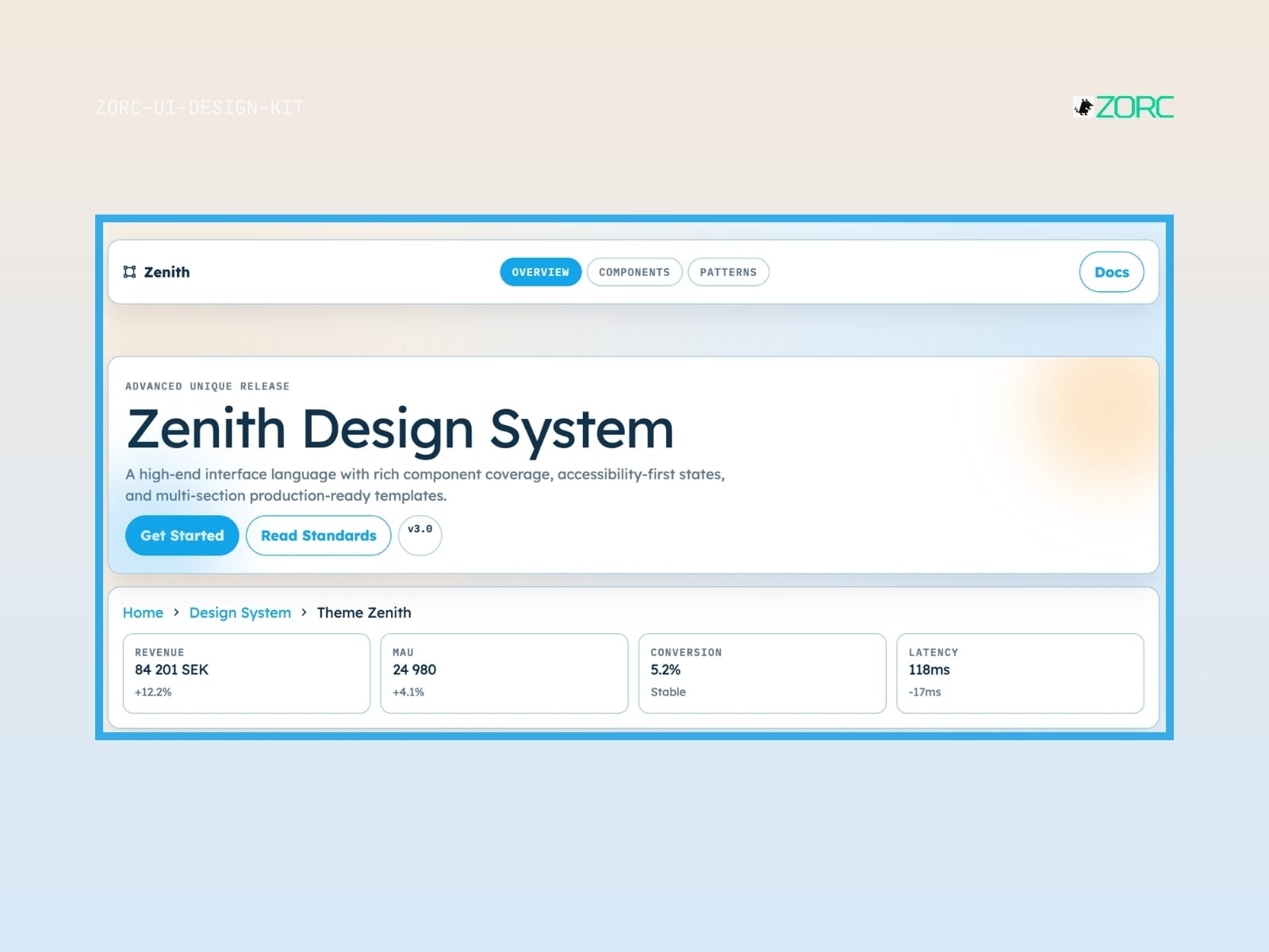
Zenith Design System offers an advanced user interface solution with components and production-ready templates for web development and design within ZORC
Glassmorphism

Zenith

Zenith-style design system for AI-driven development

10 components
25 SEK
View →
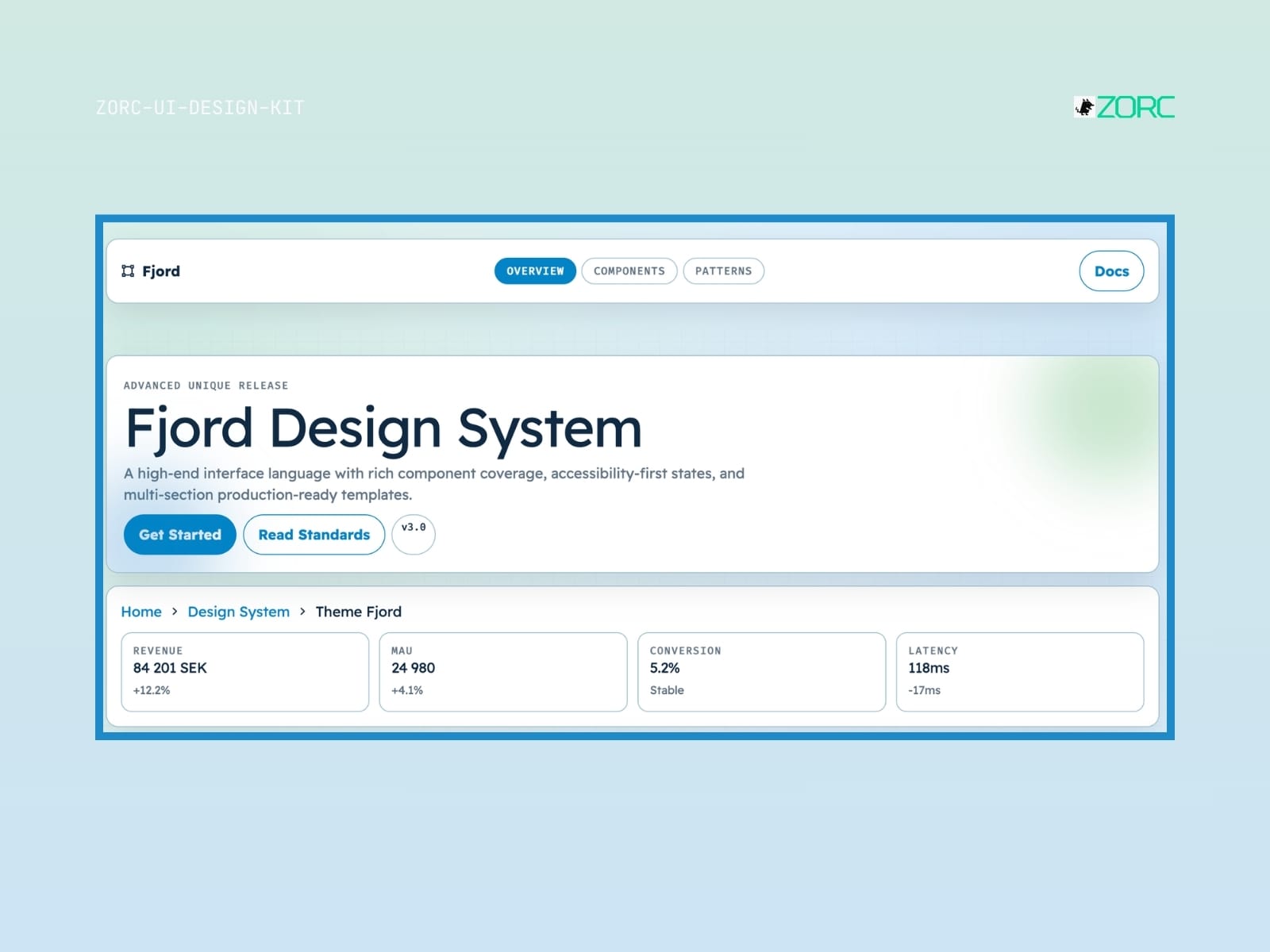
Fjord Design System with a focus on interface design and modern components from ZORC
Minimal

Fjord

Fjord-style design system for AI-driven development

10 components
25 SEK
View →
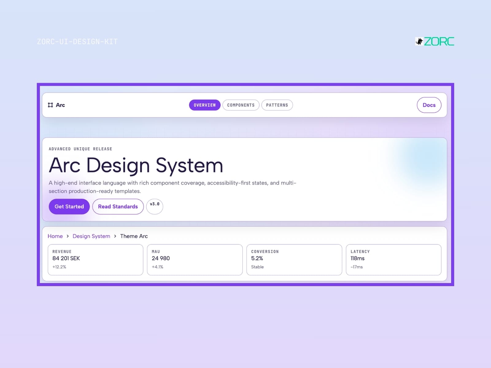
Arc Design System from ZORC shows interface components, statistics and production-ready templates with a focus on web development and design
Glassmorphism

Arc

Arc-style design system for AI-driven development

10 components
25 SEK
View →
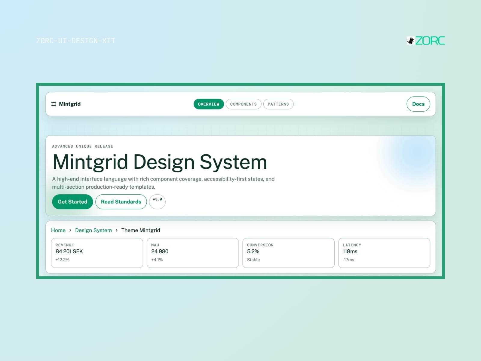
Mintgrid Design System from ZORC with information about components, standards and statistics for web development and design
Minimal

Mintgrid

Mintgrid-style design system for AI-powered development

10 components
25 SEK
View →
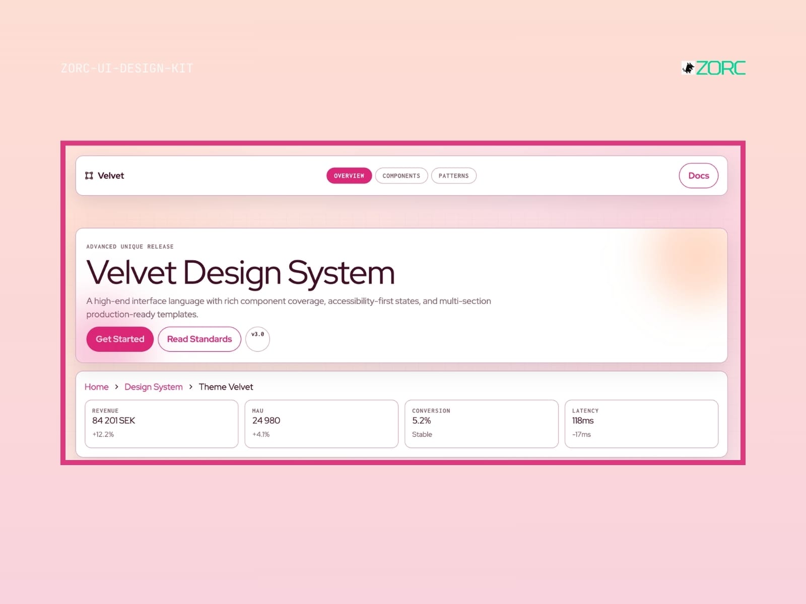
Velvet Design System for web development with components, accessibility standards and production templates from ZORC
Glassmorphism

Velvet

Velvet-style design system for AI-powered development

10 components
25 SEK
View →
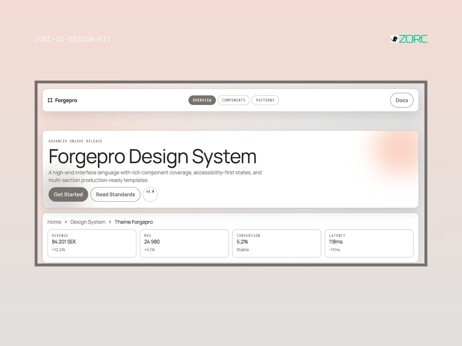
Forgepro Design System from ZORC with statistics and description of ease of use and design components
Dark

Forgepro

Forgepro-style design system for AI-driven development

10 components
25 SEK
View →
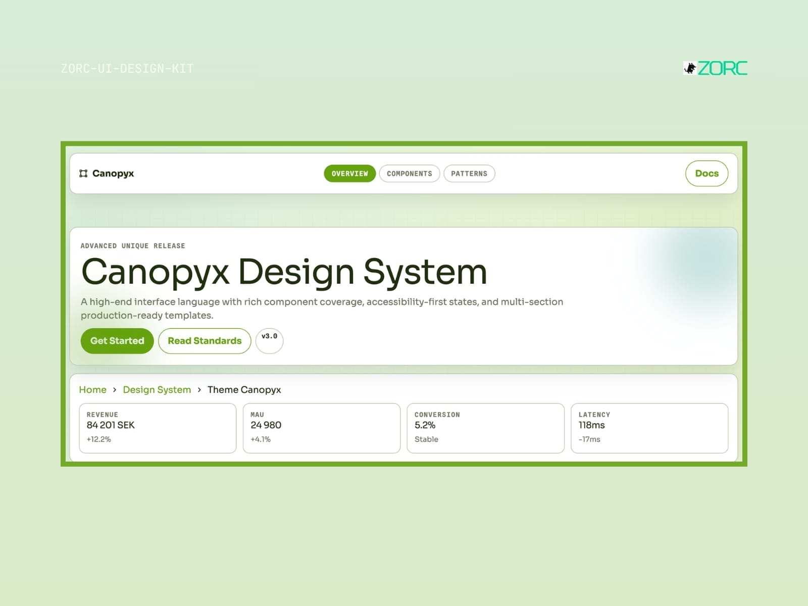
Canopix design system that shows a user-friendly interface solution with a focus on web development and app design
Minimal

Canopyx

Canopyx-style design system for AI-driven development

12 components
25 SEK
View →
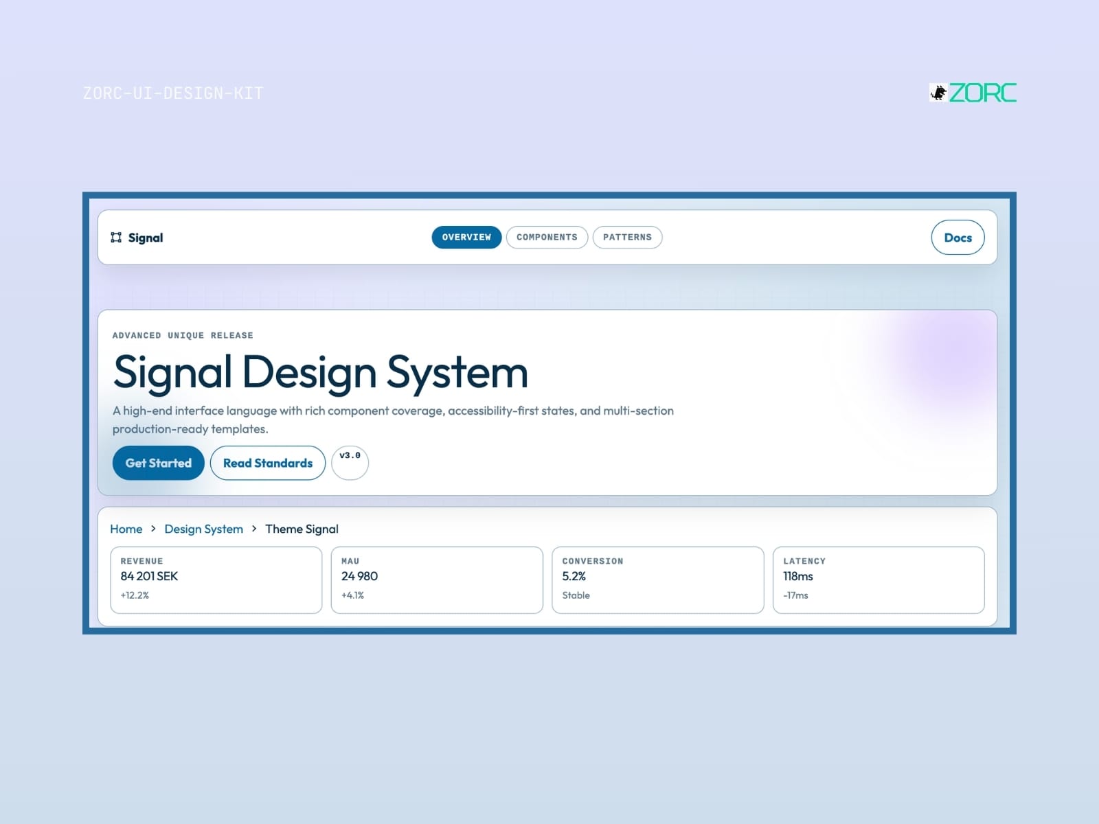
Signal Design System from ZORC with user data such as turnover, conversion and latency for web development and design
Neon

Signal

Signal-style design system for AI-driven development

10 components
25 SEK
View →
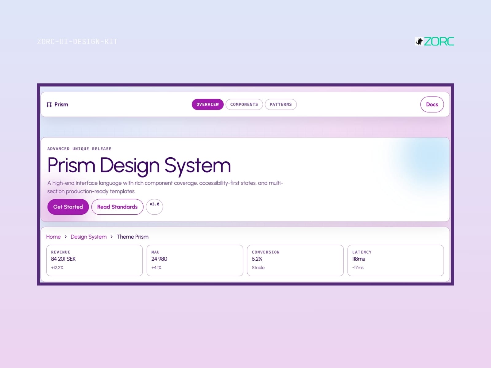
The Prism Design System from ZORC offers a high-quality interface design with a focus on components and accessibility
Glassmorphism

Prism

Prism-style design system for AI-driven development

10 components
25 SEK
View →
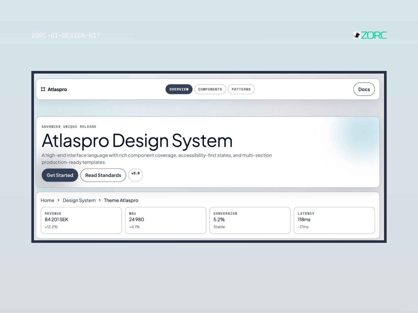
Atlaspro Design System interface that illustrates components, standards and production-ready templates for web development and design
Enterprise

Atlaspro

Atlaspro-style design system for AI-driven development

10 components
25 SEK
View →
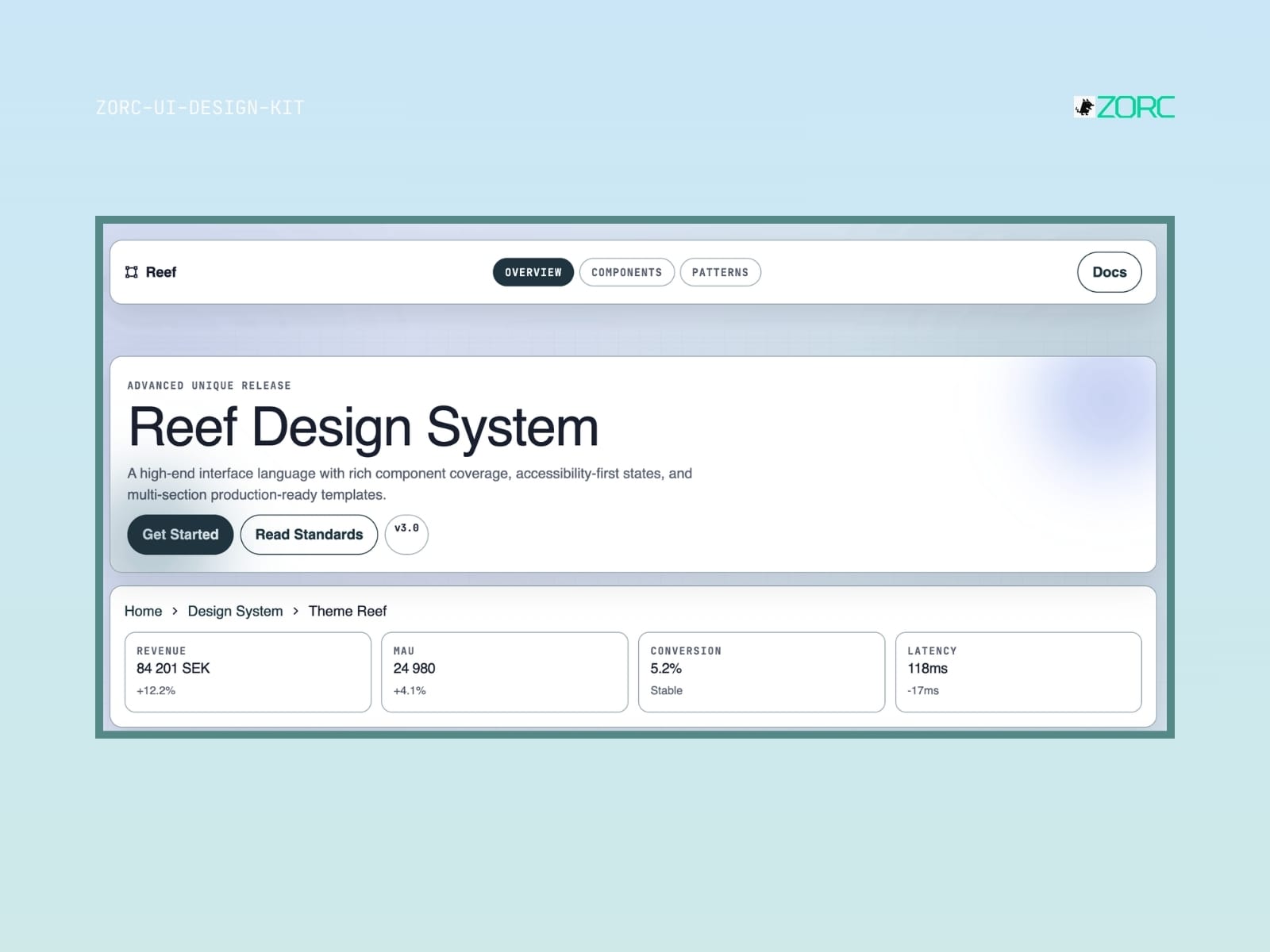
Reef Design System shows advanced templates for web development and design with a focus on components and accessibility in ZORC
Glassmorphism

Reef

Reef-style design system for AI-driven development

8 components
25 SEK
View →
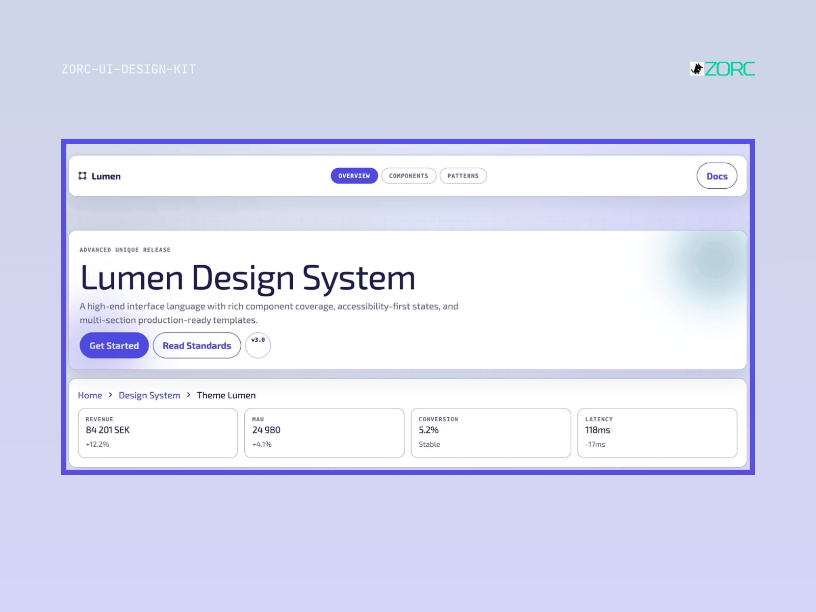
Lumen Design System with high-quality templates and components for web development and AI apps from ZORC
Glassmorphism

Lumen

Lumen-style design system for AI-driven development

10 components
25 SEK
View →
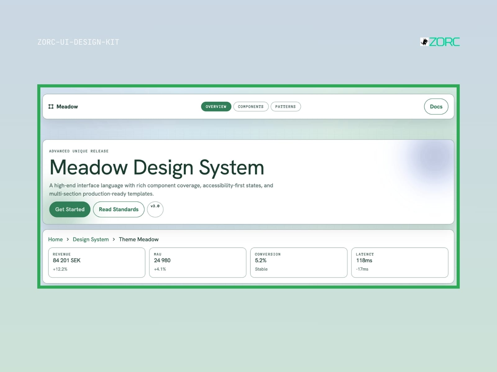
Meadow Design System by ZORC with information on components, usability and production services
Minimal

Meadow

Meadow-style design system for AI-driven development

12 components
25 SEK
View →
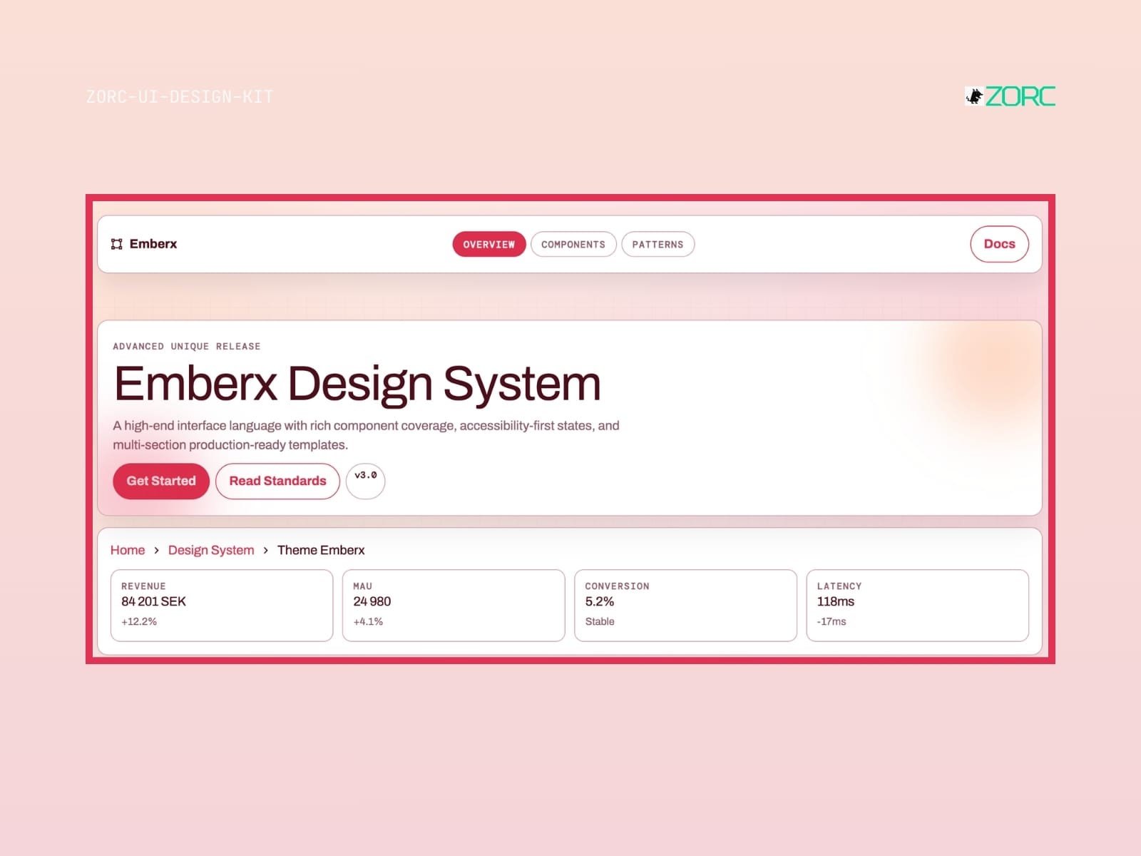
Emberx design system with components and statistics for web development, optimized for ZORC apps and user experiences
Neon

Emberx

Emberx-style design system for AI-driven development

10 components
25 SEK
View →
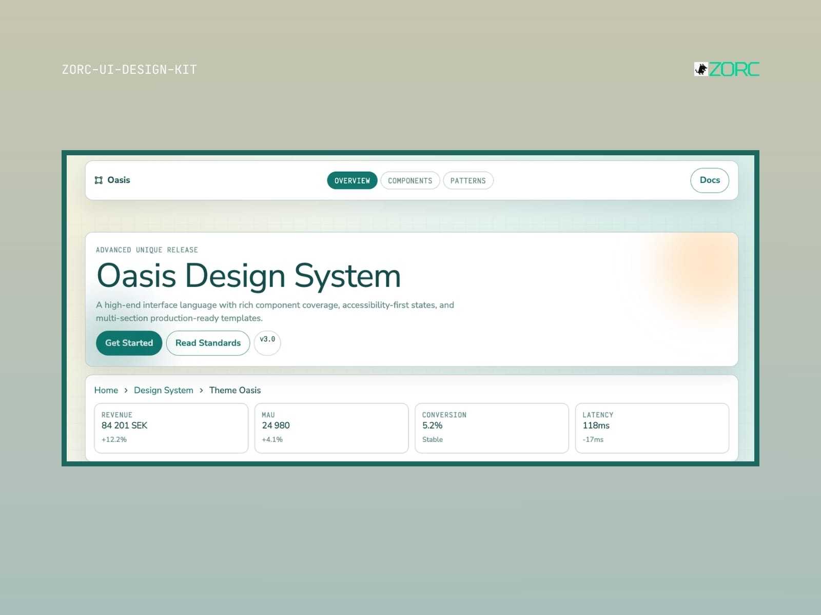
Oasis design system presentation with focus on web development, design and user interface from ZORC
Minimal

Oasis

Oasis-style design system for AI-driven development

10 components
25 SEK
View →
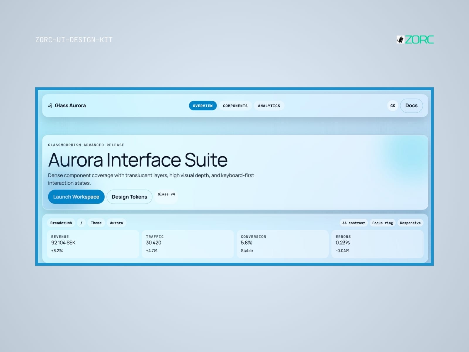
Aurora Interface Suite from ZORC with design tools and analysis statistics for web development and user interfaces
Glassmorphism

Glass Aurora

Glass Aurora-style design system for AI-driven development

10 components
25 SEK
View →
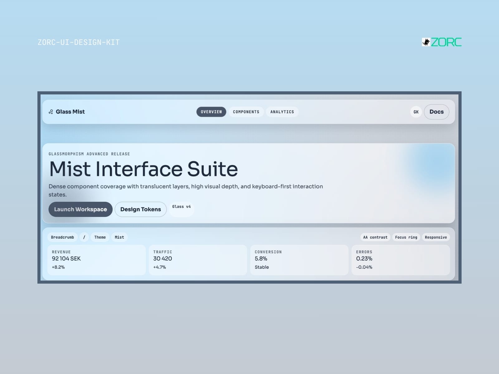
Design section of ZORC's Mist Interface Suite with revenue and traffic statistics information
Glassmorphism

Glass Mist

Glass Mist-style design system for AI-driven development

10 components
25 SEK
View →
The interface for Rosewater with a focus on design and analysis of ZORC's UI design kit for improved user experience
Glassmorphism

Glass Rosewater

Glass Rosewater-style design system for AI-driven development

10 components
25 SEK
View →
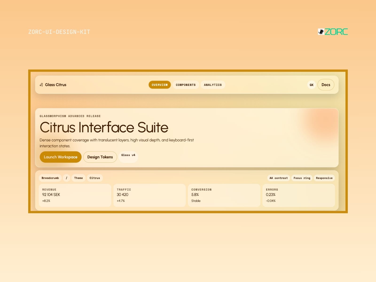
Citrus Interface Suite from ZORC with glassy design and analysis tools for web development and app interactions
Glassmorphism

Glass Citrus

Glass Citrus-style design system for AI-driven development

10 components
25 SEK
View →
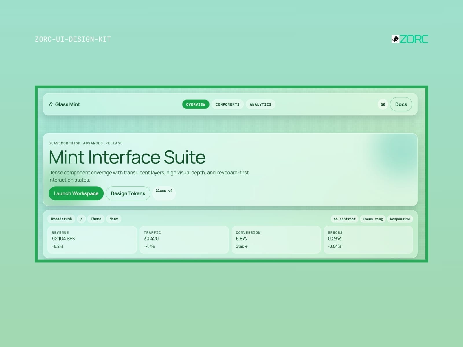
Mint Interface Suite with glassmorphism design, statistics for revenue, traffic and conversion in ZORC app
Glassmorphism

Glass Mint

Glass Mint-style design system for AI-powered development

10 components
25 SEK
View →
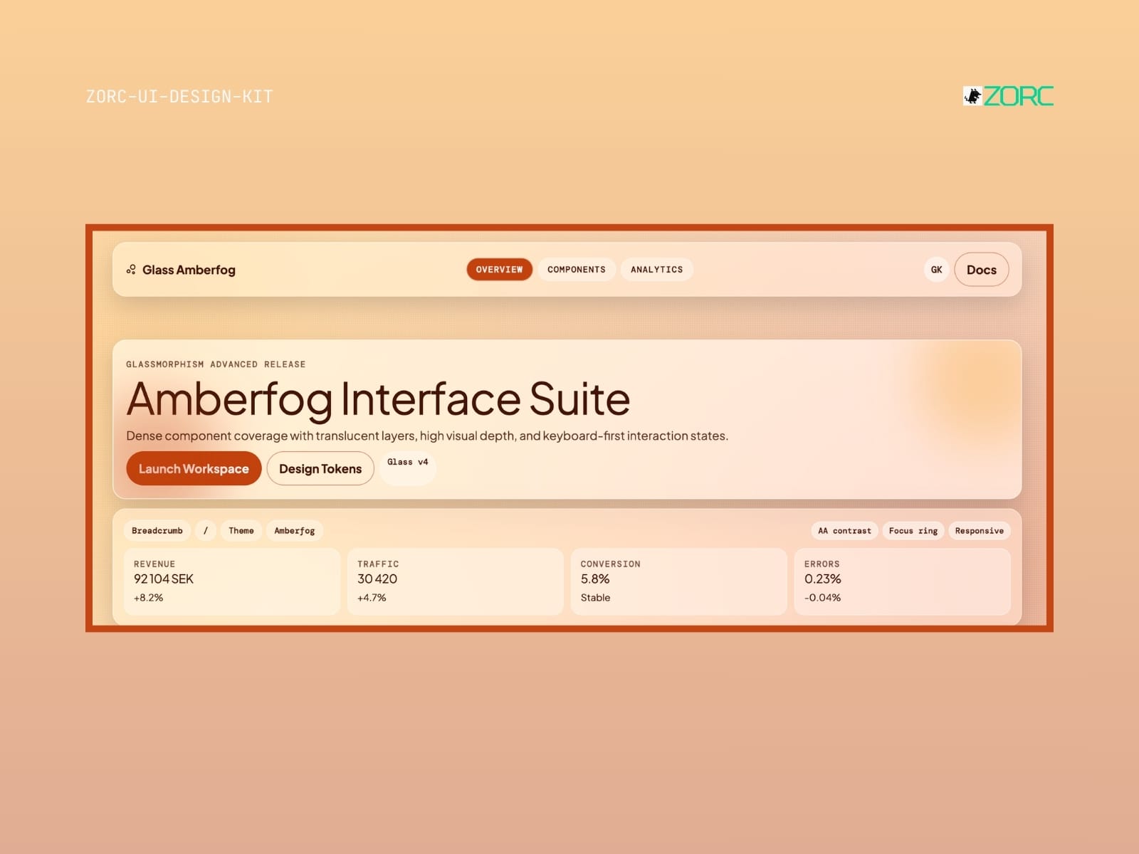
Amberfog Interface Suite in ZORC design tool displays traffic data and user statistics for effective web design and app development
Glassmorphism

Glass Amberfog

Glass Amberfog-style design system for AI-powered development

11 components
25 SEK
View →
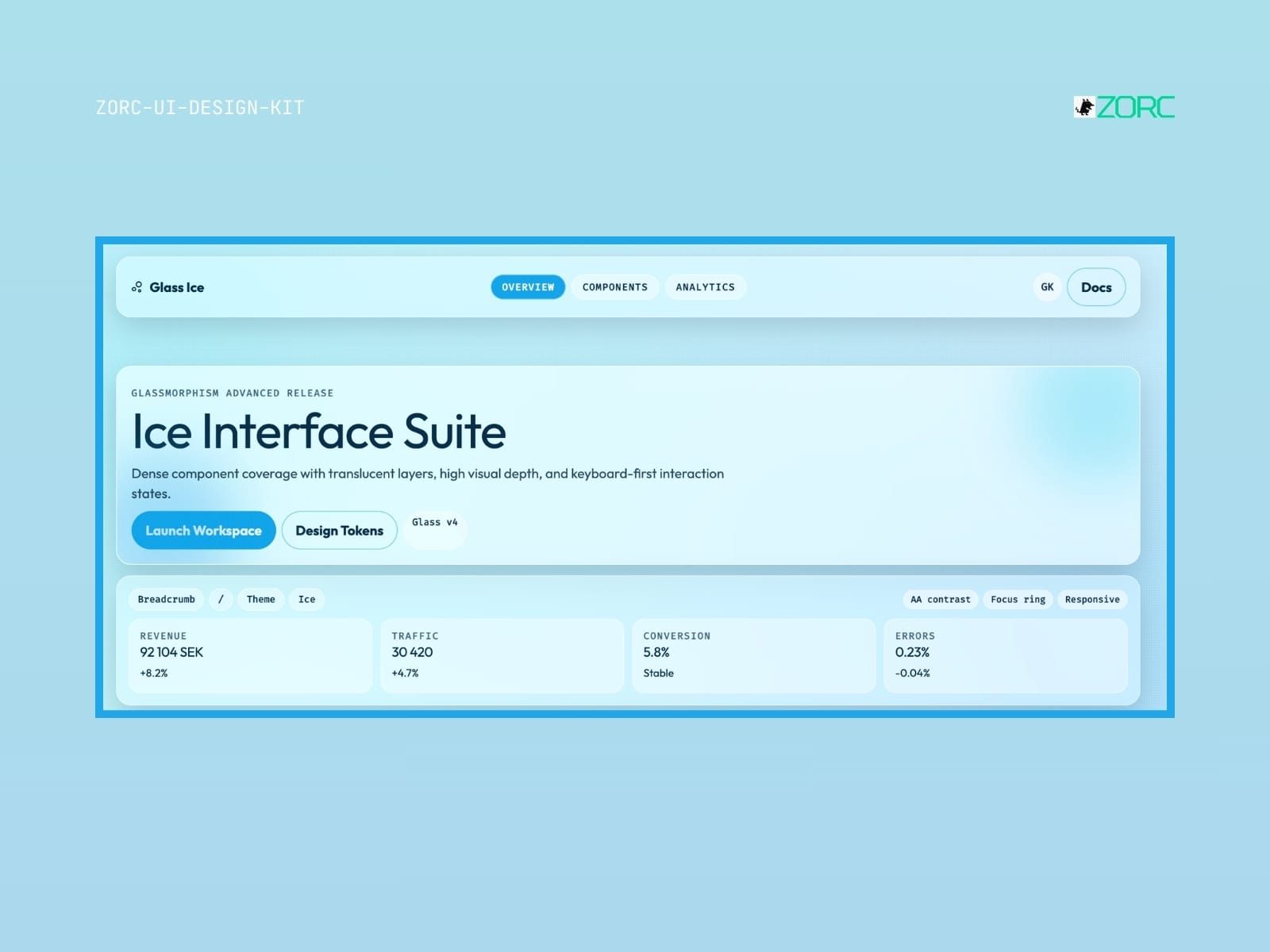
User interface for ZORC's Ice Interface Suite with statistics and design components for web development and AI
Glassmorphism

Glass Ice

Glass Ice-style design system for AI-driven development

10 components
25 SEK
View →
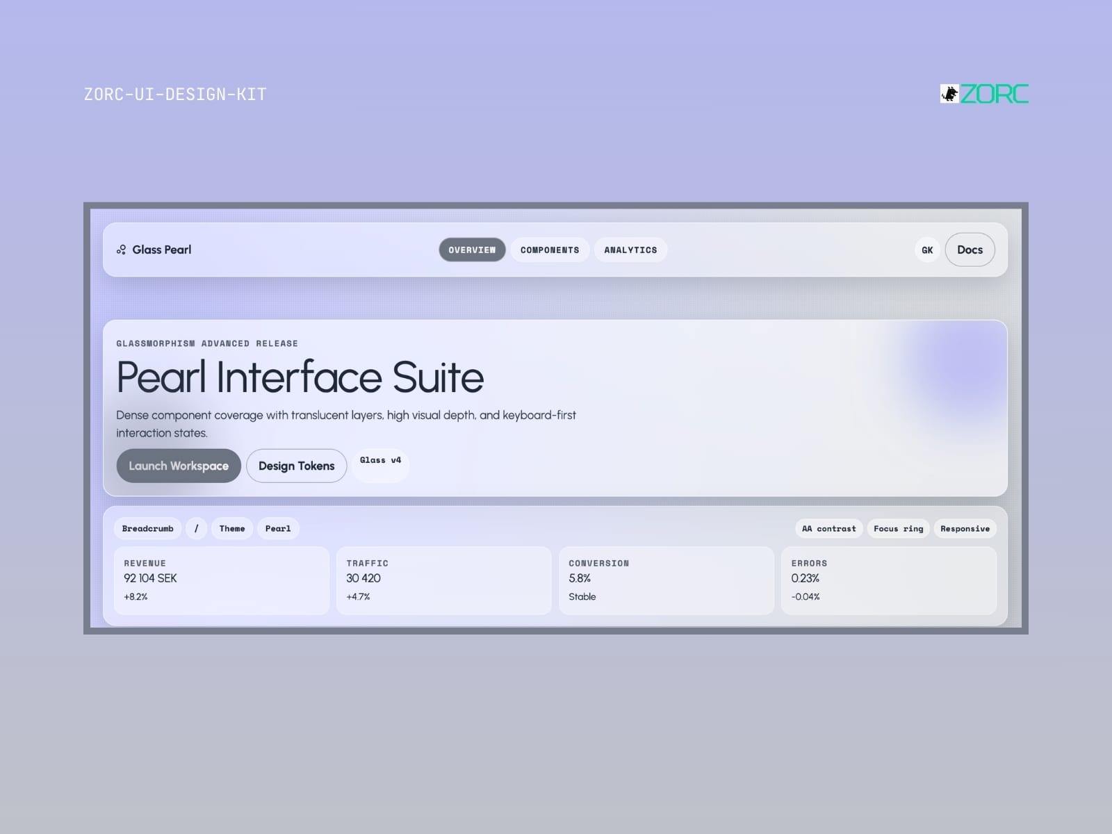
The Pearl Interface Suite interface shows design tools with glassmorphism, traffic and conversion stats, and interaction design
Glassmorphism

Glass Pearl

Glass Pearl-style design system for AI-driven development

10 components
25 SEK
View →
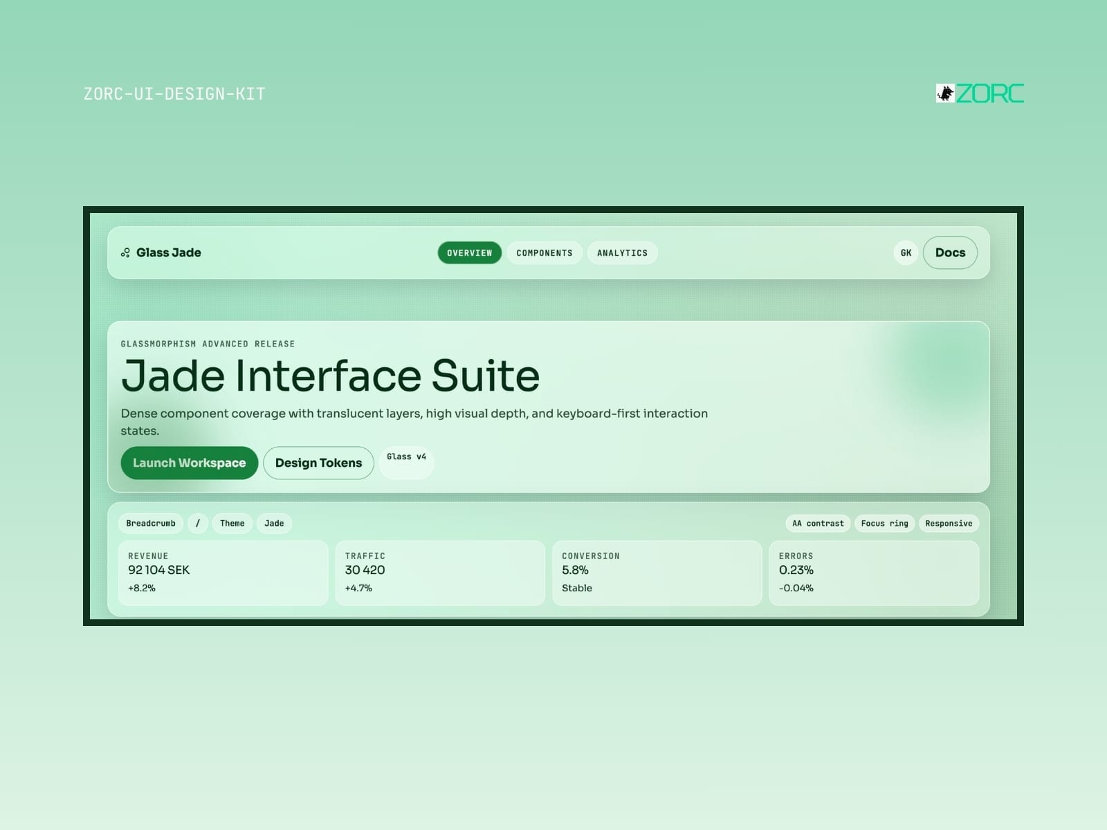
Jade Interface Suite displays statistics and features for web development and design with ZORC's UI design kit
Glassmorphism

Glass Jade

Glass Jade-style design system for AI-powered development

10 components
25 SEK
View →
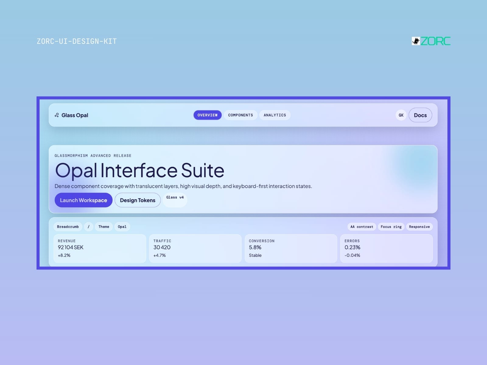
The UI design for Opal Interface Suite with features like glassy design and interactive components from ZORC
Glassmorphism

Glass Opal

Glass Opal-style design system for AI-powered development

10 components
25 SEK
View →
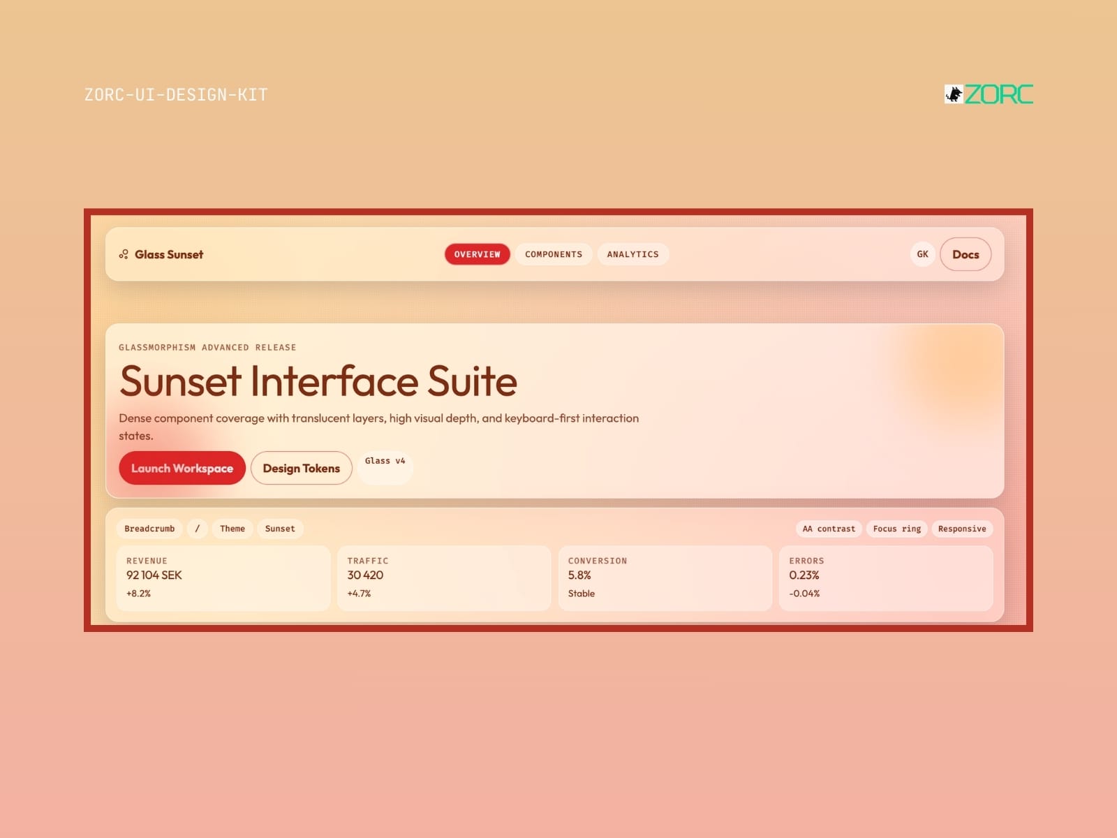
The user interface for ZORC's Sunset Interface Suite with statistical presentation and design tools
Glassmorphism

Glass Sunset

Glass Sunset-style design system for AI-driven development

10 components
25 SEK
View →
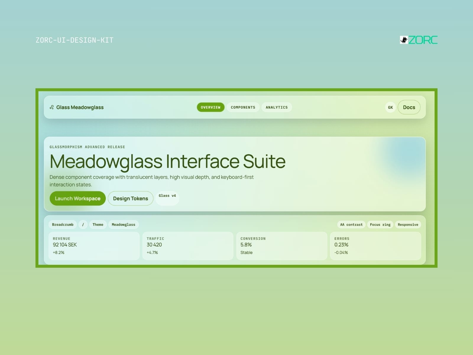
Meadowglass Interface Suite with high visual depth, design components and statistics for web design and user experience
Glassmorphism

Glass Meadowglass

Glass Meadowglass-style design system for AI-driven development

10 components
25 SEK
View →
Glassmorphism

Glass Plasma

Glass Plasma-style design system for AI-driven development

10 components
-12 SEK
View →
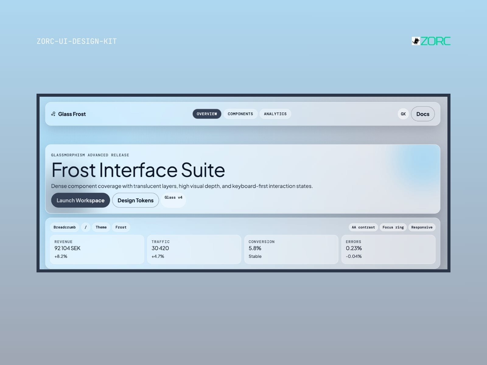
Glass Frost – Glassmorphism UI kit
Glassmorphism

Glass Frost

Glass Frost-style design system for AI-driven development

10 components

25 SEK
View →
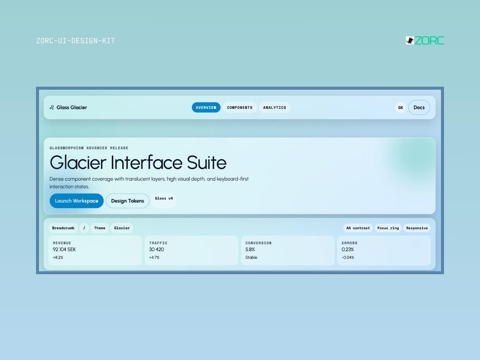
Glacier Interface Suite provides a user interface design with transparent layers and high visual depth for web development and app design
Glassmorphism

Glass Glacier

Glass Glacier-style design system for AI-driven development

6 components
25 SEK
View →
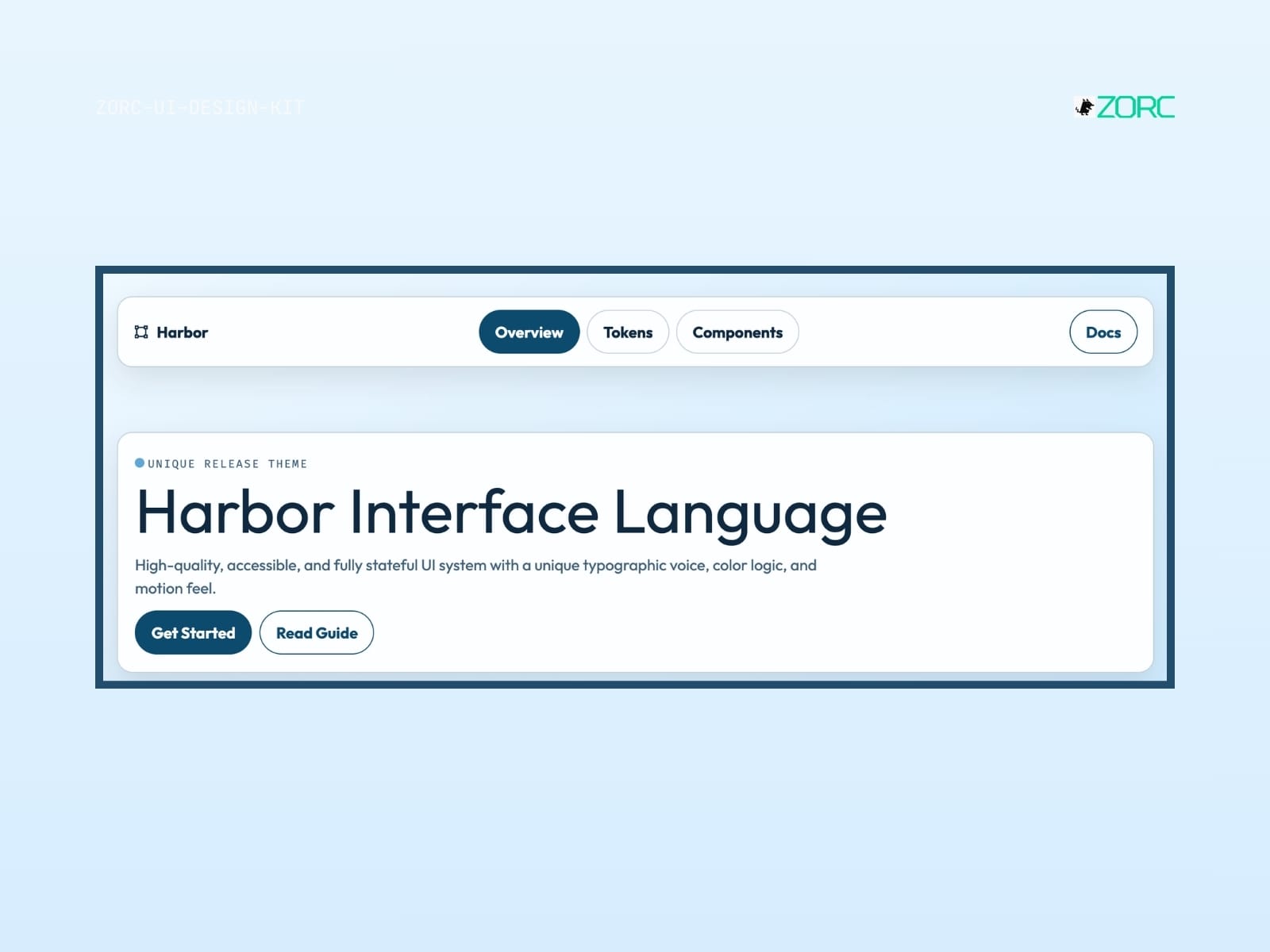
Interactive user interface for ZORC with a focus on unified design, typography and components for web and app development
Glassmorphism

Harbor

Harbor-style design system for AI-driven development

10 components
25 SEK
View →
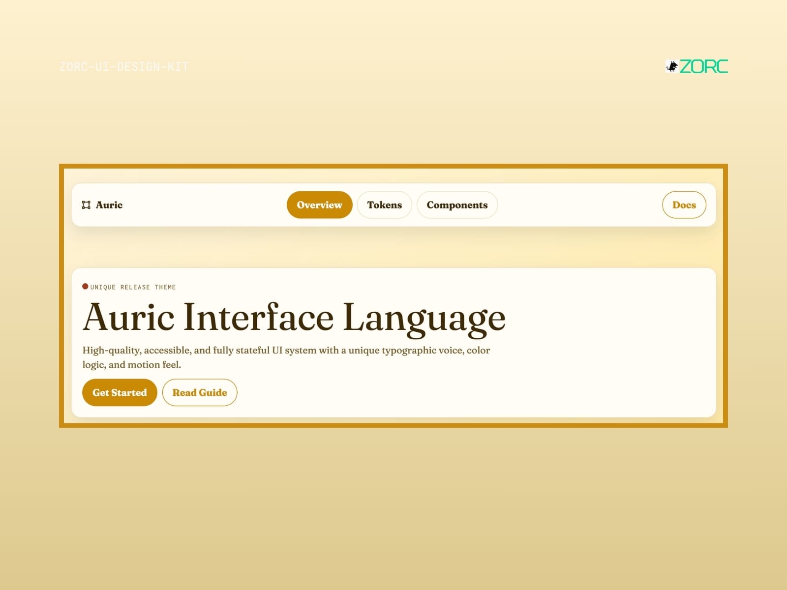
Auric Interface Language shows a modern UI design with buttons and texts focused on web development and design at ZORC
Glassmorphism

Auric

Auric-style design system for AI-driven development

10 components
25 SEK
View →
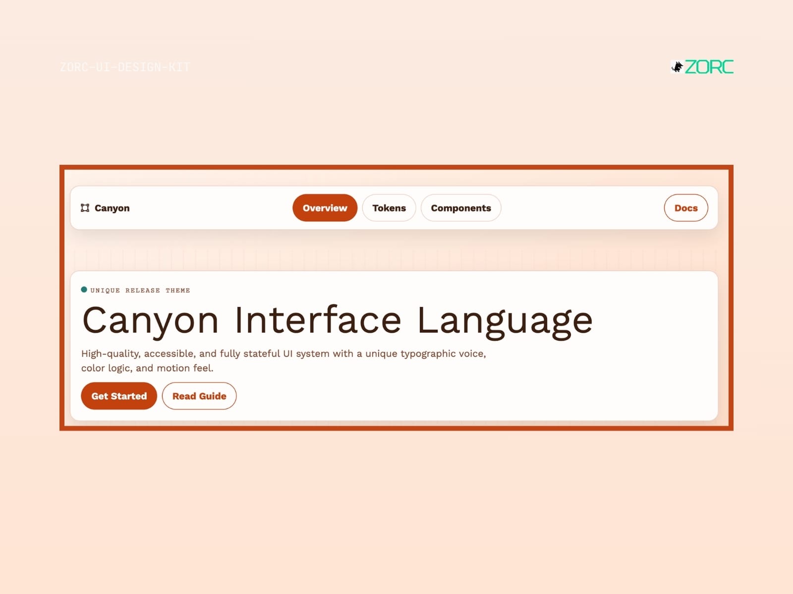
Canyon interface language from ZORC with a focus on accessibility and high-quality design for web development and applications
Dark

Canyon

Canyon-style design system for AI-driven development

10 components
25 SEK
View →
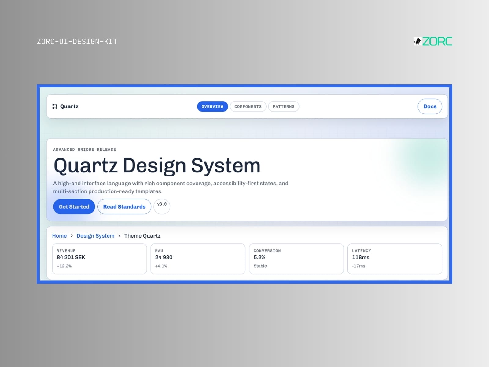
Quartz Design System from ZORC with statistics and features for web development and design
Glassmorphism

Quartz

Quartz-style design system for AI-powered development

9 components
25 SEK
View →
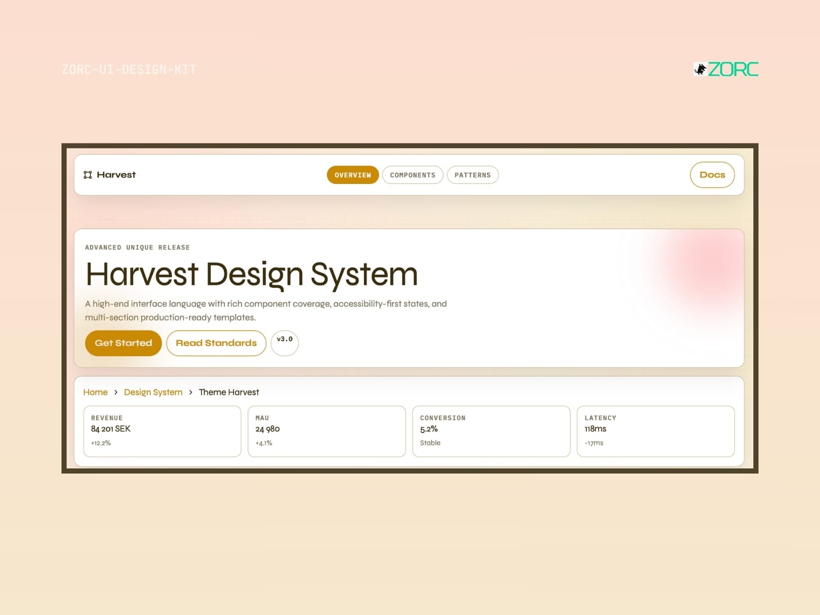
A design system overview for Harvest showing components, stats and ZORC related features
Minimal

Harvest

Harvest-style design system for AI-driven development

10 components
25 SEK
View →
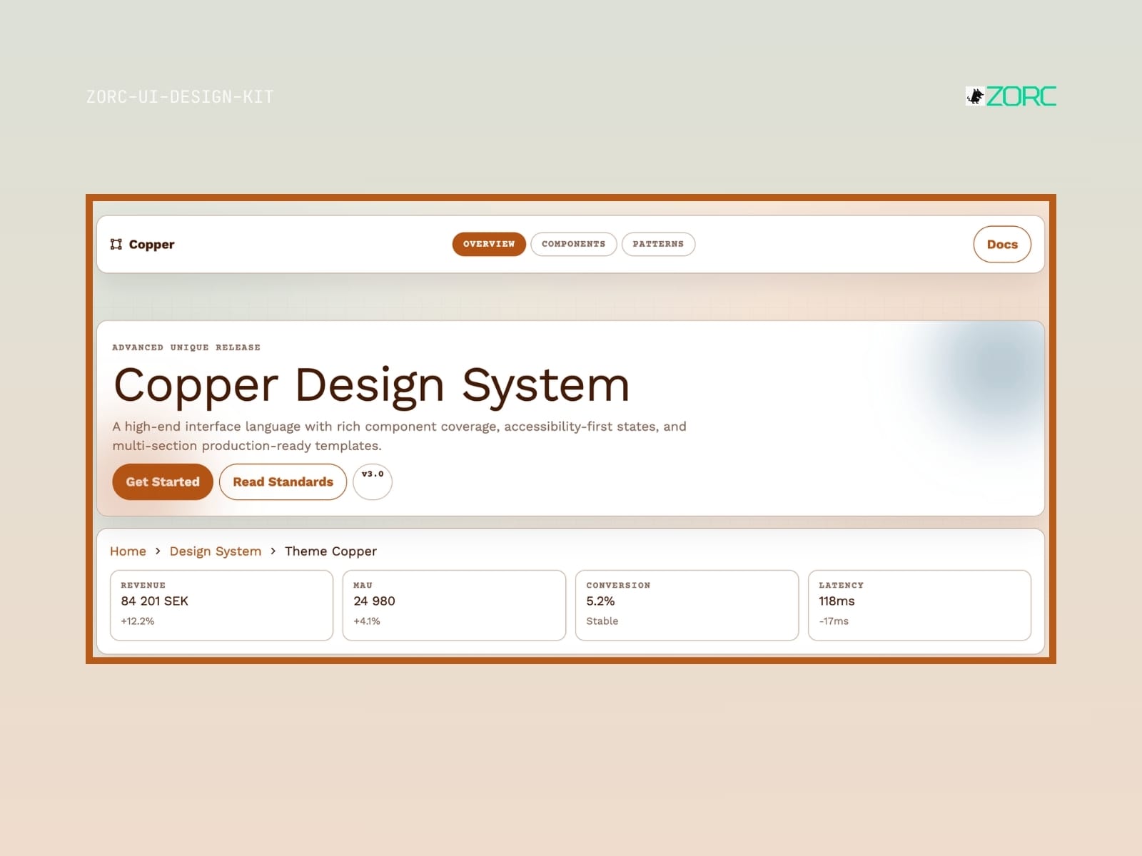
Copper Design System shows an advanced design solution with components and metrics for web development and app design by ZORC
Dark

Copper

Copper-style design system for AI-driven development

10 components
25 SEK
View →
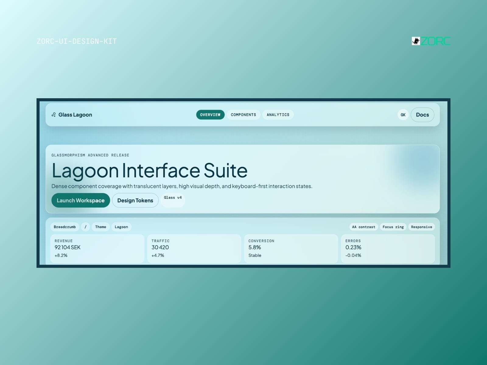
Lagoon Interface Suite presents a user-friendly design with glassy components for web development and app analysis in ZORC
Glassmorphism

Glass Lagoon

Glass Lagoon-style design system for AI-driven development

10 components
25 SEK
View →
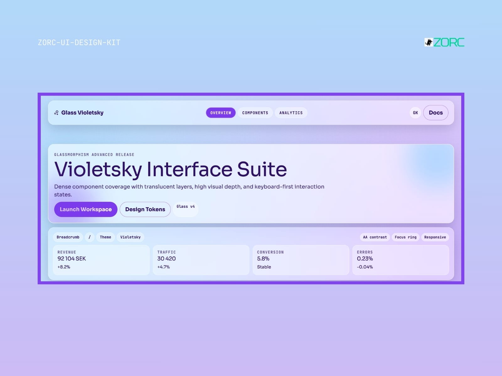
Violetsky Interface Suite shows advanced design with glass formism, user interaction and statistics for web development in the ZORC app
Glassmorphism

Glass Violetsky

Glass Violetsky-style design system for AI-driven development

10 components
25 SEK
View →
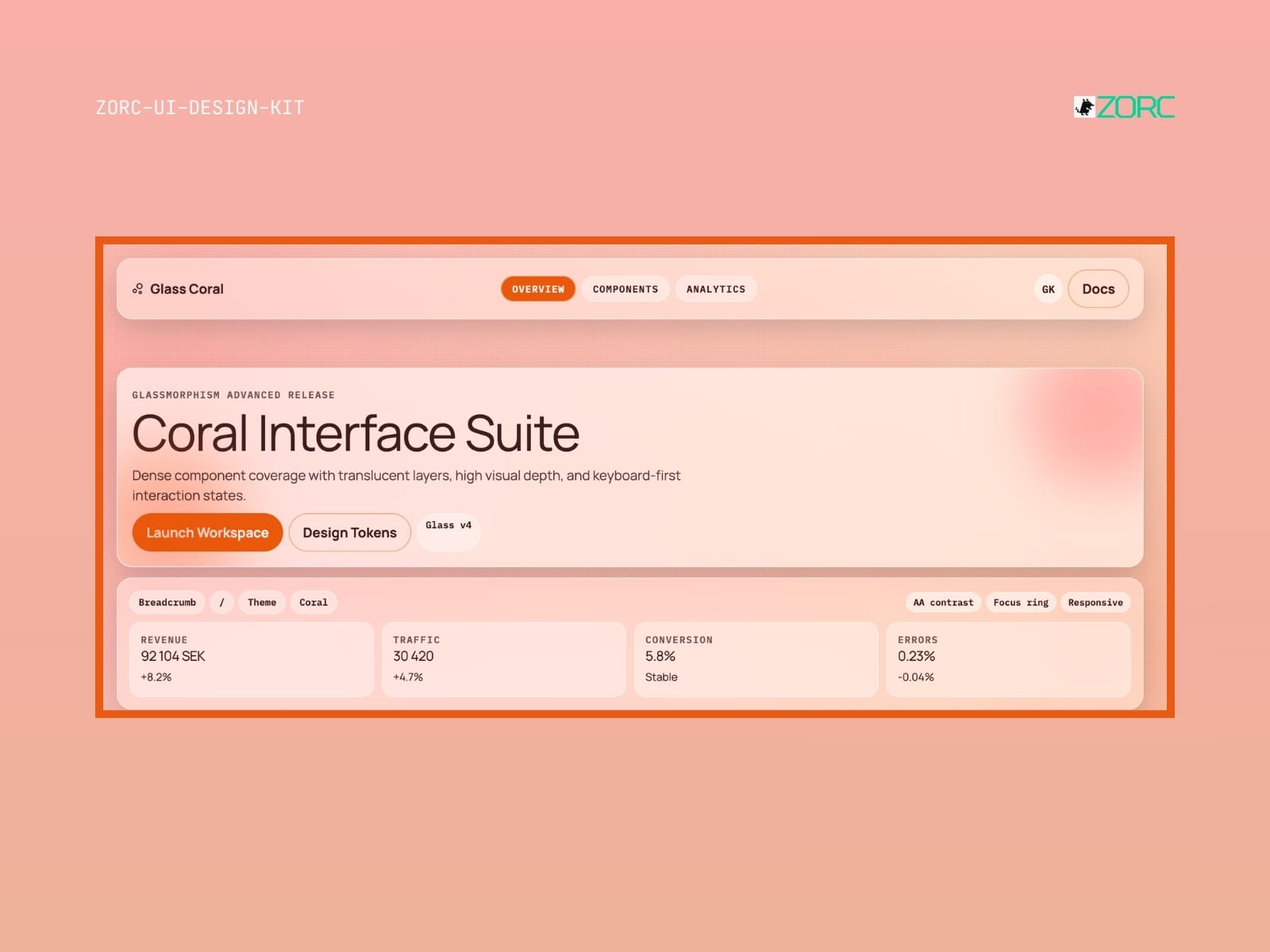
UI design for ZORC's Coral Interface Suite with revenue and traffic statistics and design tokens
Glassmorphism

Glass Coral

Glass Coral-style design system for AI-powered development

10 components
25 SEK
View →
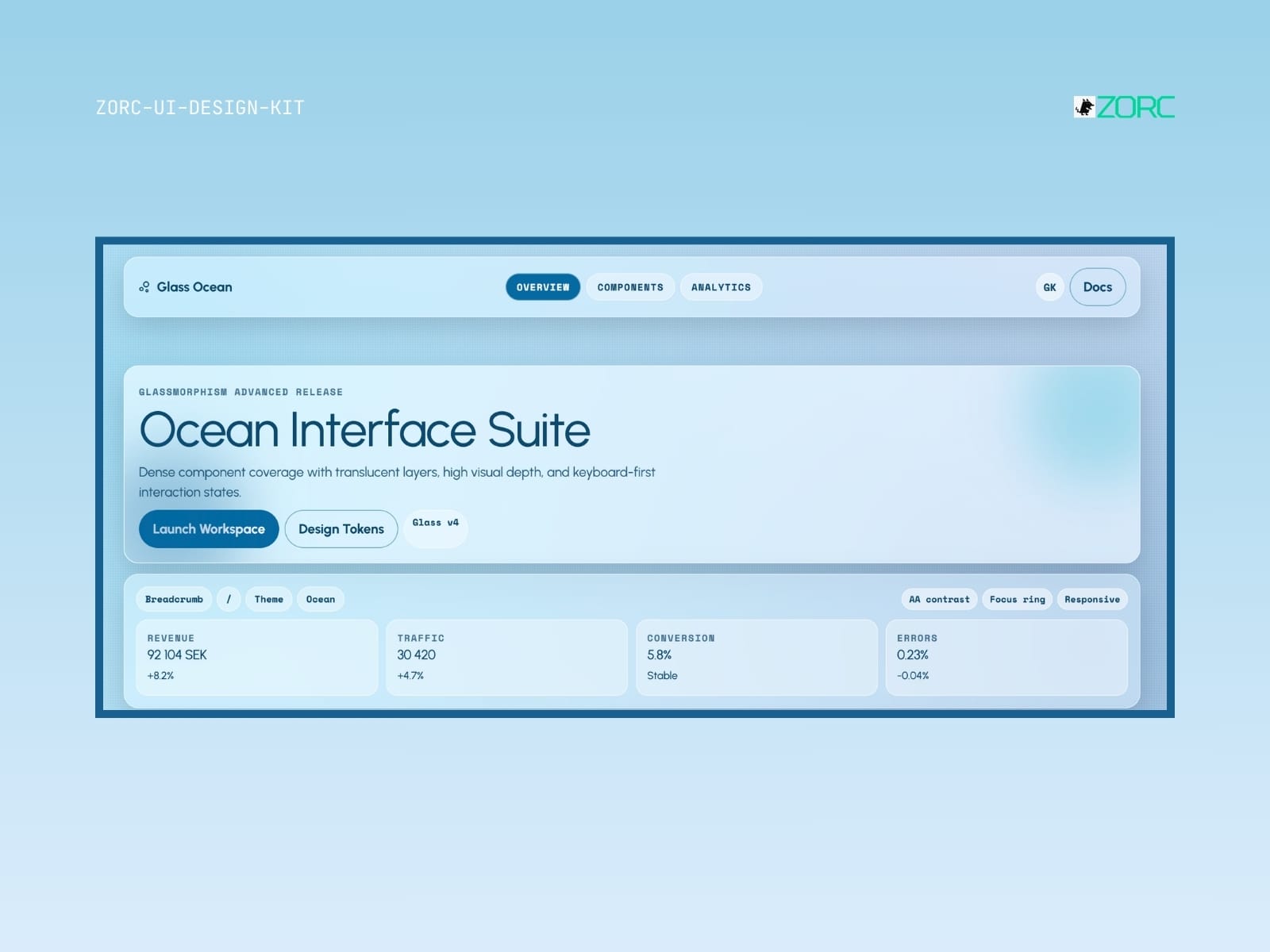
Ocean Interface Suite with glassy design and advanced components for web development and app user interfaces
Glassmorphism

Glass Ocean

Glass Ocean-style design system for AI-driven development

10 components
25 SEK
View →
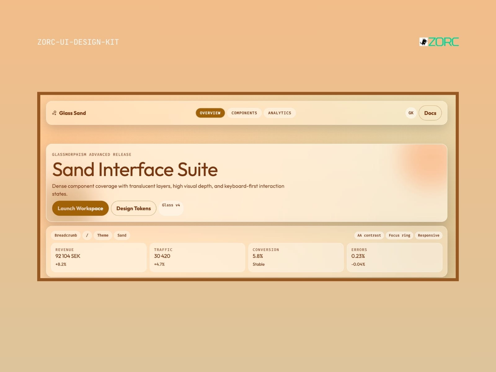
Glass Sand – Glassmorphism UI kit
Glassmorphism

Glass Sand

Glass Sand-style design system for AI-driven development

5 components
25 SEK
View →
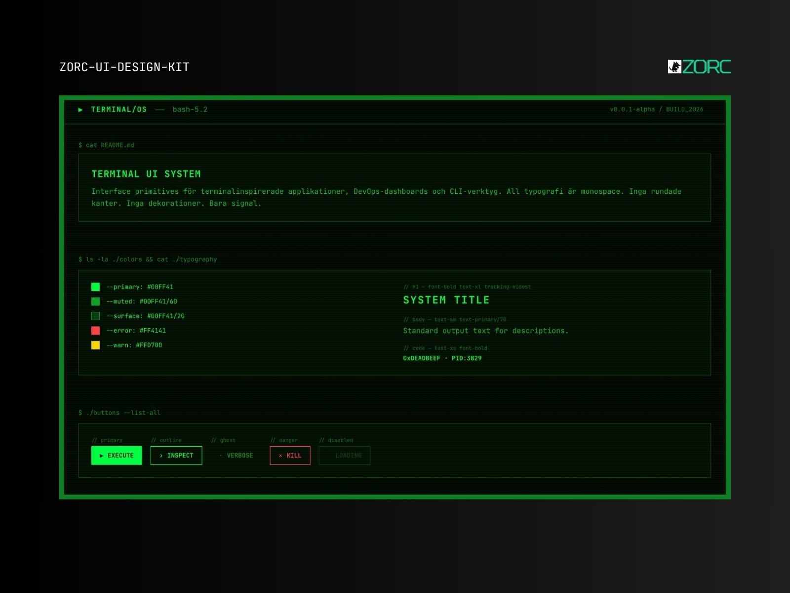
UI design tool ZORC shows terminal-based app with typography and color scheme for developers
Editorial

Terminal Component System

Pure CLI aesthetic design system with scan-lines and monospace everywhere. For hackers, devs and CLI fans.

5 components
50 SEK
View →
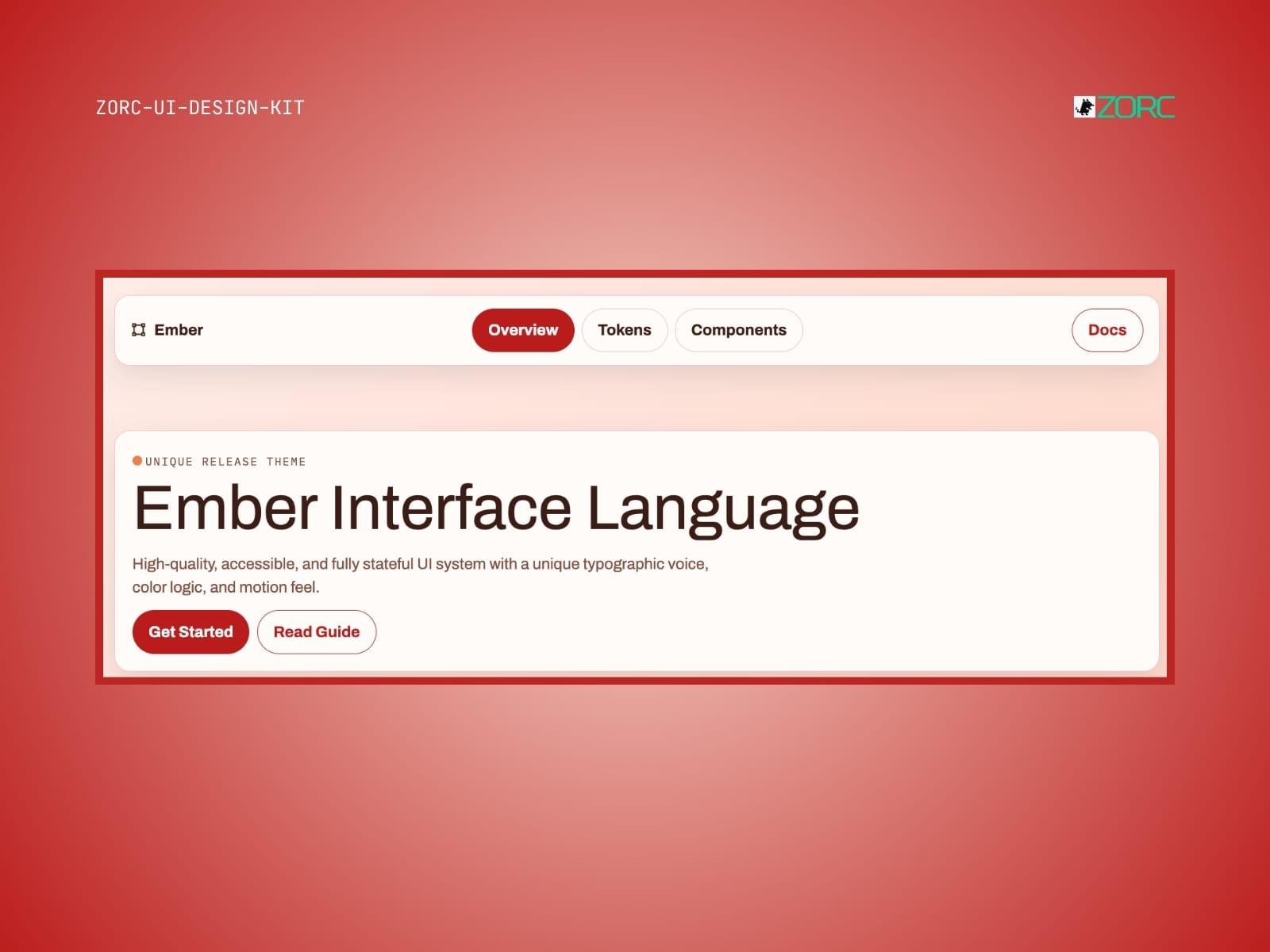
Ember Interface Language design in the ZORC UI design kit with a focus on high-quality, accessible UI systems and typography Light
Neon

Ember UI System

Warm enterprise look with ember/amber accents. Like Nexus but more friendly and inviting.

6 components
25 SEK 50 SEK
View →
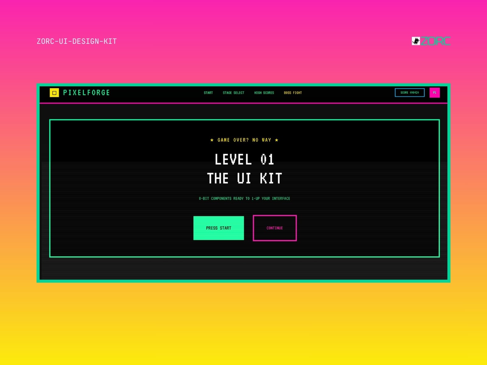
UI design by ZORC with retro gaming theme and 8-bit components for app development Retro
Retro

Pixelforge 16-bit Legacy

Retro 16-bit arcade aesthetic. Press Start 2P, VT323, CRT effects and pure pixel colors.

7 components

50 SEK
View →
// FAQ

Worth knowing before you buy

What is a UI kit?
A collection of ready-made components — buttons, forms, cards, navigation. Copy them into your project and skip building from scratch.
Which frameworks does it work with?
Astro, React, Vue or plain HTML and Tailwind. Each kit states clearly what it is built for.
Can I use it in paid client work?
Yes. You may use the components across your organisation's commercial projects. What you cannot do is resell the kit itself.
Do updates come included?
Yes. All future versions are free for as long as the kit remains in the catalogue.
Are the components accessible?
Yes. Kits follow WCAG 2.1 AA where the content allows — focus rings, keyboard support, ARIA and contrast are tested.