 Light
Light 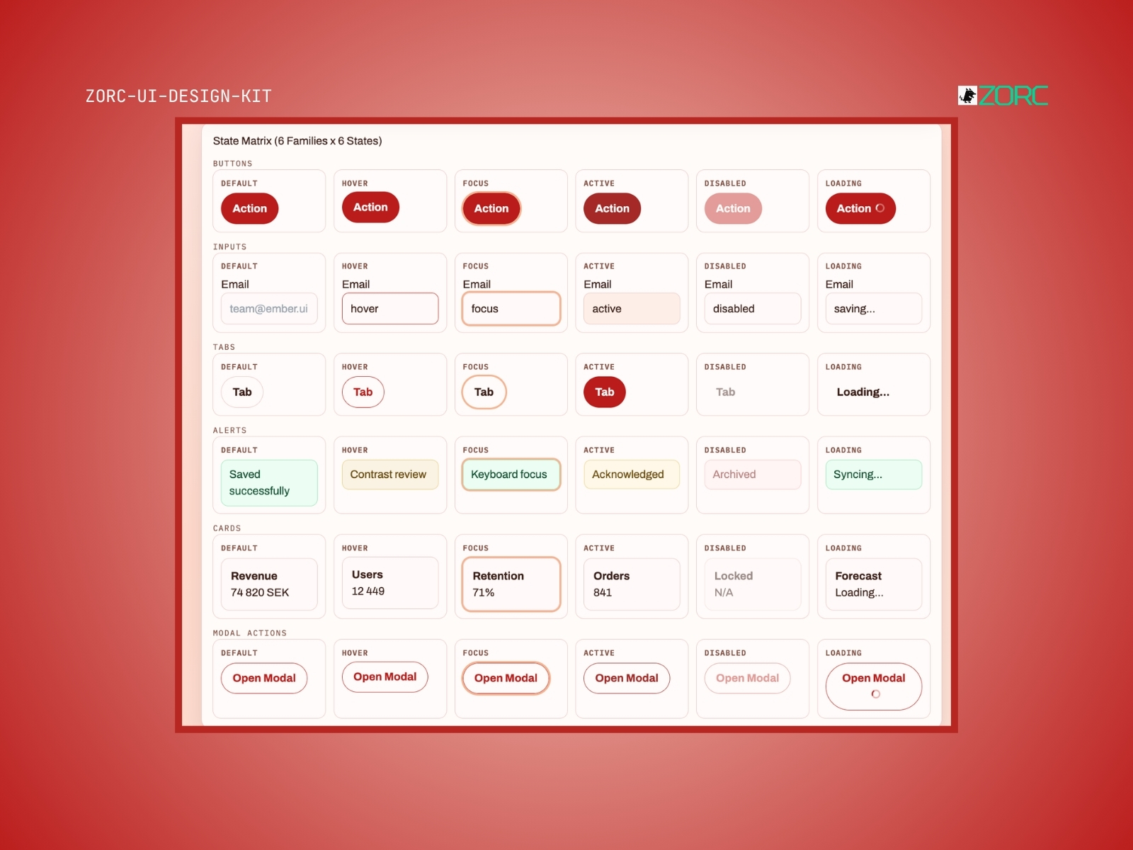
Ember UI System
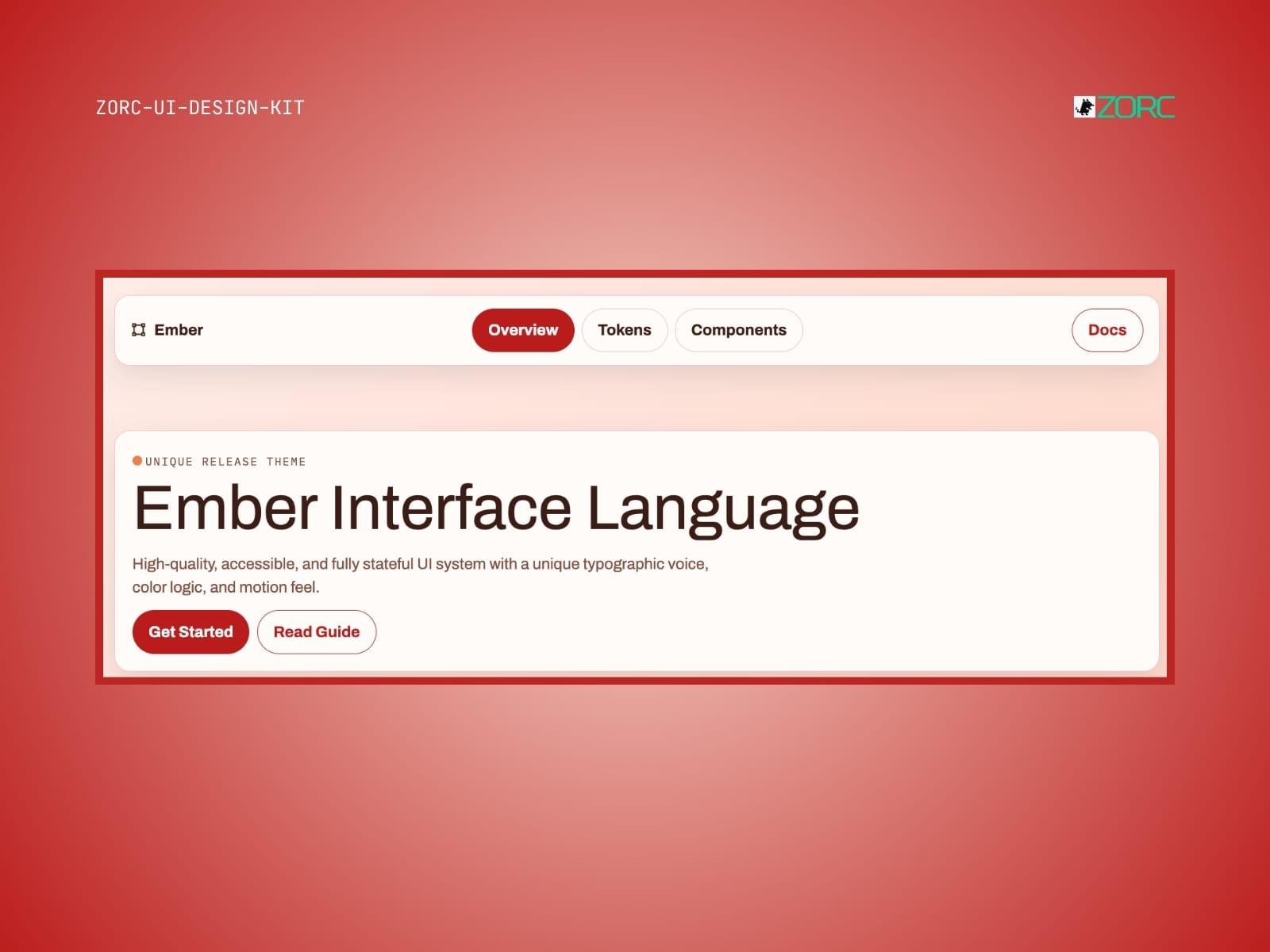
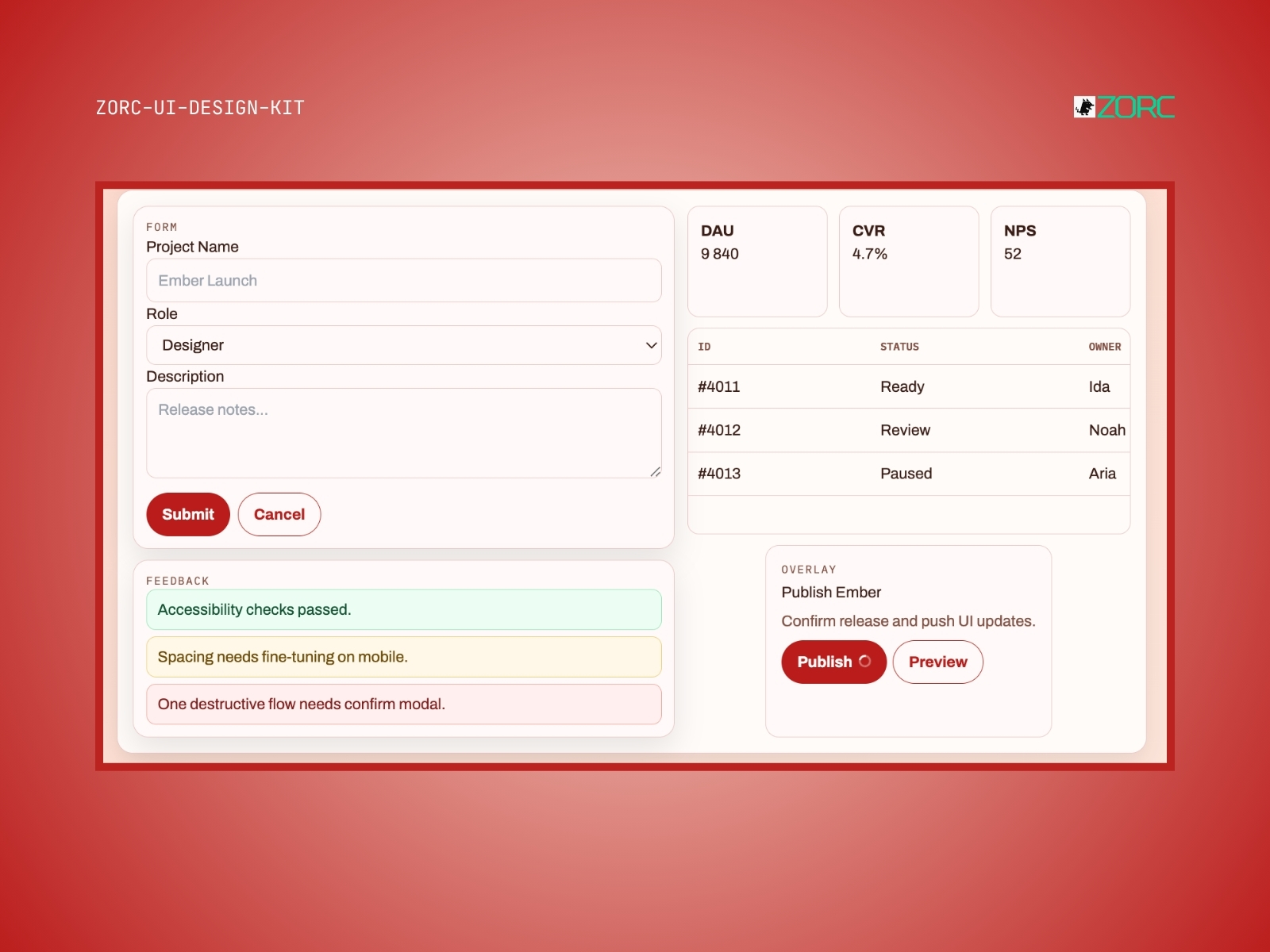
Warm enterprise look with ember/amber accents. Like Nexus but more friendly and inviting.
One-time payment • VAT included • Source code included
- Components
- 6
- Tech stack
- React, Vue, Angular, Tailwind CSS
- Licence
- Commercial
- Delivery
- Instant access (zip + Git)
- Updated
Creator
About this kit
Ember is an enterprise system with a heated dispute. The same stable zinc base as Nexus but with ember/amber as the primary color instead of white. Gives a more inviting, premium feel — like Stripe meets Linear.
Perfect for fintech, e-commerce and consumer-facing SaaS who want to be serious but not cold.
Components included
Features
- Responsiv design
- Dark mode
- Customizable color palette
- Availability
- Form management
- Animationer
When does this kit fit?
Tech stack
How to use this kit
- Step 01
Download
Sign in to ZORC and fetch the zip from your purchases. All source code and documentation is included.
- Step 02
Copy into your project
Drop the components/ folder into your project — or install via package.json if the kit is packaged for npm.
- Step 03
Wire up design tokens
The tokens/ folder holds colours, typography and spacing for your Tailwind config or CSS variables.
- Step 04
Start building
Import the components and use them straight away. Each one ships with examples, props and variants in the docs.
Example AI prompt
Create a user-friendly dashboard with Ember UI System that displays statistics and has interactive charts. Use the glowing red color for important areas.