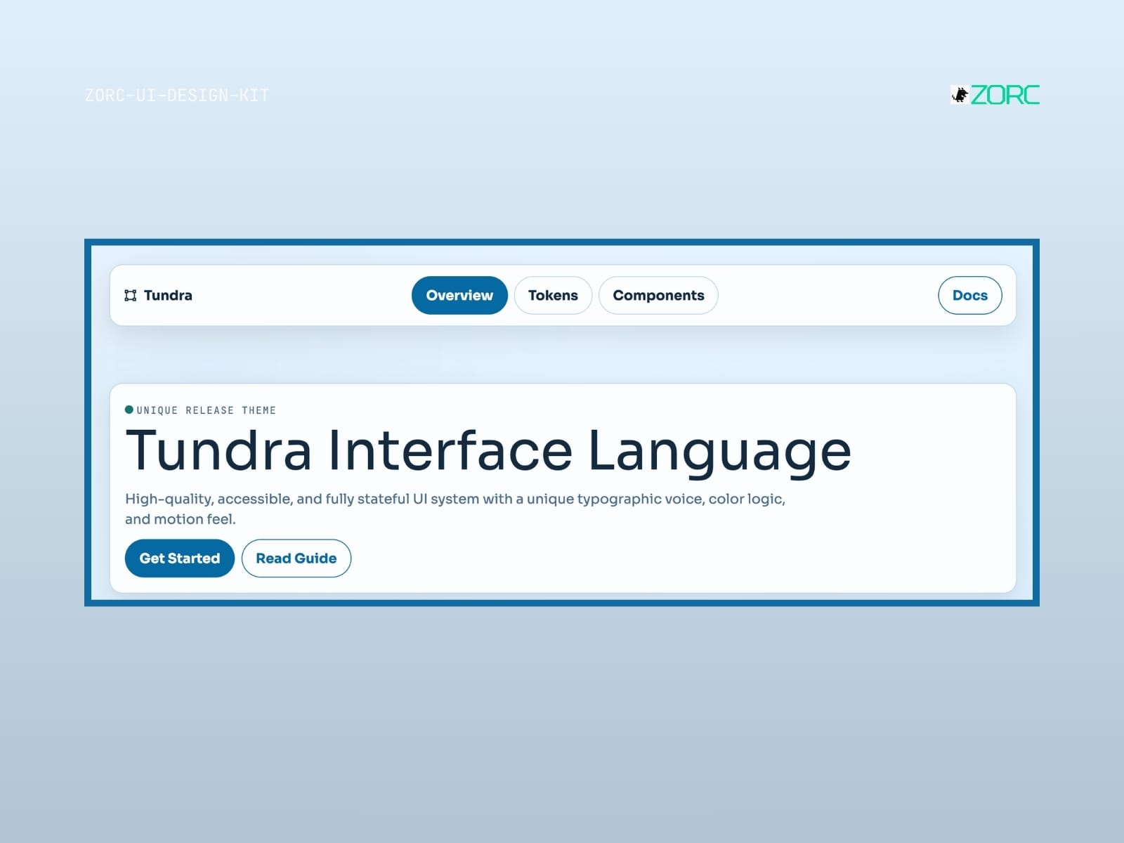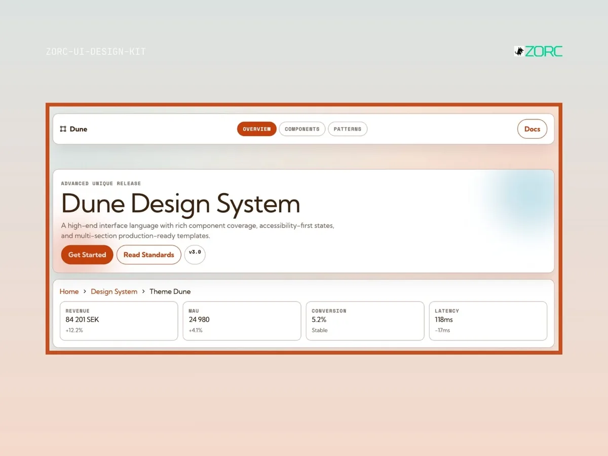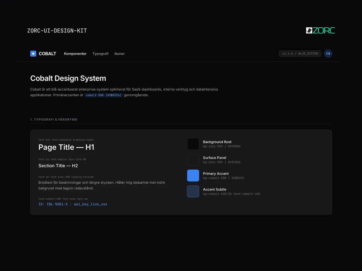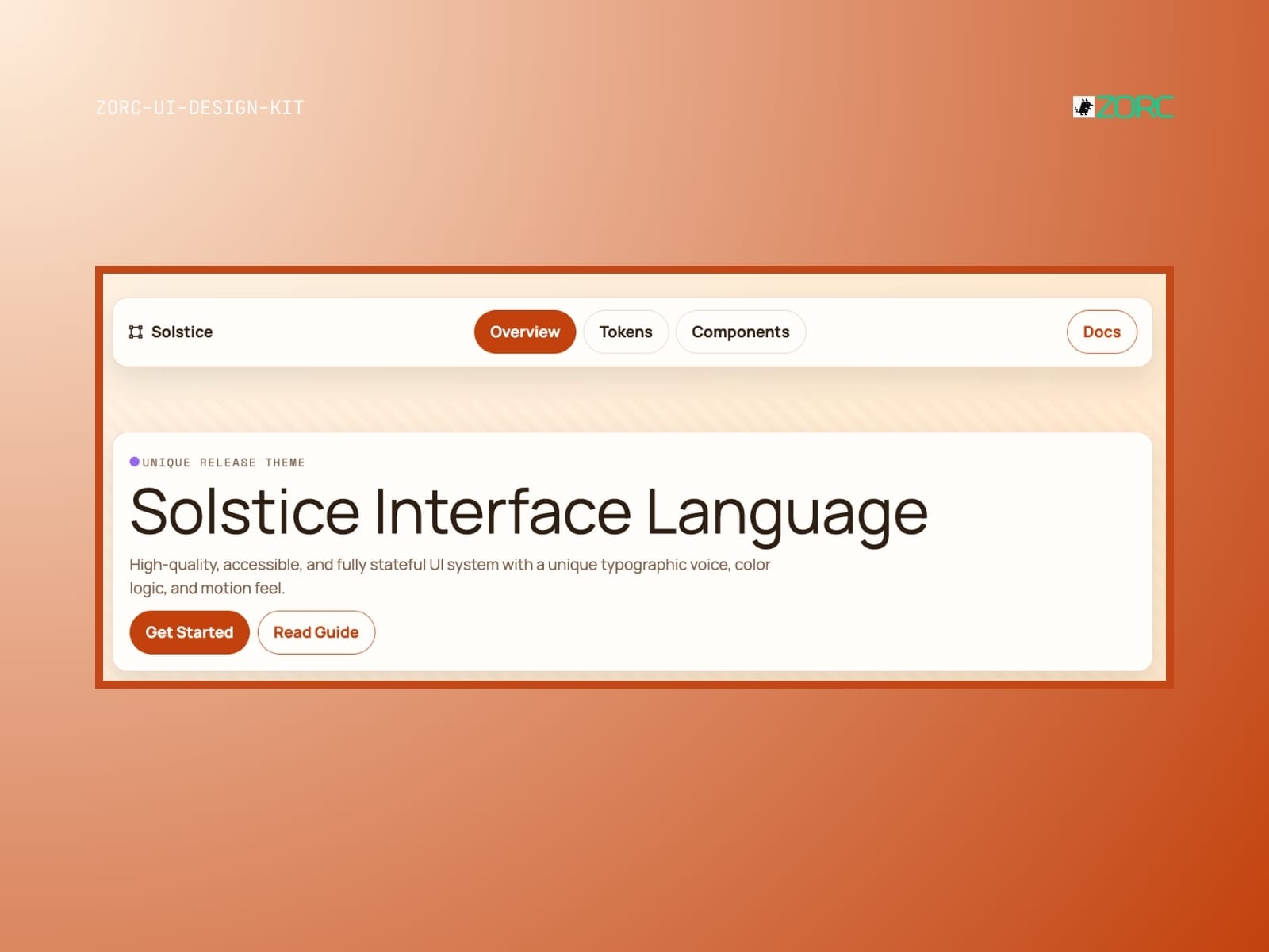
// Enterprise UI kit
Atlas
Atlas-style design system for AI-driven development
25 kr
One-time payment • VAT included • Source code included
- Components
- 10
- Tech stack
- React 18, Tailwind CSS, TypeScript, Framer Motion, Lucide Icons, Geist Sans
- Licence
- Commercial
- Delivery
- Instant access (zip + Git)
- Updated
z
Creator
About this kit
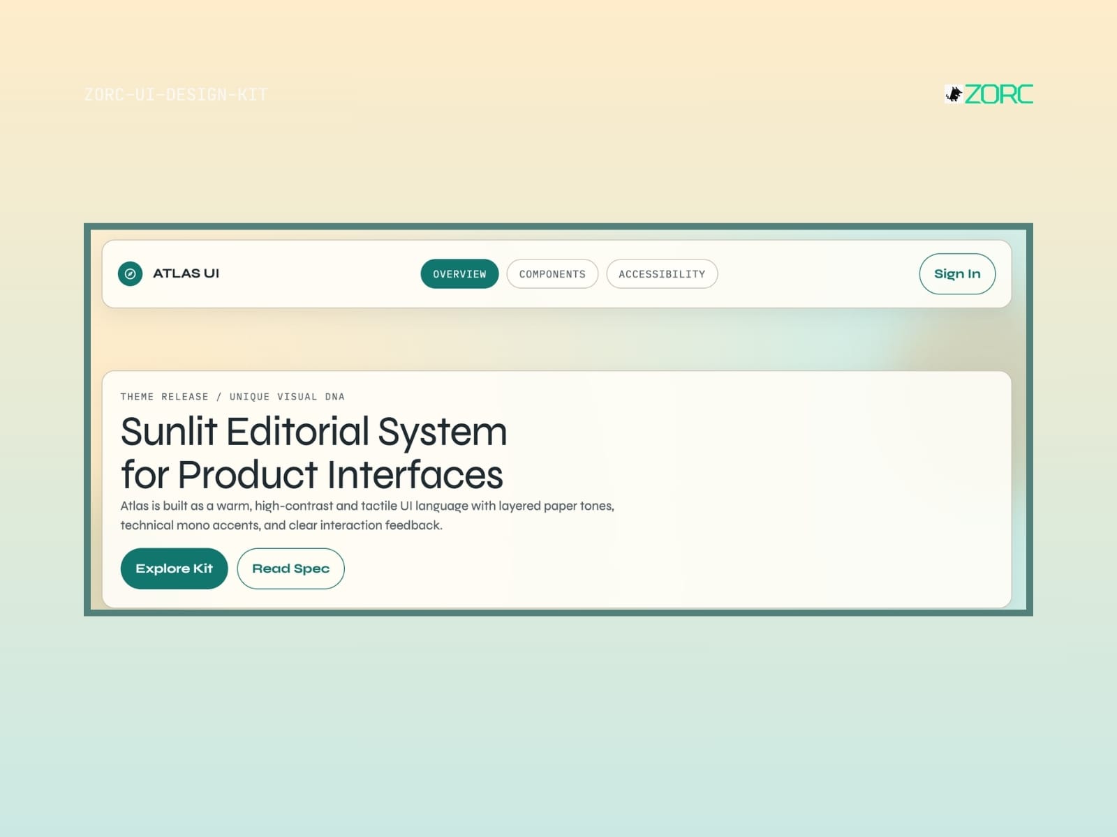
A modern UI Kit with Atlas aesthetics. Contains ready-made components for rapid prototyping and production.
Components included
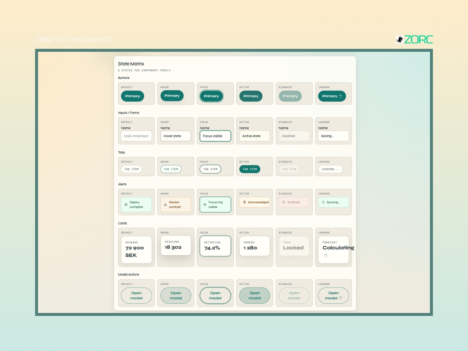
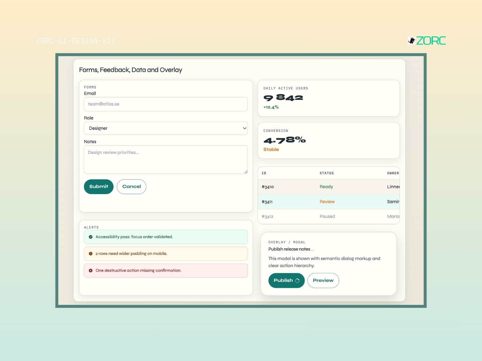
Knappar Input field Datatabeller Sidopaneler Modaler Kortkomponenter Navigeringsmenyer Statistikpaneler Toasts Varningsmeddelanden
Features
- Full support for dark and light mode
- AI-friendly component structure optimized for LLMs
- WCAG 2.1 AA contrast level for accessibility
- Responsive layout for all screen sizes
- Enkel anpassning via Tailwind-konfiguration
- Blixtsnabb rendering och minimal bundle-storlek
When does this kit fit?
saas dashboard crm erp admin
Tech stack
React 18 Tailwind CSS TypeScript Framer Motion Lucide Icons Geist Sans
How to use this kit
- Step 01
Download
Sign in to ZORC and fetch the zip from your purchases. All source code and documentation is included.
- Step 02
Copy into your project
Drop the components/ folder into your project — or install via package.json if the kit is packaged for npm.
- Step 03
Wire up design tokens
The tokens/ folder holds colours, typography and spacing for your Tailwind config or CSS variables.
- Step 04
Start building
Import the components and use them straight away. Each one ships with examples, props and variants in the docs.
Example AI prompt
Build a comprehensive dashboard for a subscription service with the Atlas UI Kit. Implement a data table for user management with search and filtering capabilities, a side panel for main navigation and three statistics panels at the top showing KPIs. Make sure the code is modular and uses Tailwind CSS classes consistently to match Atlas' professional aesthetic.
Common questions
What does Atlas include?
Atlas includes 10 components, including Knappar, Input field, Datatabeller, Sidopaneler and more.
What tech stack is Atlas built on?
Atlas is built with React 18, Tailwind CSS, TypeScript, Framer Motion, Lucide Icons, Geist Sans.
Are the components accessible?
Yes. They follow WCAG 2.1 AA where the content allows — focus rings, keyboard support, ARIA and contrast.
What licence do I get?
Commercial. You may use the components across your organisation's paid projects. What you cannot do is resell the kit itself.
How do I get started?
Copy in the components/ folder, add the design tokens and start building. A full guide ships with the kit.
Do I get updates?
Yes. All future versions are included at no extra cost for as long as the kit remains in the catalogue.