 Light
Light 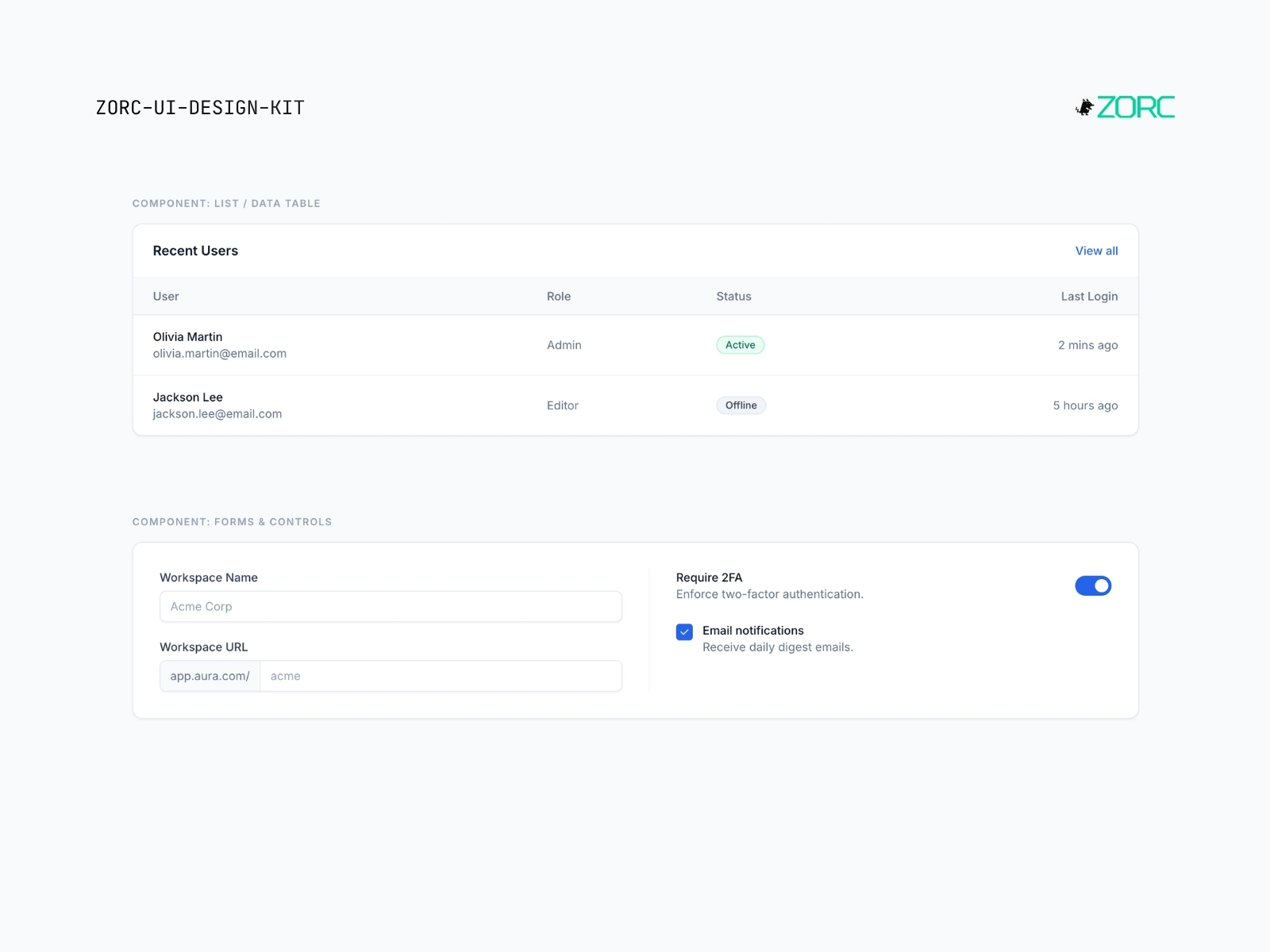
Aura SaaS Light
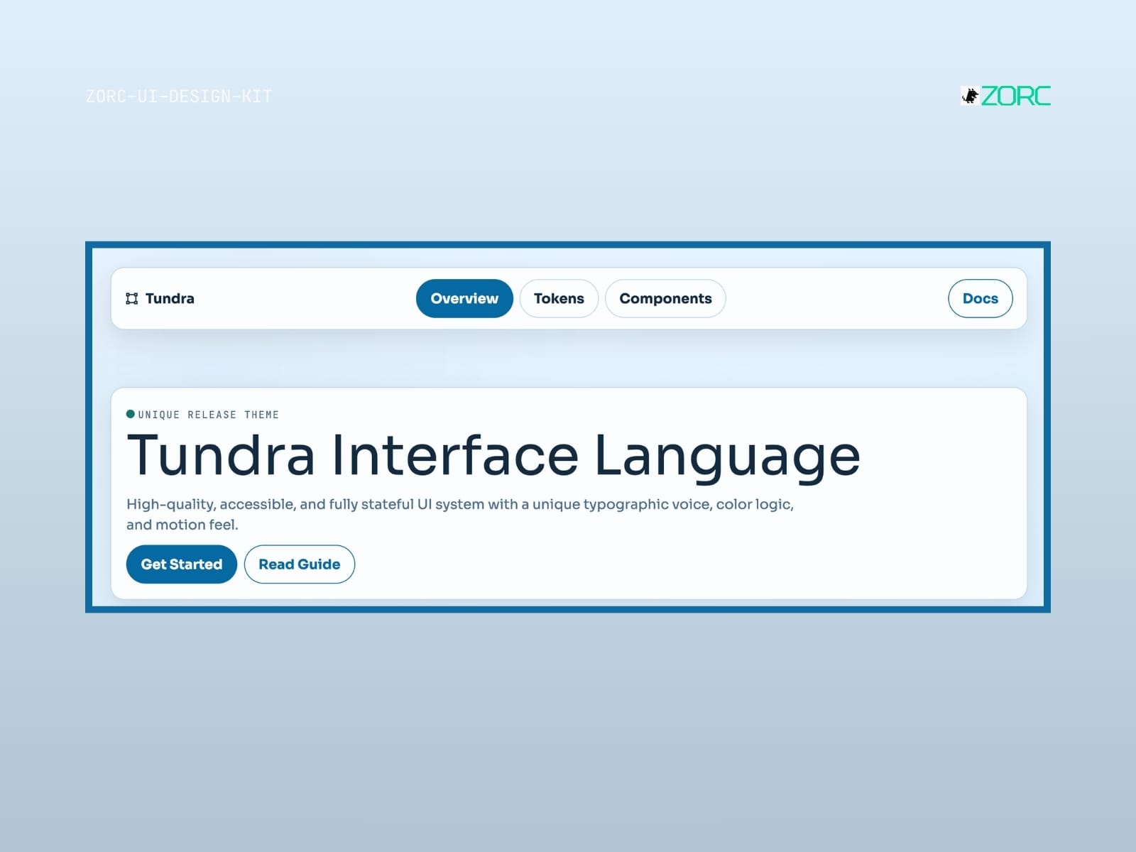
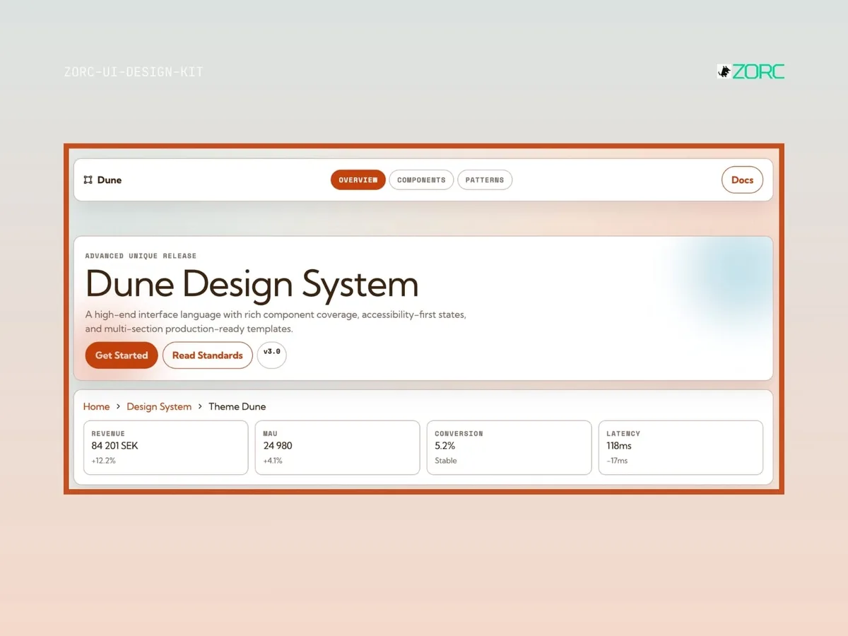
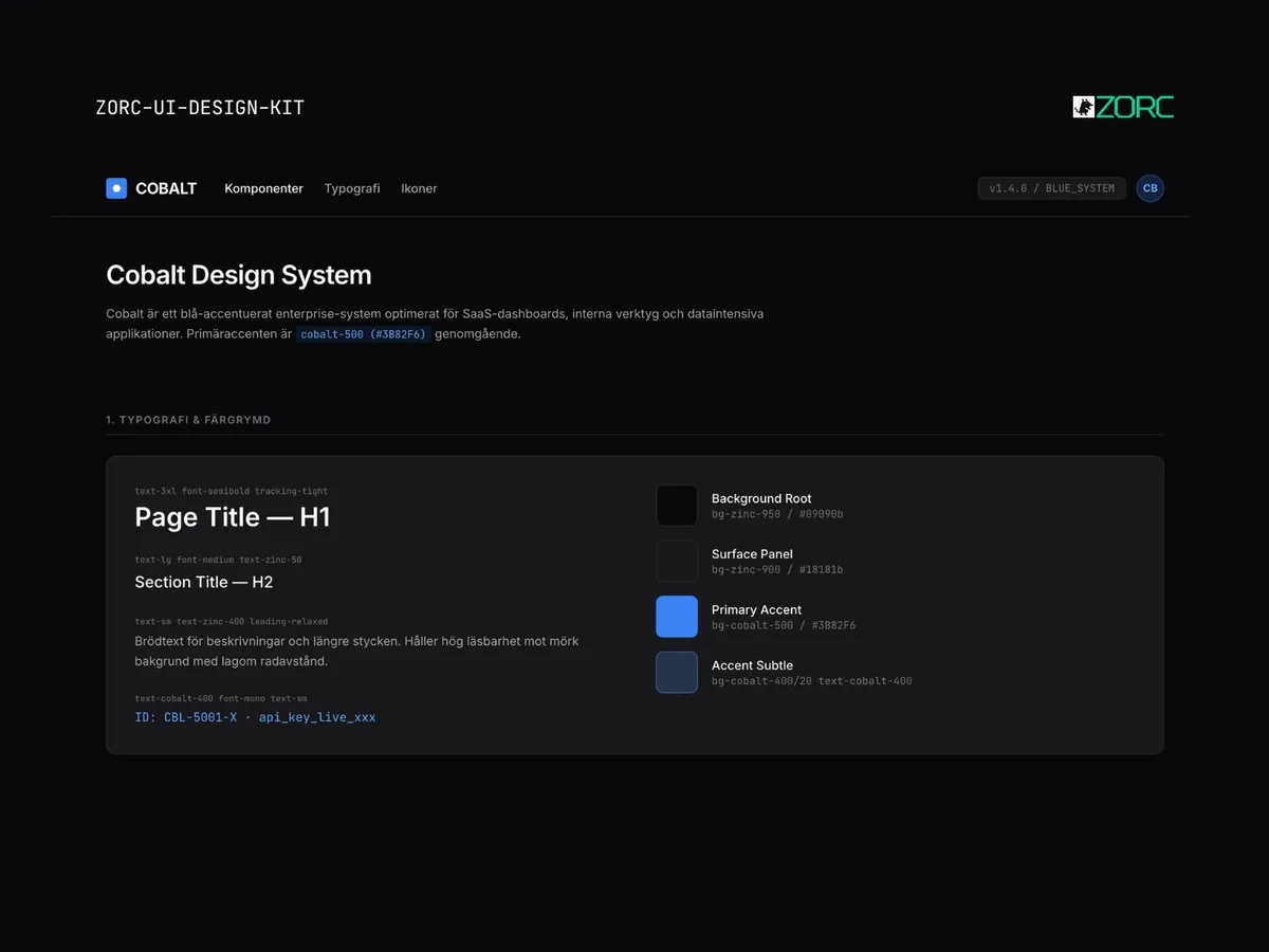
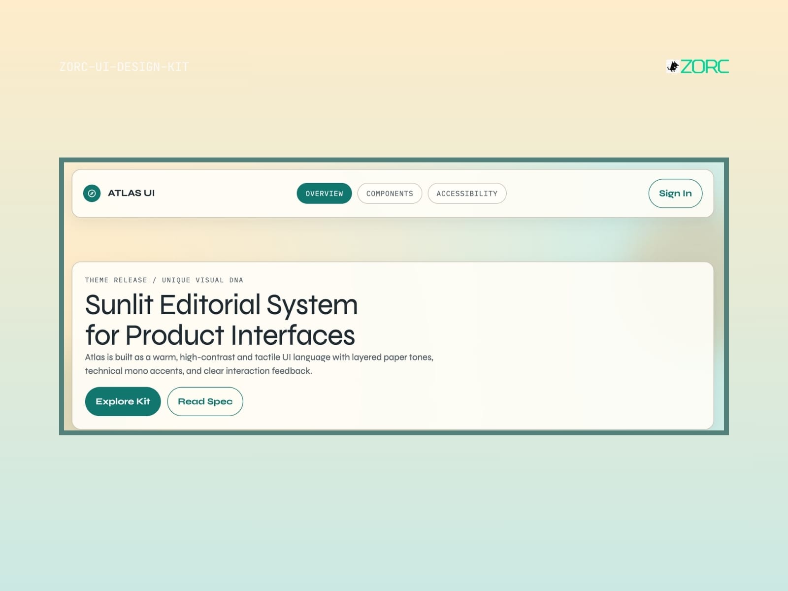
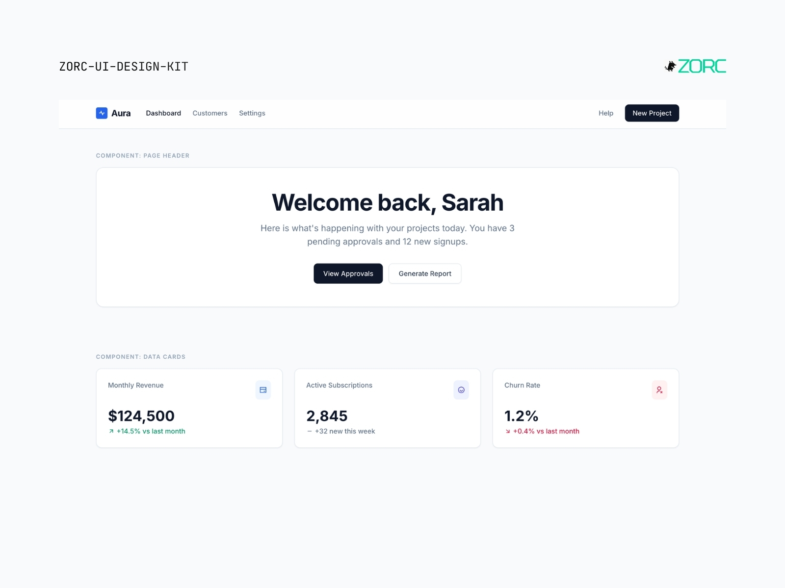
Bright, clean SaaS look with slate and blue. Like classic Stripe/Linear — white surface, soft shadows, modern Inter.
One-time payment • VAT included • Source code included
- Components
- 5
- Tech stack
- React, Vue, Figma
- Licence
- Commercial
- Delivery
- Instant access (zip + Git)
- Updated
Creator
About this kit
Aura is a bright SaaS design system built for products that want to feel clean, modern and accessible. White background, slate-toned text, classic blue primary color. Soft shadows and rounded corners for an inviting feel.
Perfect for B2C-SaaS, landing pages, marketing sites and products where availability and trust are most important. Think Stripe, Linear, Notion vibes.
Components included
Features
- responsiv design
- dark and light mode
- anpassningsbara komponenter
- interaktiv prototyputveckling
- availability
When does this kit fit?
Tech stack
How to use this kit
- Step 01
Download
Sign in to ZORC and fetch the zip from your purchases. All source code and documentation is included.
- Step 02
Copy into your project
Drop the components/ folder into your project — or install via package.json if the kit is packaged for npm.
- Step 03
Wire up design tokens
The tokens/ folder holds colours, typography and spacing for your Tailwind config or CSS variables.
- Step 04
Start building
Import the components and use them straight away. Each one ships with examples, props and variants in the docs.
Example AI prompt
Use "Aura SaaS Light" to create a responsive dashboard with modern buttons and forms. Remember to use the primary blue shade for uniformity.