Ready-made components. Copy in and ship.
Buttons, forms, cards and navigation — designed and coded. Skip the blank canvas. Pick a style and build on it straight away.
What is a UI kit?
A curated set of components in a consistent style. Download the source, drop it into your project, and you are building within minutes. Responsive and accessible throughout.
- 62 kits to choose from
- 8 distinct styles
- From -12 SEK — one-time payment
- Commercial licence included
 Hot
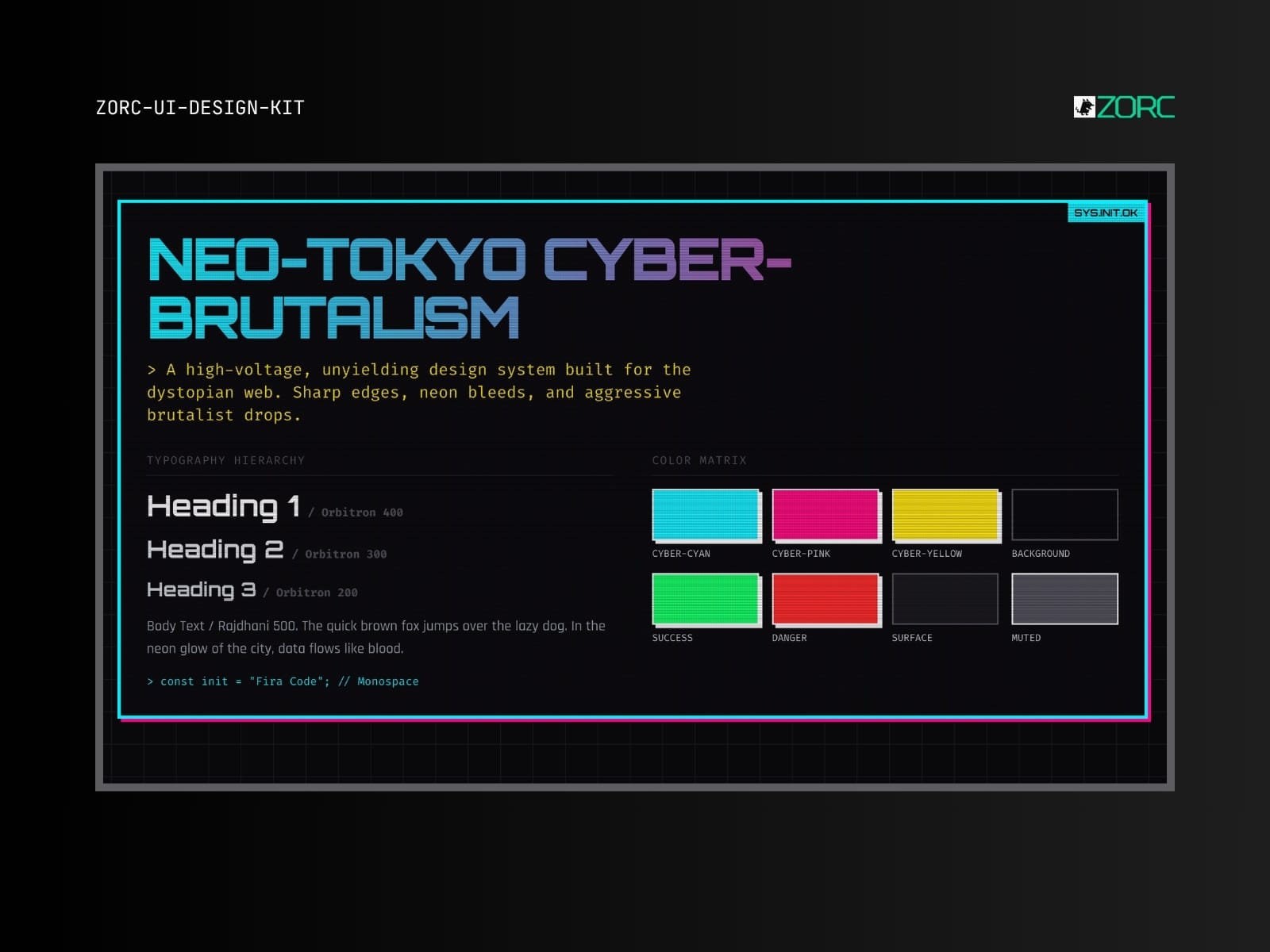
Hot Neo-Tokyo Cyber-Brutalism
Cyberpunk brutalism with neon pink, terminal green and glitch effects. Built for bold products that want to stand out.
10 components
 God Mode
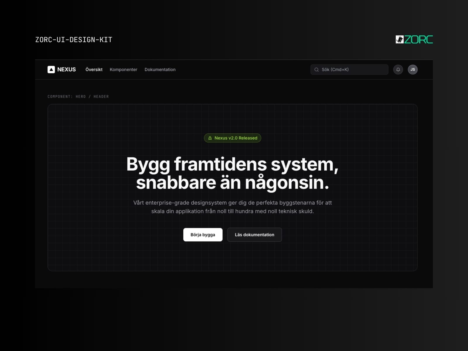
 Nexus Ultimate God Mode
The ultimate enterprise template. All components, all designs, all edge cases. For when AI has to build an entire product.
8 components
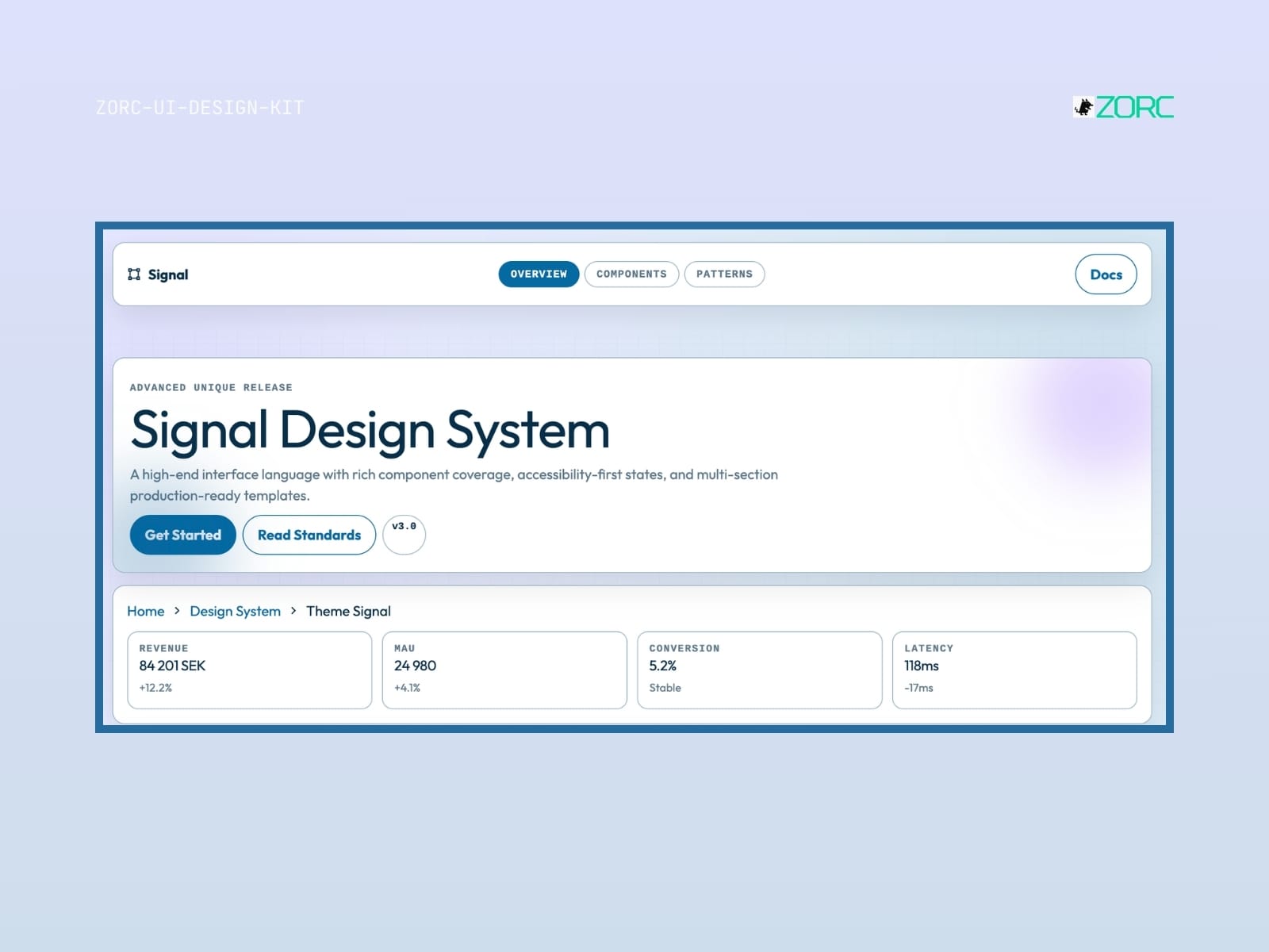
Signal
Signal-style design system for AI-driven development
10 components
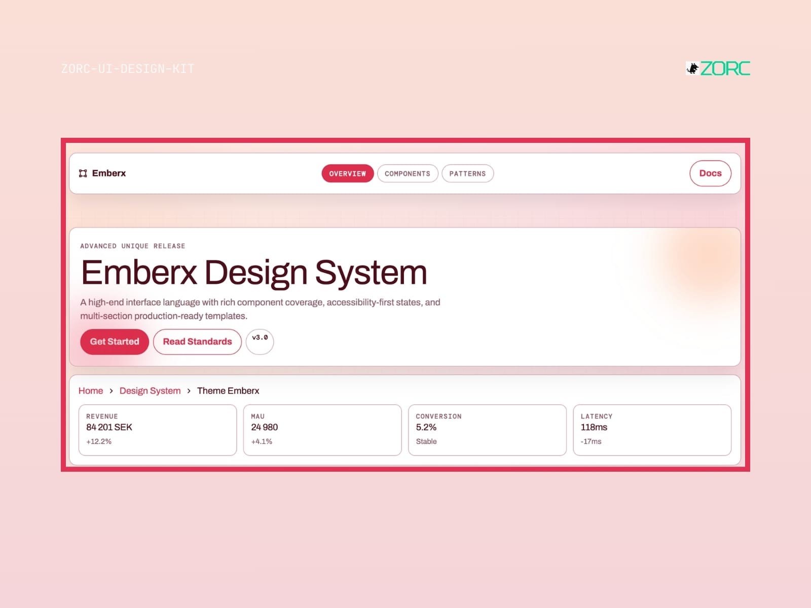
Emberx
Emberx-style design system for AI-driven development
10 components
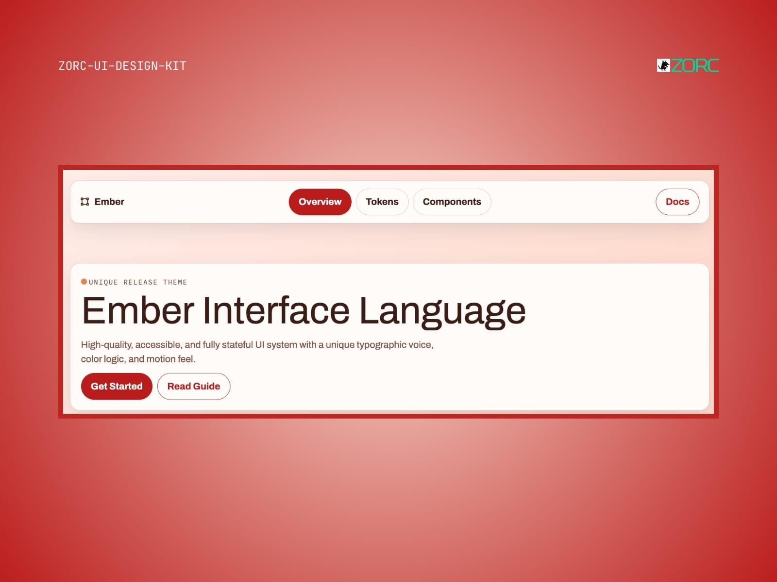 Light
Light Ember UI System
Warm enterprise look with ember/amber accents. Like Nexus but more friendly and inviting.
6 components
Worth knowing before you buy
- What is a UI kit?
- A collection of ready-made components — buttons, forms, cards, navigation. Copy them into your project and skip building from scratch.
- Which frameworks does it work with?
- Astro, React, Vue or plain HTML and Tailwind. Each kit states clearly what it is built for.
- Can I use it in paid client work?
- Yes. You may use the components across your organisation's commercial projects. What you cannot do is resell the kit itself.
- Do updates come included?
- Yes. All future versions are free for as long as the kit remains in the catalogue.
- Are the components accessible?
- Yes. Kits follow WCAG 2.1 AA where the content allows — focus rings, keyboard support, ARIA and contrast are tested.