Ready-made components. Copy in and ship.
Buttons, forms, cards and navigation — designed and coded. Skip the blank canvas. Pick a style and build on it straight away.
What is a UI kit?
A curated set of components in a consistent style. Download the source, drop it into your project, and you are building within minutes. Responsive and accessible throughout.
- 62 kits to choose from
- 8 distinct styles
- From -12 SEK — one-time payment
- Commercial licence included
 Light
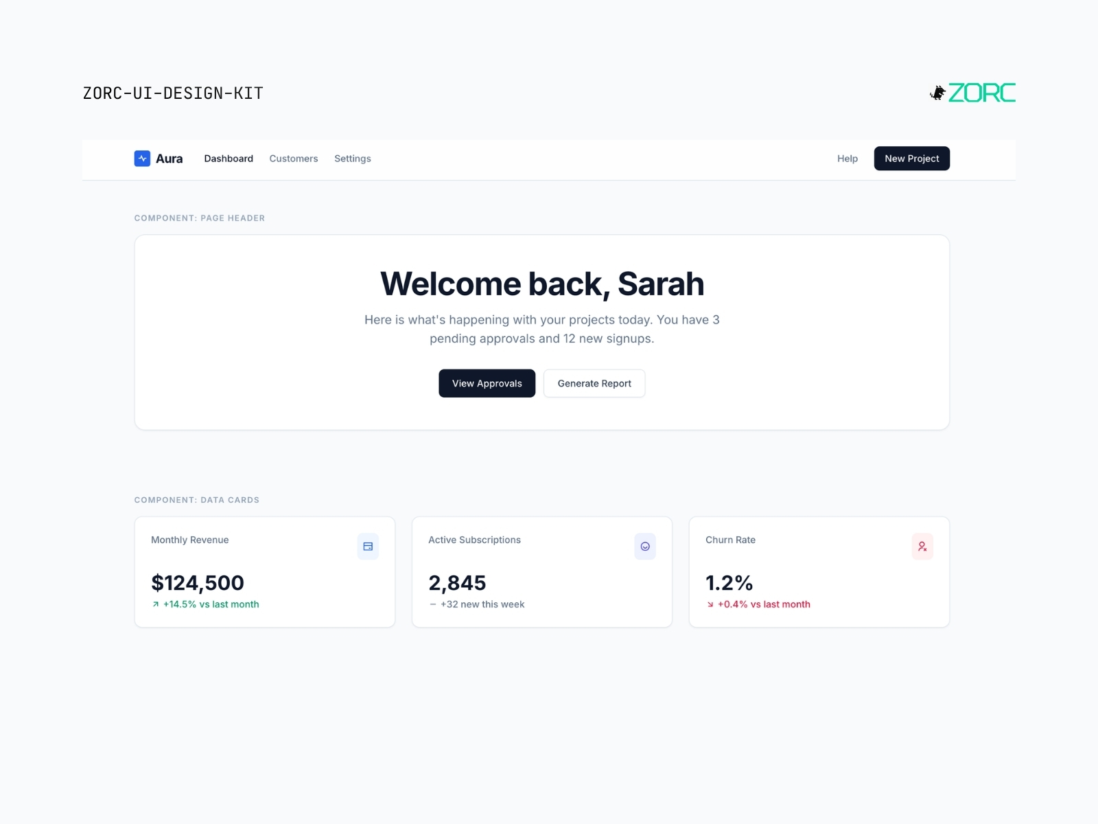
Light Aura SaaS Light
Bright, clean SaaS look with slate and blue. Like classic Stripe/Linear — white surface, soft shadows, modern Inter.
5 components
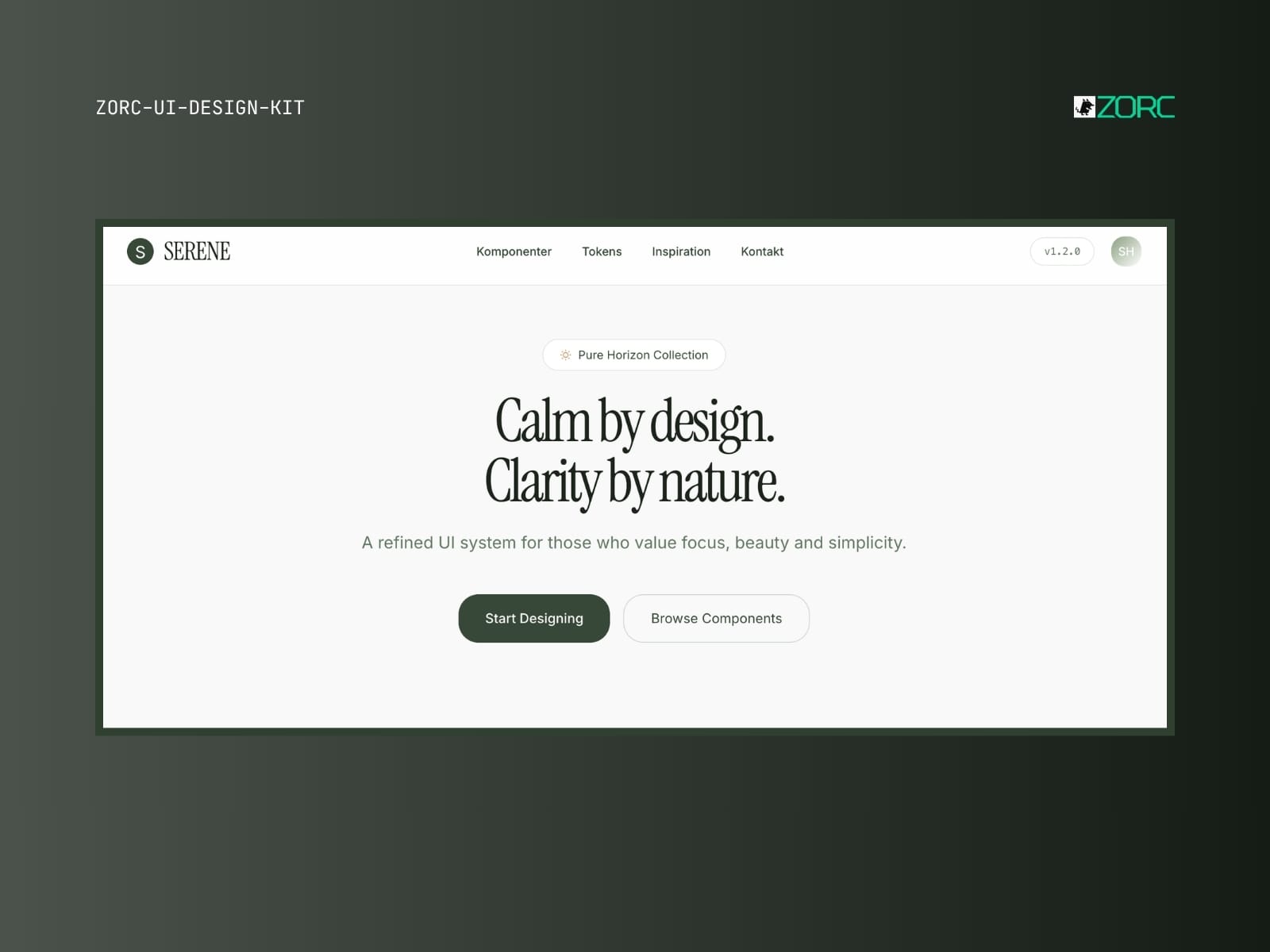
Serene Pure Horizon
Calm, minimalist sage-green aesthetic with Instrument Serif. For wellness, journals and soft products.
5 components
 Pro
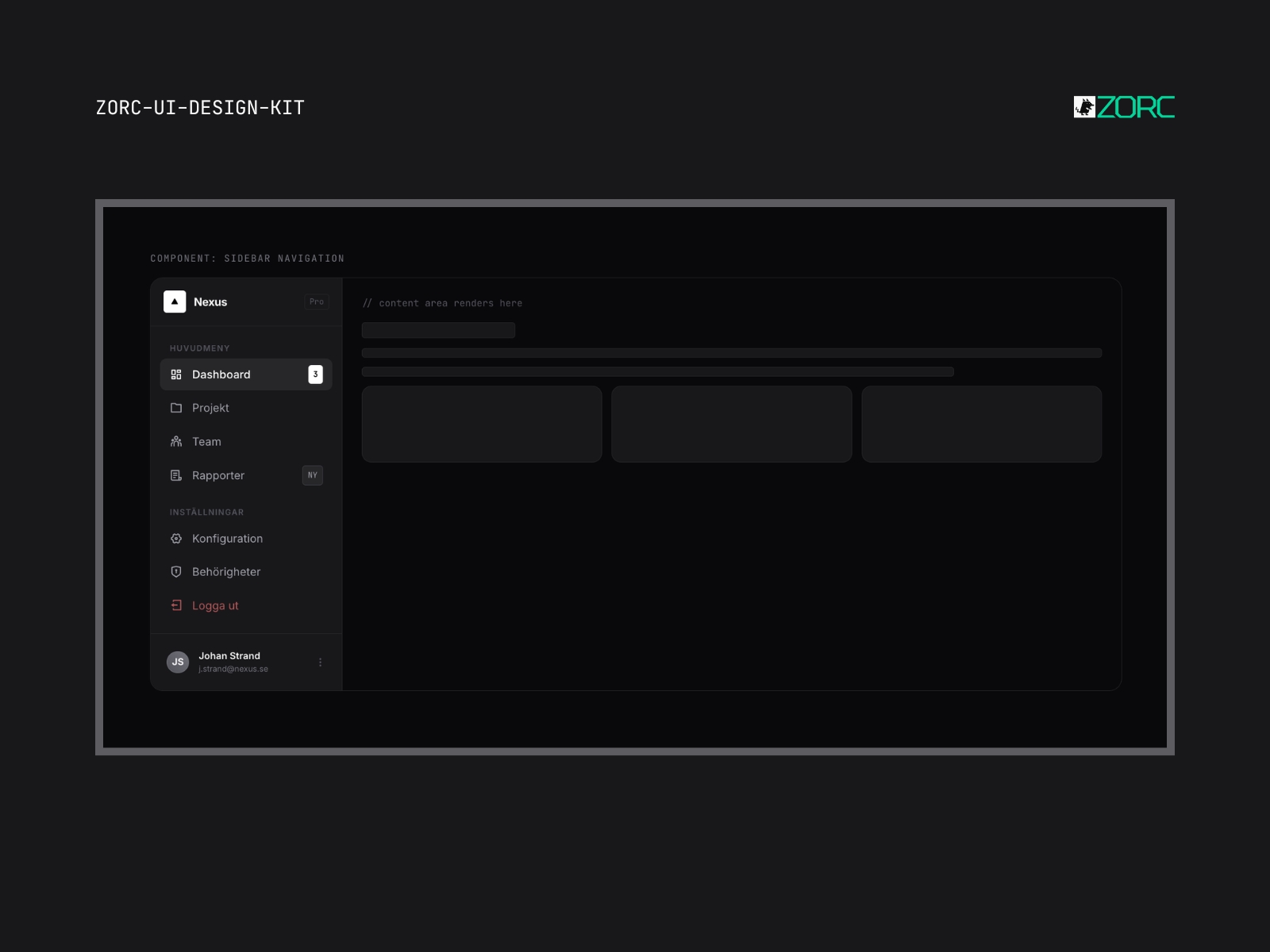
Pro Nexus Advanced Extended
Expanded enterprise system with 40+ components. CRM, ERP, project management — build everything with the same DNA.
6 components
 New
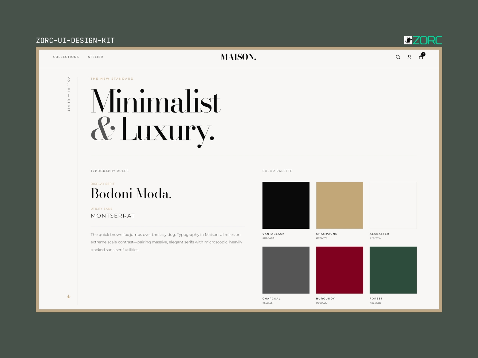
New Maison UI
High-fashion editorial design system with Bodoni Moda and Montserrat. Like Vogue, Dior and The Row — in code.
6 components
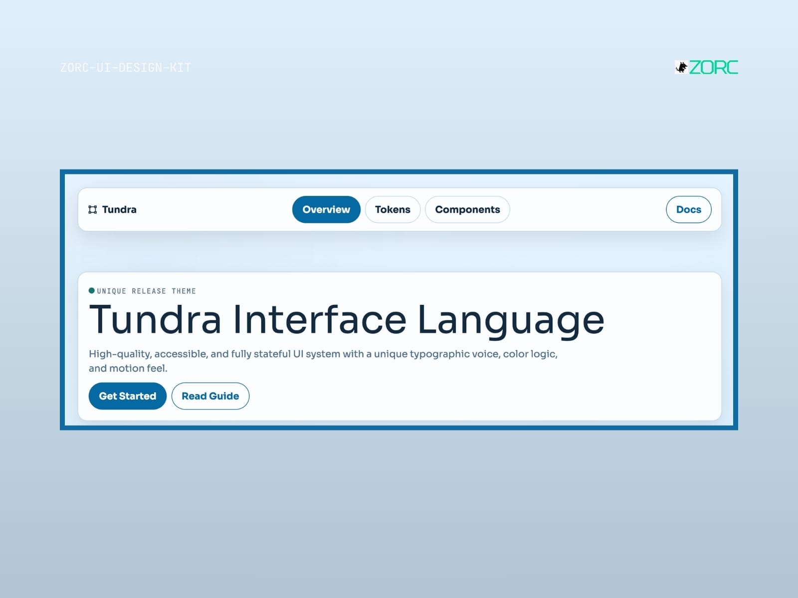
Tundra
Tundra-style design system for AI-driven development
10 components
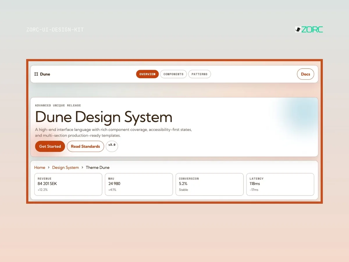
Dune
Dune-style design system for AI-driven development
10 components
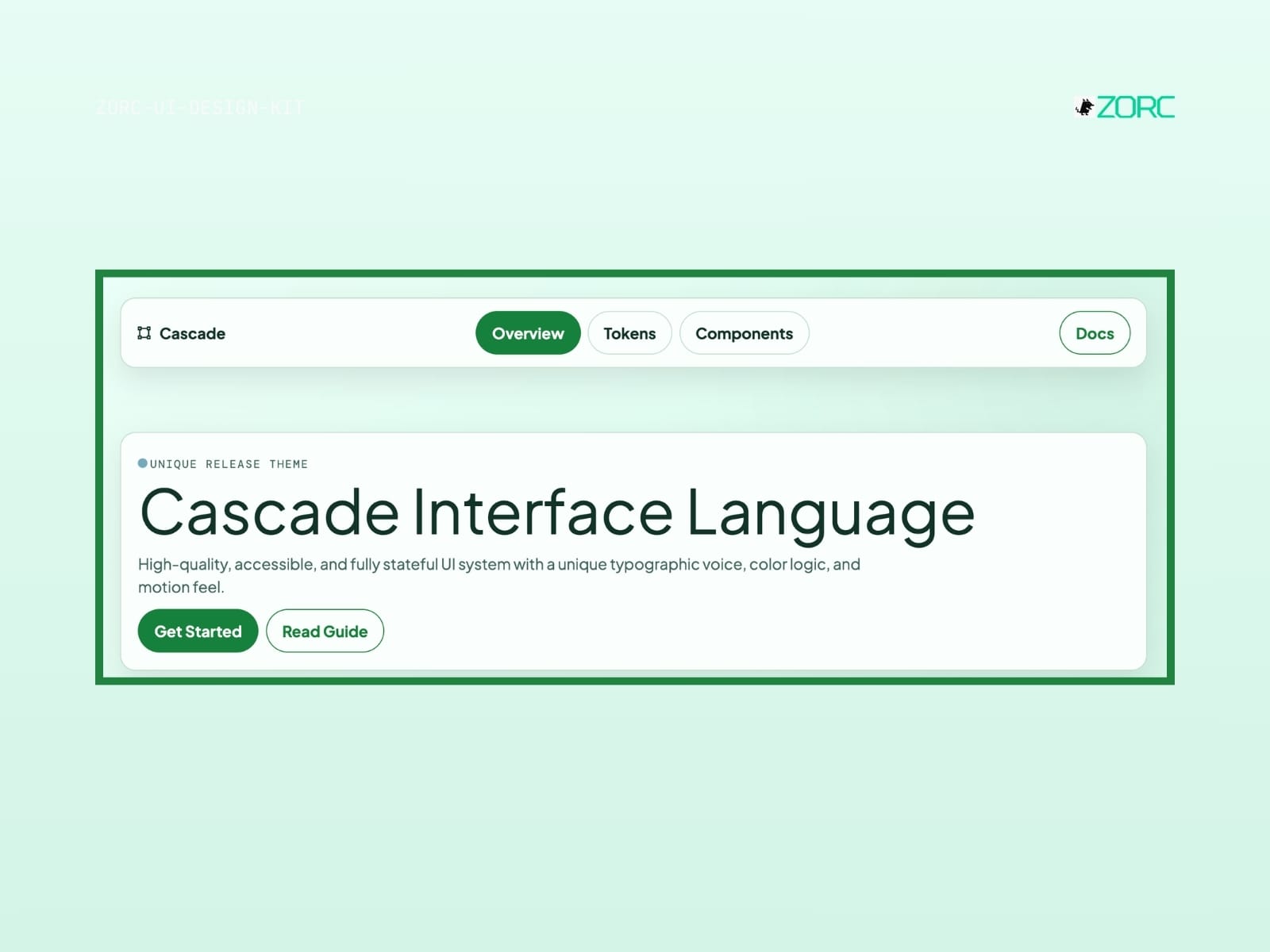
Cascade
Cascade-style design system for AI-driven development
10 components
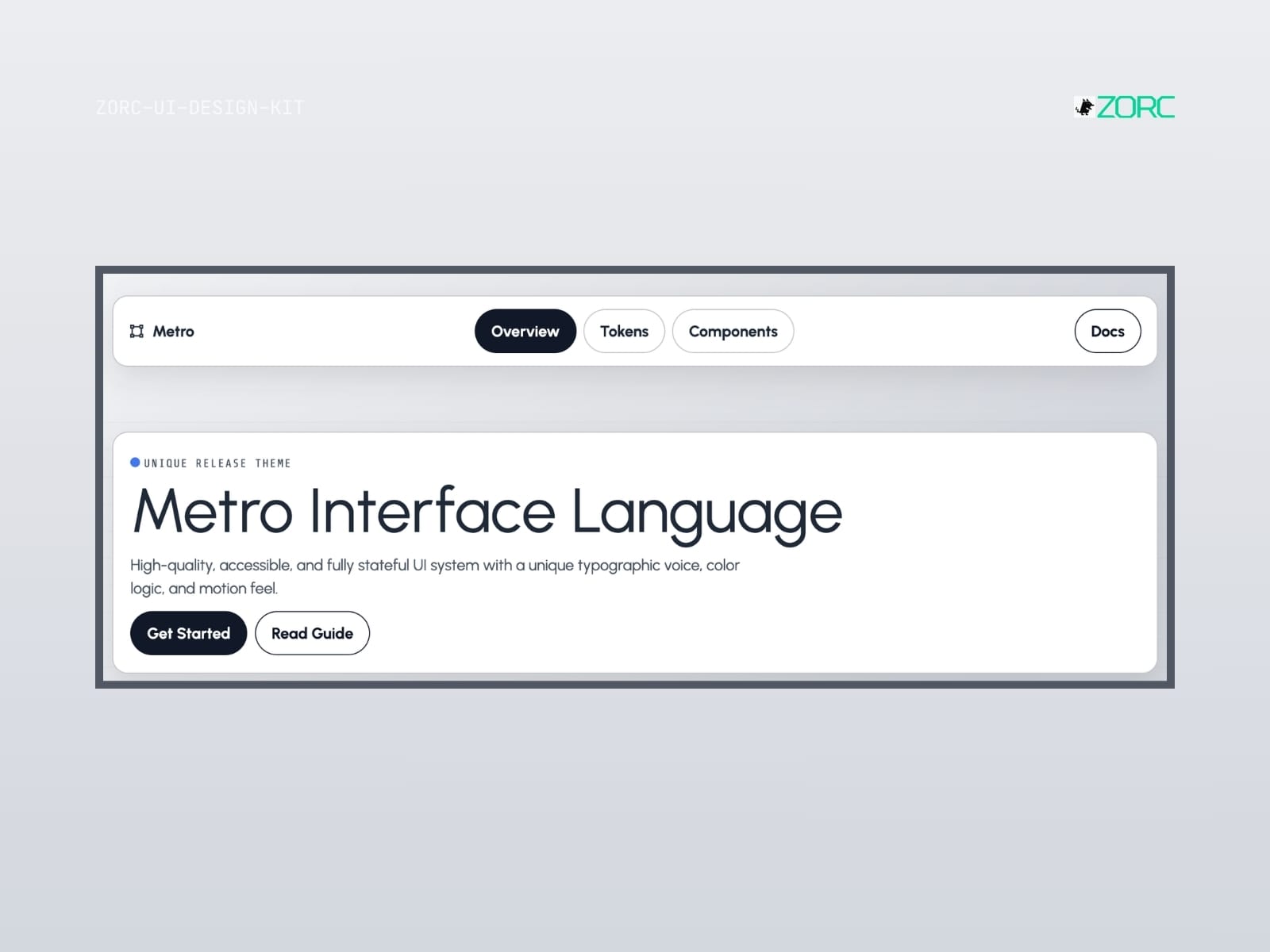
Metro
Metro-style design system for AI-driven development
10 components
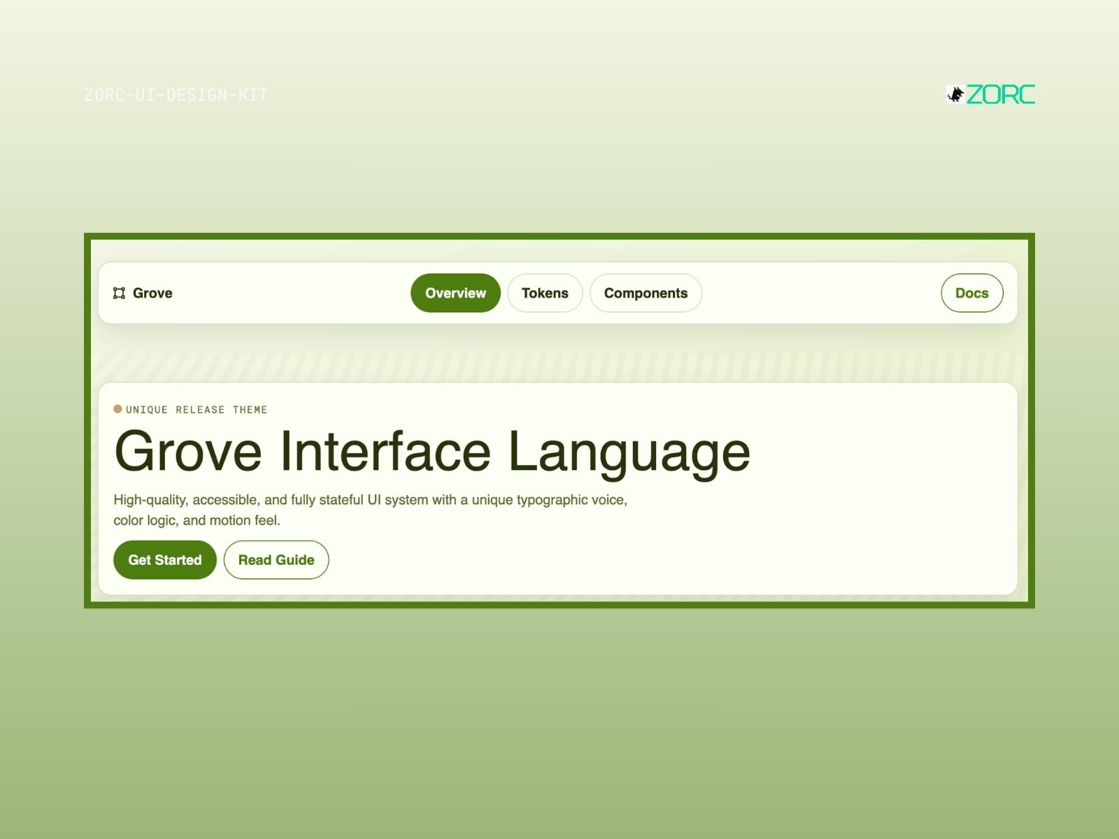
Grove
Grove-style design system for AI-driven development
10 components
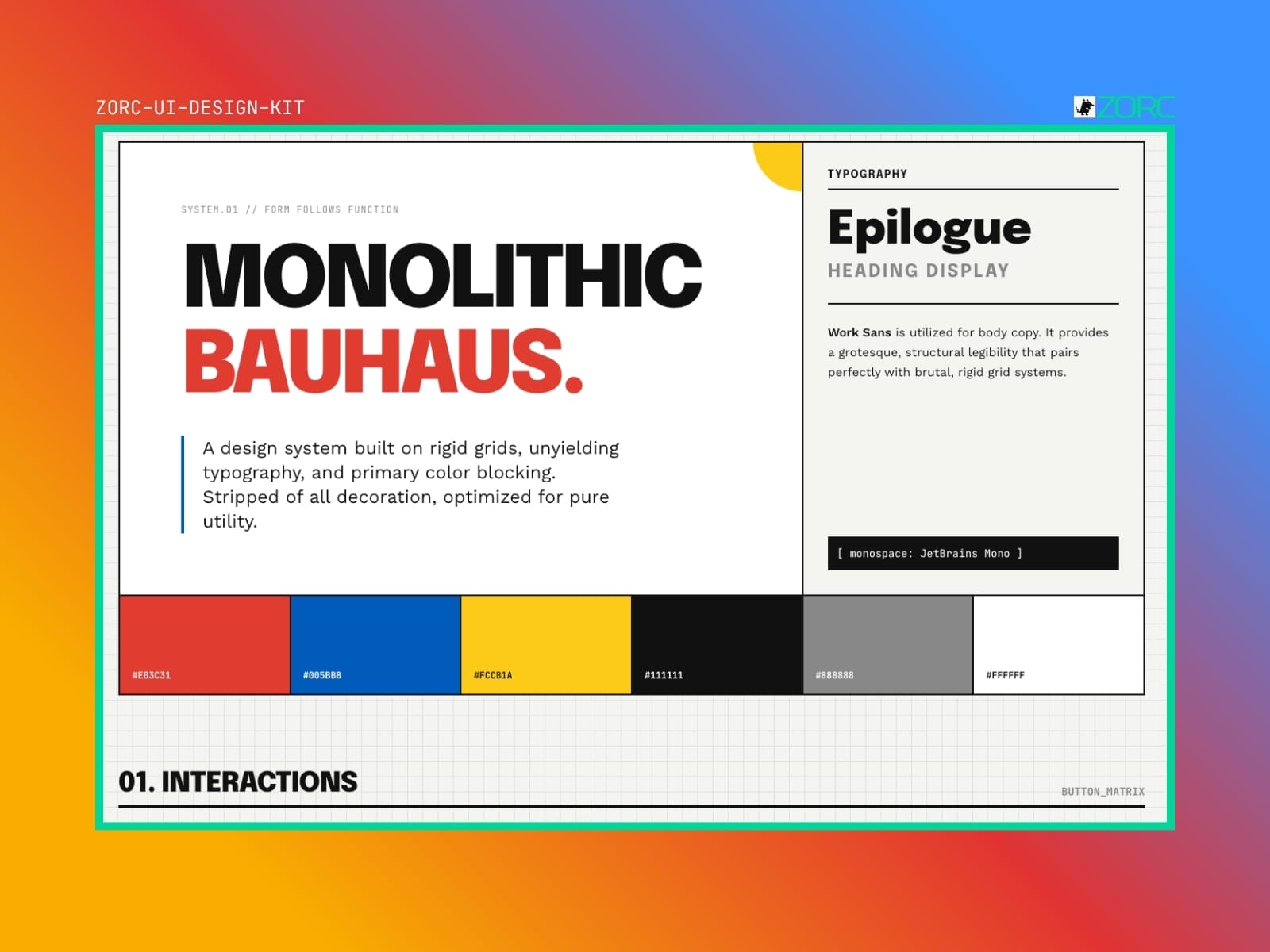
Bauhouse
Bauhouse-style design system for AI-driven development
10 components
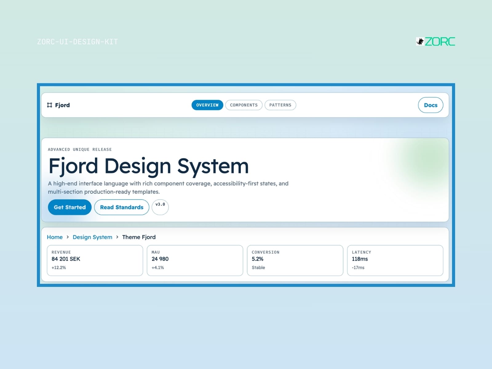
Fjord
Fjord-style design system for AI-driven development
10 components
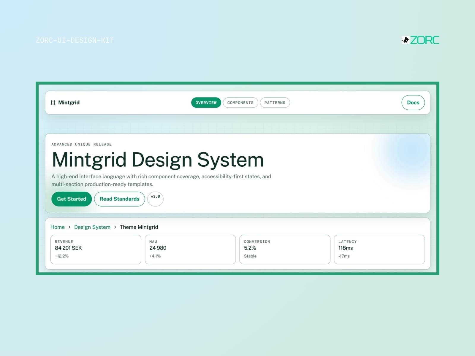
Mintgrid
Mintgrid-style design system for AI-powered development
10 components
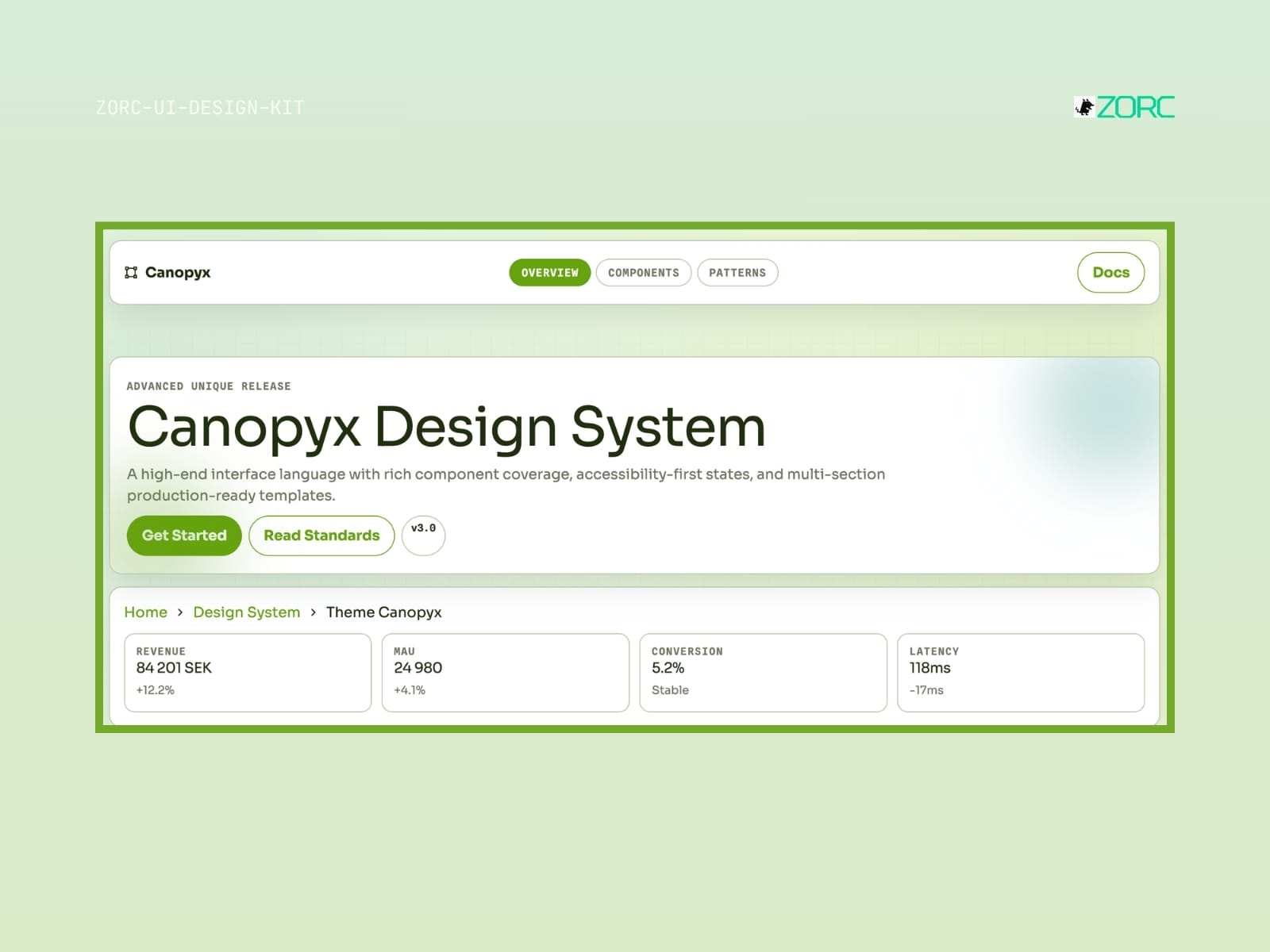
Canopyx
Canopyx-style design system for AI-driven development
12 components
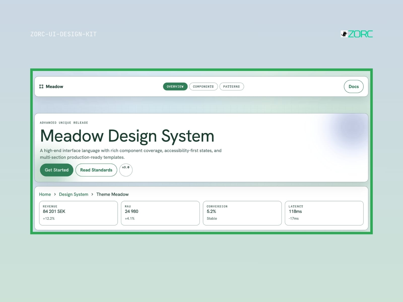
Meadow
Meadow-style design system for AI-driven development
12 components
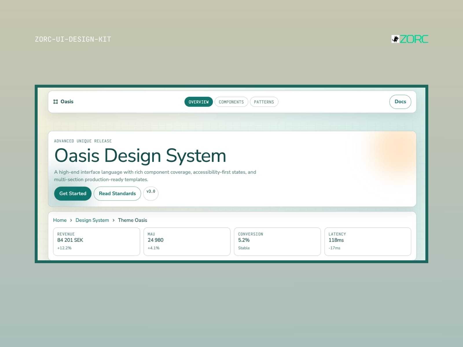
Oasis
Oasis-style design system for AI-driven development
10 components
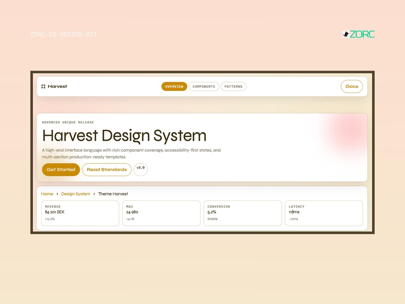
Harvest
Harvest-style design system for AI-driven development
10 components
Worth knowing before you buy
- What is a UI kit?
- A collection of ready-made components — buttons, forms, cards, navigation. Copy them into your project and skip building from scratch.
- Which frameworks does it work with?
- Astro, React, Vue or plain HTML and Tailwind. Each kit states clearly what it is built for.
- Can I use it in paid client work?
- Yes. You may use the components across your organisation's commercial projects. What you cannot do is resell the kit itself.
- Do updates come included?
- Yes. All future versions are free for as long as the kit remains in the catalogue.
- Are the components accessible?
- Yes. Kits follow WCAG 2.1 AA where the content allows — focus rings, keyboard support, ARIA and contrast are tested.