Skip to content
// UI KITS

Ready-made components. Copy in and ship.

Buttons, forms, cards and navigation — designed and coded. Skip the blank canvas. Pick a style and build on it straight away.

// the short version

What is a UI kit?

A curated set of components in a consistent style. Download the source, drop it into your project, and you are building within minutes. Responsive and accessible throughout.

  • 62 kits to choose from
  • 8 distinct styles
  • From -12 SEK — one-time payment
  • Commercial licence included
Style
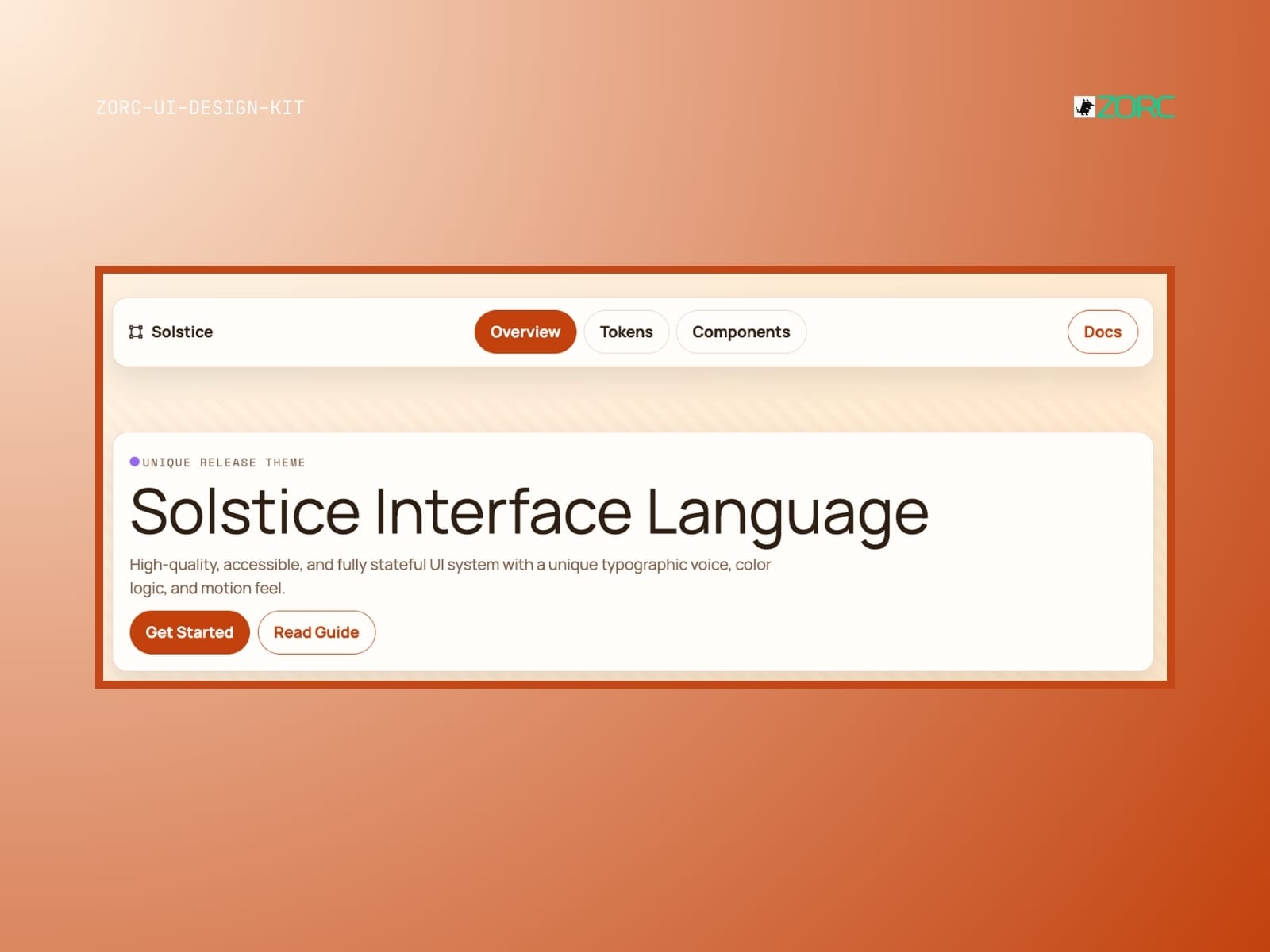
Solstice interfaces with a new UI design and features for web development and app design from ZORC
Glassmorphism

Solstice

Solstice-style design system for AI-driven development

10 components
25 SEK
View →
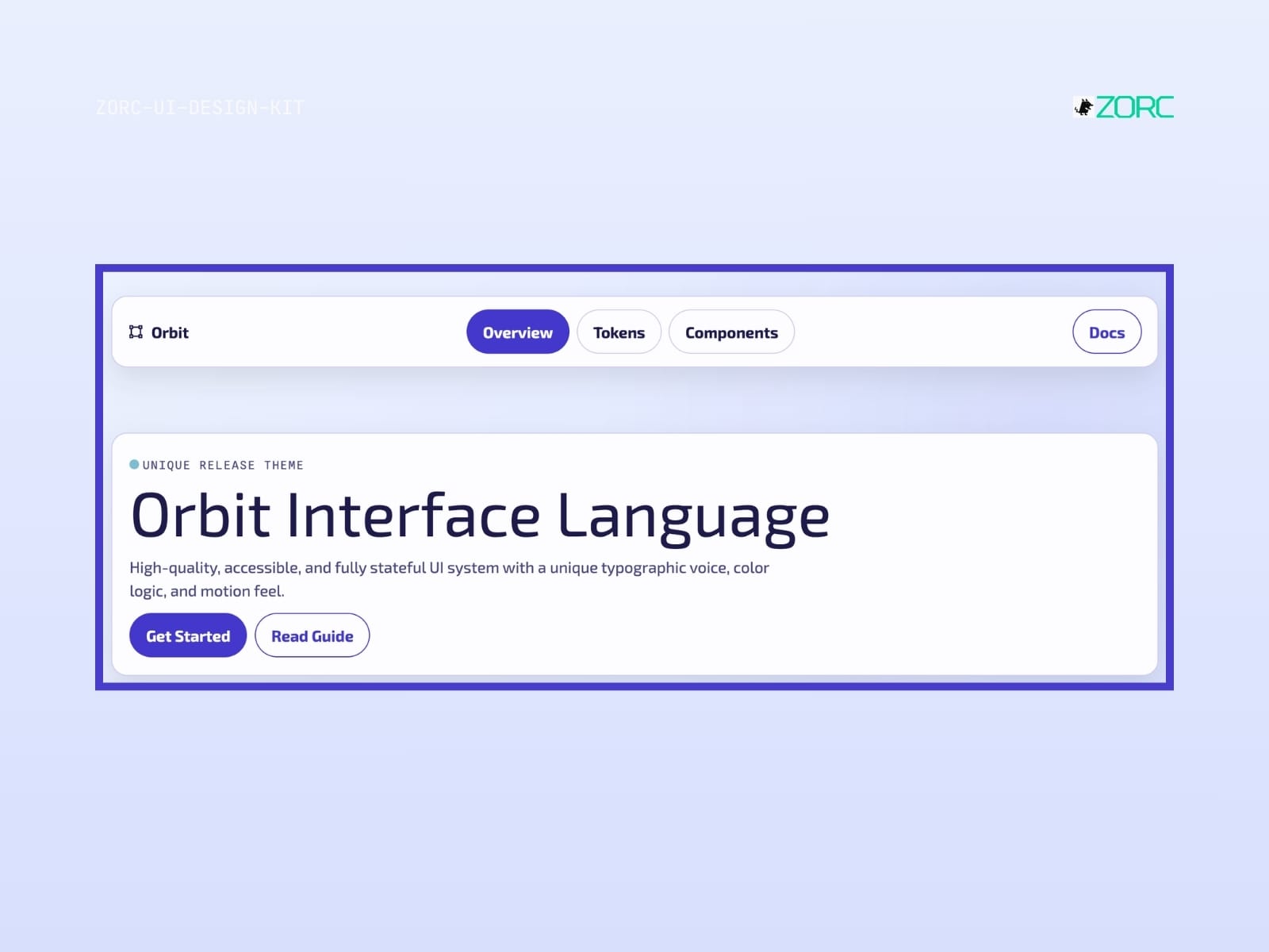
Overview of ZORC's Orbit Interface Language with a focus on design and ease of use for web development and applications
Glassmorphism

Orbit

Orbit-style design system for AI-driven development

10 components
25 SEK
View →
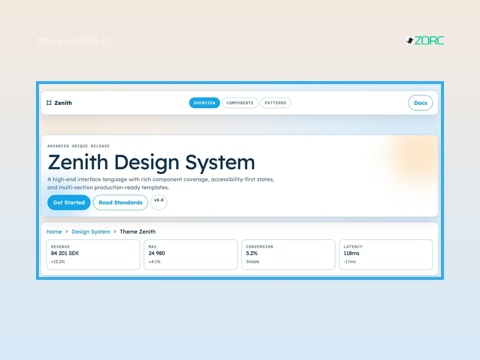
Zenith Design System offers an advanced user interface solution with components and production-ready templates for web development and design within ZORC
Glassmorphism

Zenith

Zenith-style design system for AI-driven development

10 components
25 SEK
View →
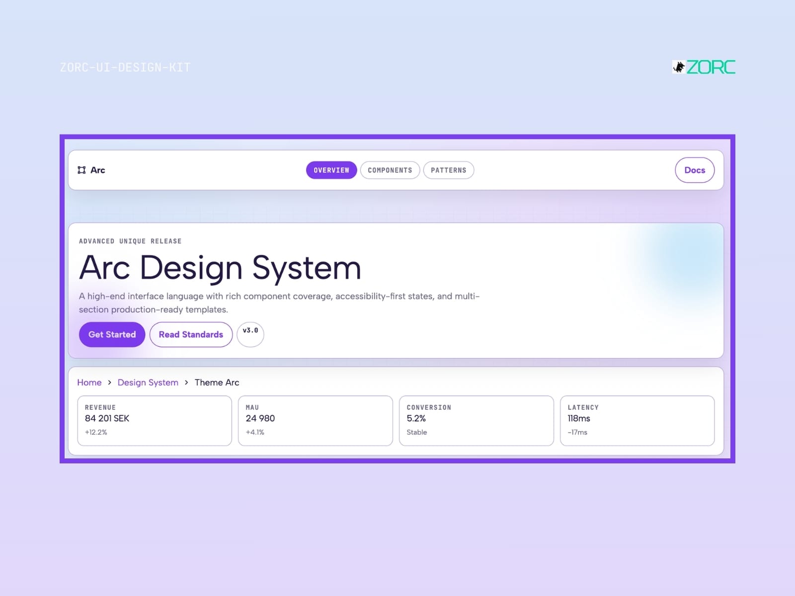
Arc Design System from ZORC shows interface components, statistics and production-ready templates with a focus on web development and design
Glassmorphism

Arc

Arc-style design system for AI-driven development

10 components
25 SEK
View →
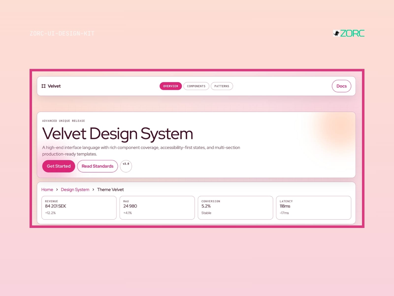
Velvet Design System for web development with components, accessibility standards and production templates from ZORC
Glassmorphism

Velvet

Velvet-style design system for AI-powered development

10 components
25 SEK
View →
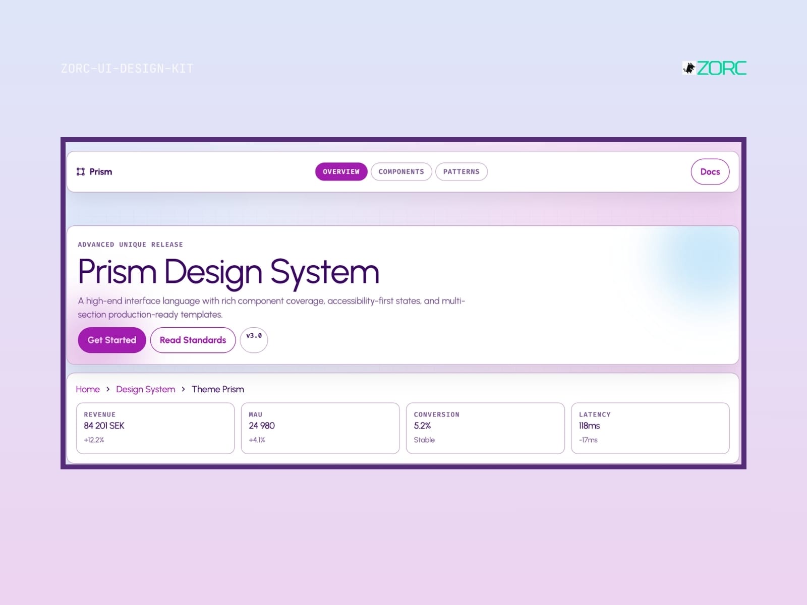
The Prism Design System from ZORC offers a high-quality interface design with a focus on components and accessibility
Glassmorphism

Prism

Prism-style design system for AI-driven development

10 components
25 SEK
View →
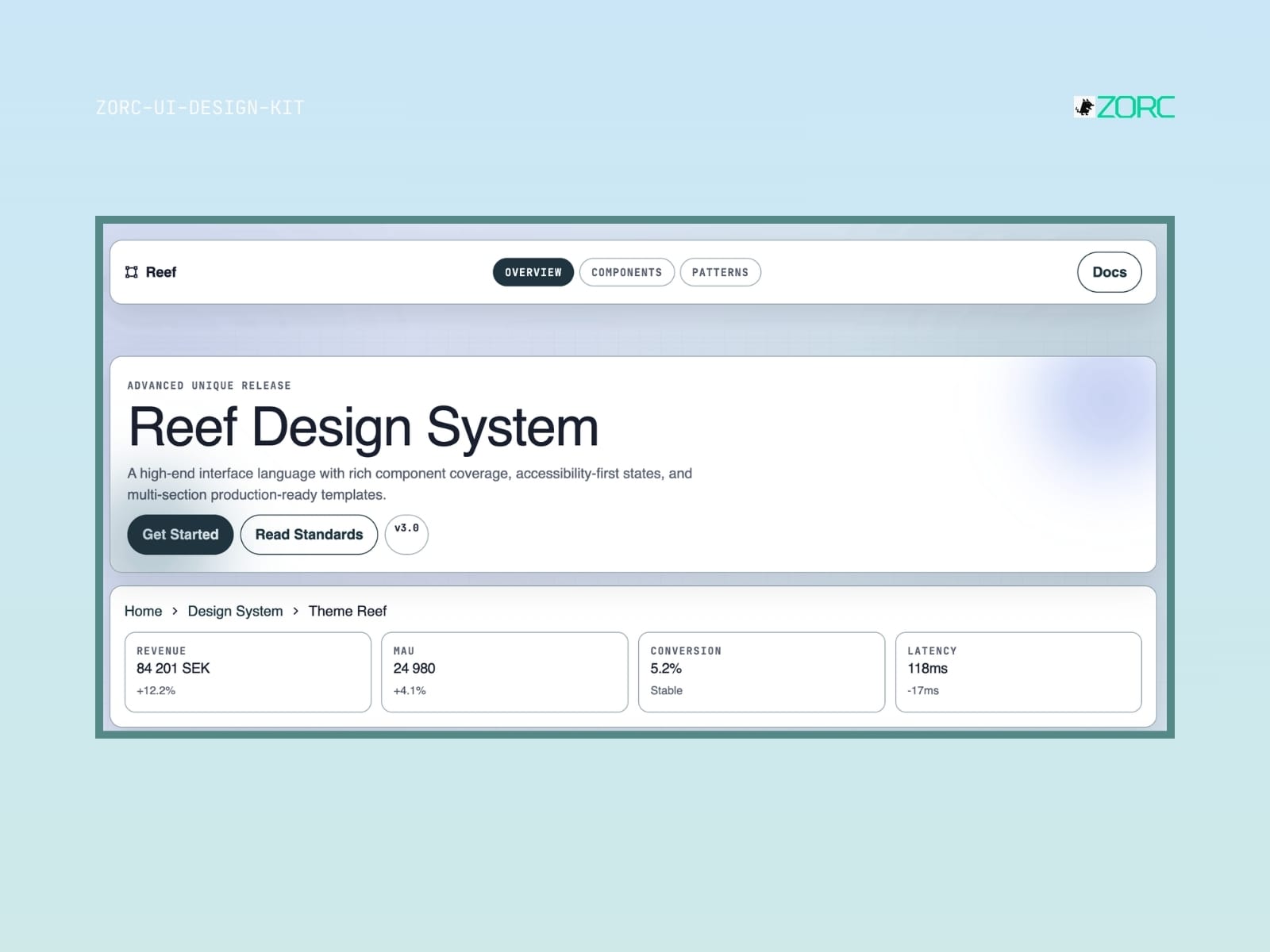
Reef Design System shows advanced templates for web development and design with a focus on components and accessibility in ZORC
Glassmorphism

Reef

Reef-style design system for AI-driven development

8 components
25 SEK
View →
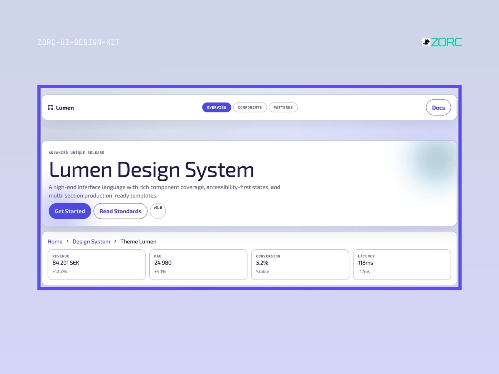
Lumen Design System with high-quality templates and components for web development and AI apps from ZORC
Glassmorphism

Lumen

Lumen-style design system for AI-driven development

10 components
25 SEK
View →
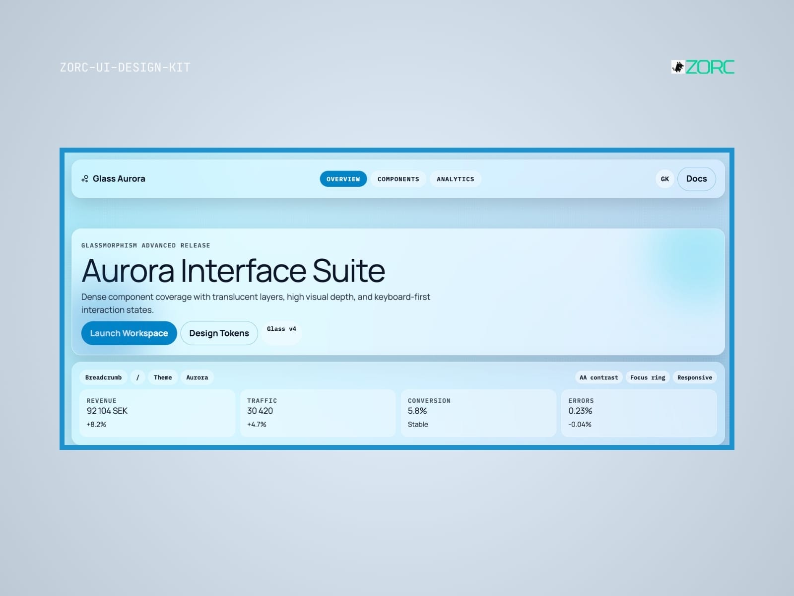
Aurora Interface Suite from ZORC with design tools and analysis statistics for web development and user interfaces
Glassmorphism

Glass Aurora

Glass Aurora-style design system for AI-driven development

10 components
25 SEK
View →
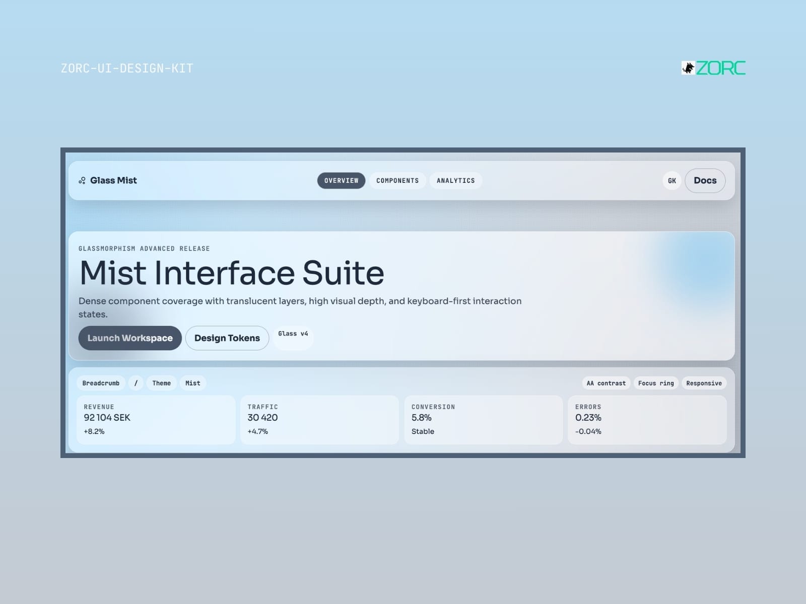
Design section of ZORC's Mist Interface Suite with revenue and traffic statistics information
Glassmorphism

Glass Mist

Glass Mist-style design system for AI-driven development

10 components
25 SEK
View →
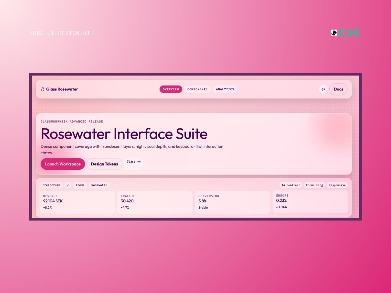
The interface for Rosewater with a focus on design and analysis of ZORC's UI design kit for improved user experience
Glassmorphism

Glass Rosewater

Glass Rosewater-style design system for AI-driven development

10 components
25 SEK
View →
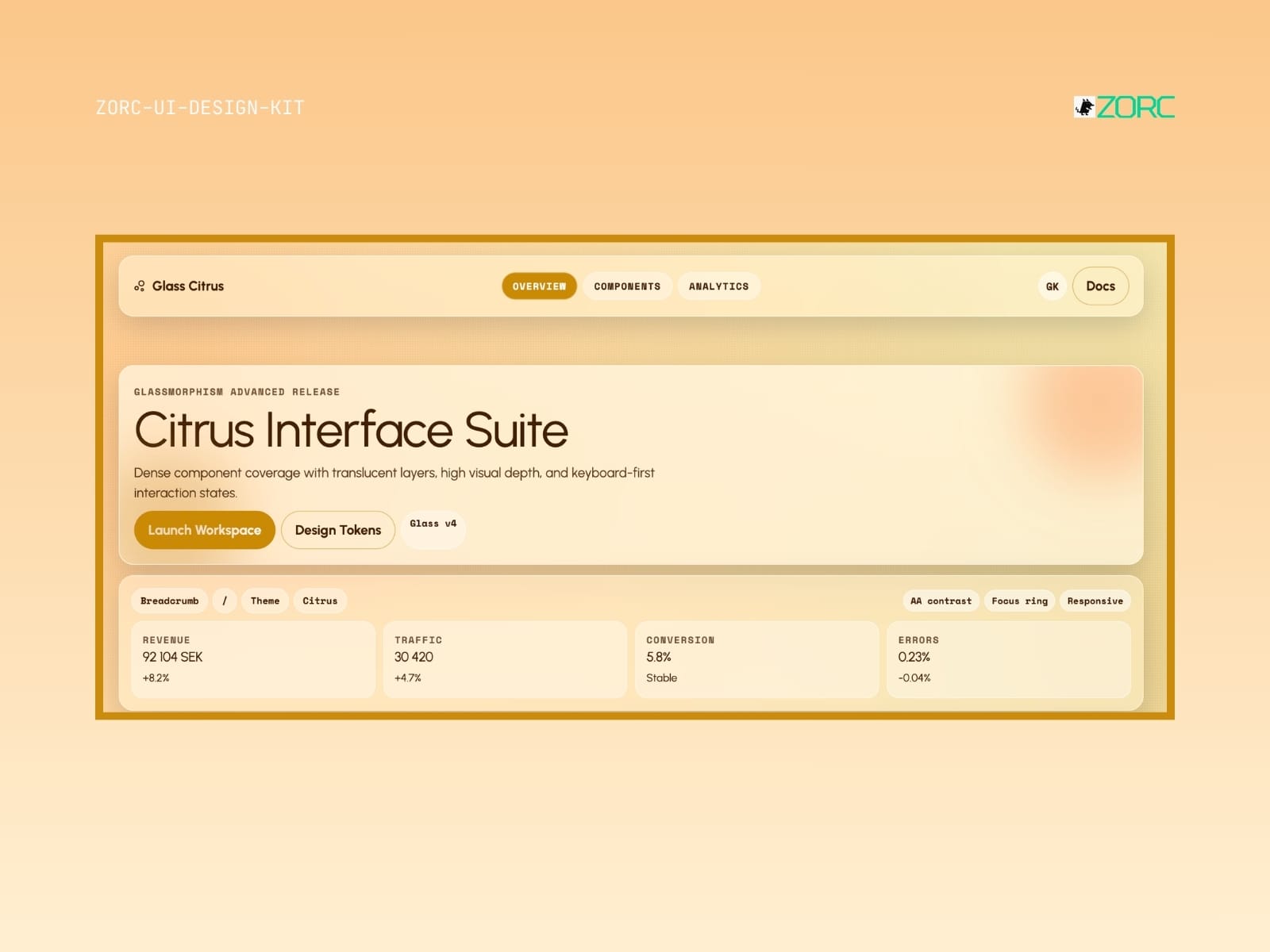
Citrus Interface Suite from ZORC with glassy design and analysis tools for web development and app interactions
Glassmorphism

Glass Citrus

Glass Citrus-style design system for AI-driven development

10 components
25 SEK
View →
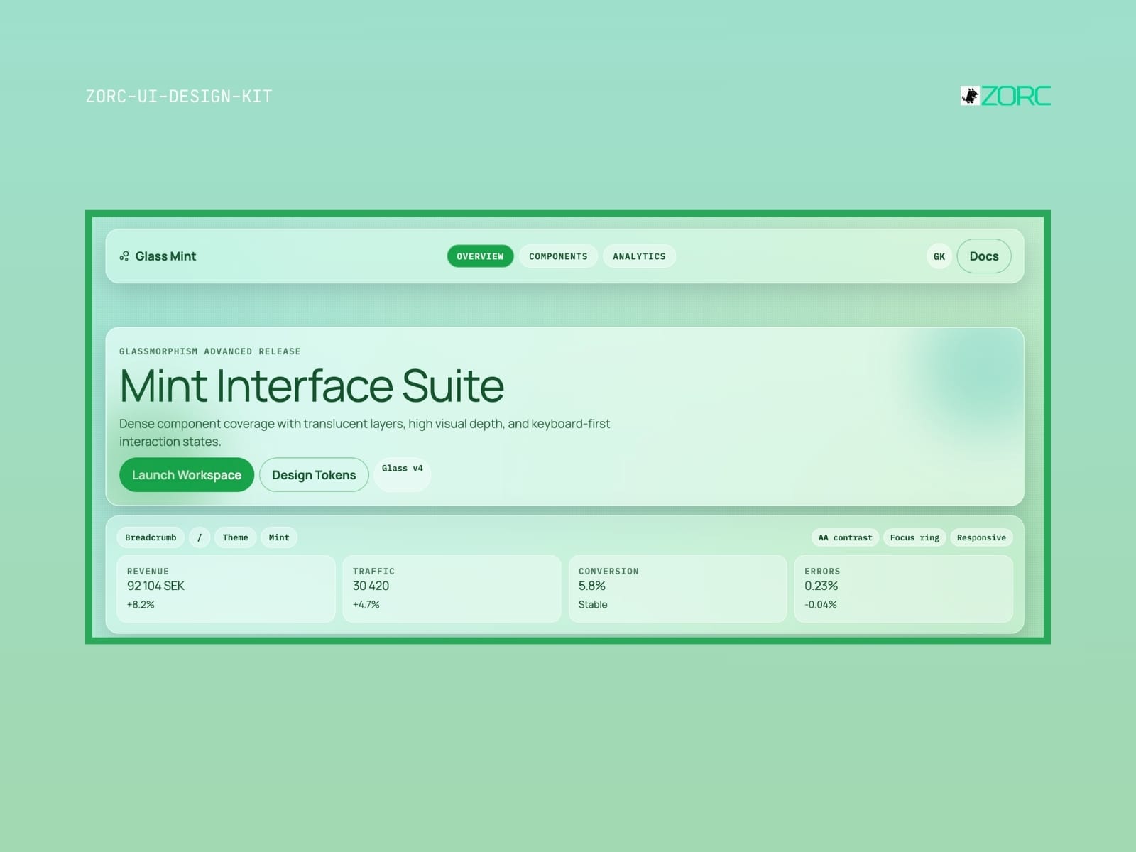
Mint Interface Suite with glassmorphism design, statistics for revenue, traffic and conversion in ZORC app
Glassmorphism

Glass Mint

Glass Mint-style design system for AI-powered development

10 components
25 SEK
View →
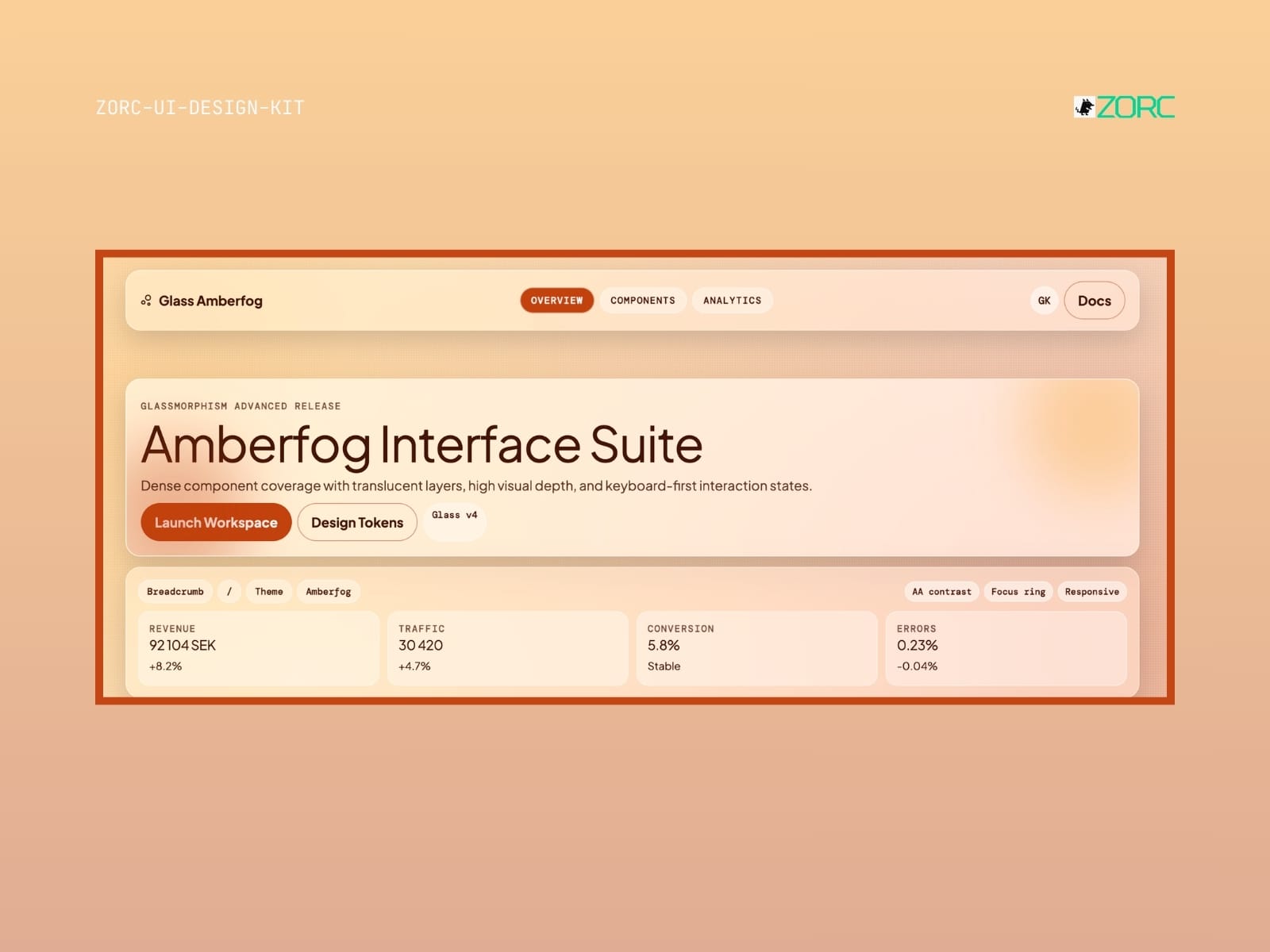
Amberfog Interface Suite in ZORC design tool displays traffic data and user statistics for effective web design and app development
Glassmorphism

Glass Amberfog

Glass Amberfog-style design system for AI-powered development

11 components
25 SEK
View →
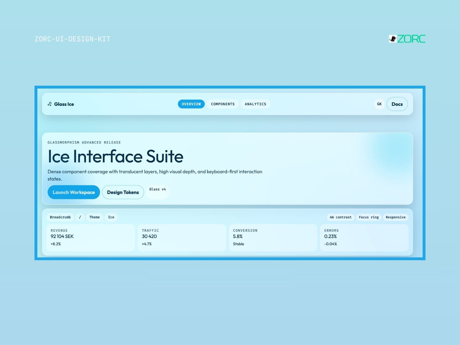
User interface for ZORC's Ice Interface Suite with statistics and design components for web development and AI
Glassmorphism

Glass Ice

Glass Ice-style design system for AI-driven development

10 components
25 SEK
View →
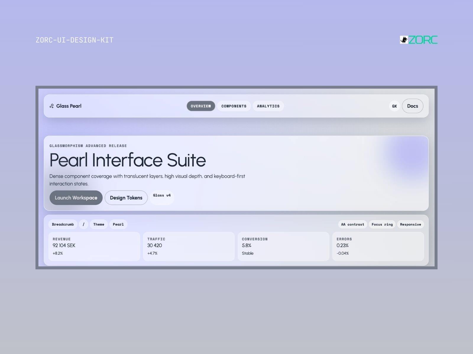
The Pearl Interface Suite interface shows design tools with glassmorphism, traffic and conversion stats, and interaction design
Glassmorphism

Glass Pearl

Glass Pearl-style design system for AI-driven development

10 components
25 SEK
View →
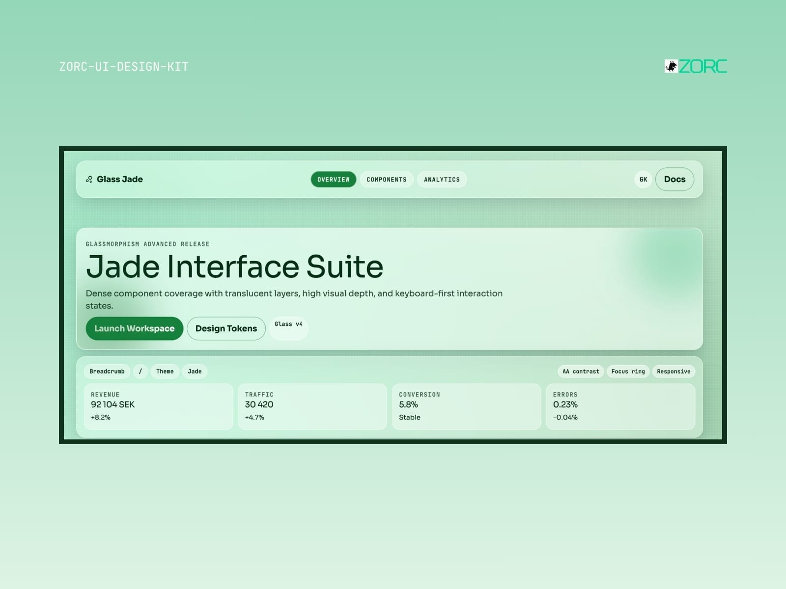
Jade Interface Suite displays statistics and features for web development and design with ZORC's UI design kit
Glassmorphism

Glass Jade

Glass Jade-style design system for AI-powered development

10 components
25 SEK
View →
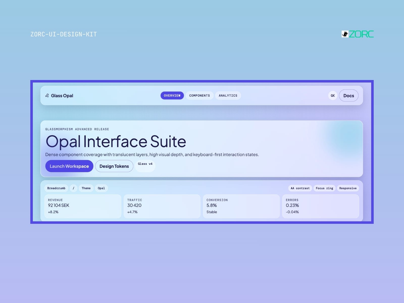
The UI design for Opal Interface Suite with features like glassy design and interactive components from ZORC
Glassmorphism

Glass Opal

Glass Opal-style design system for AI-powered development

10 components
25 SEK
View →
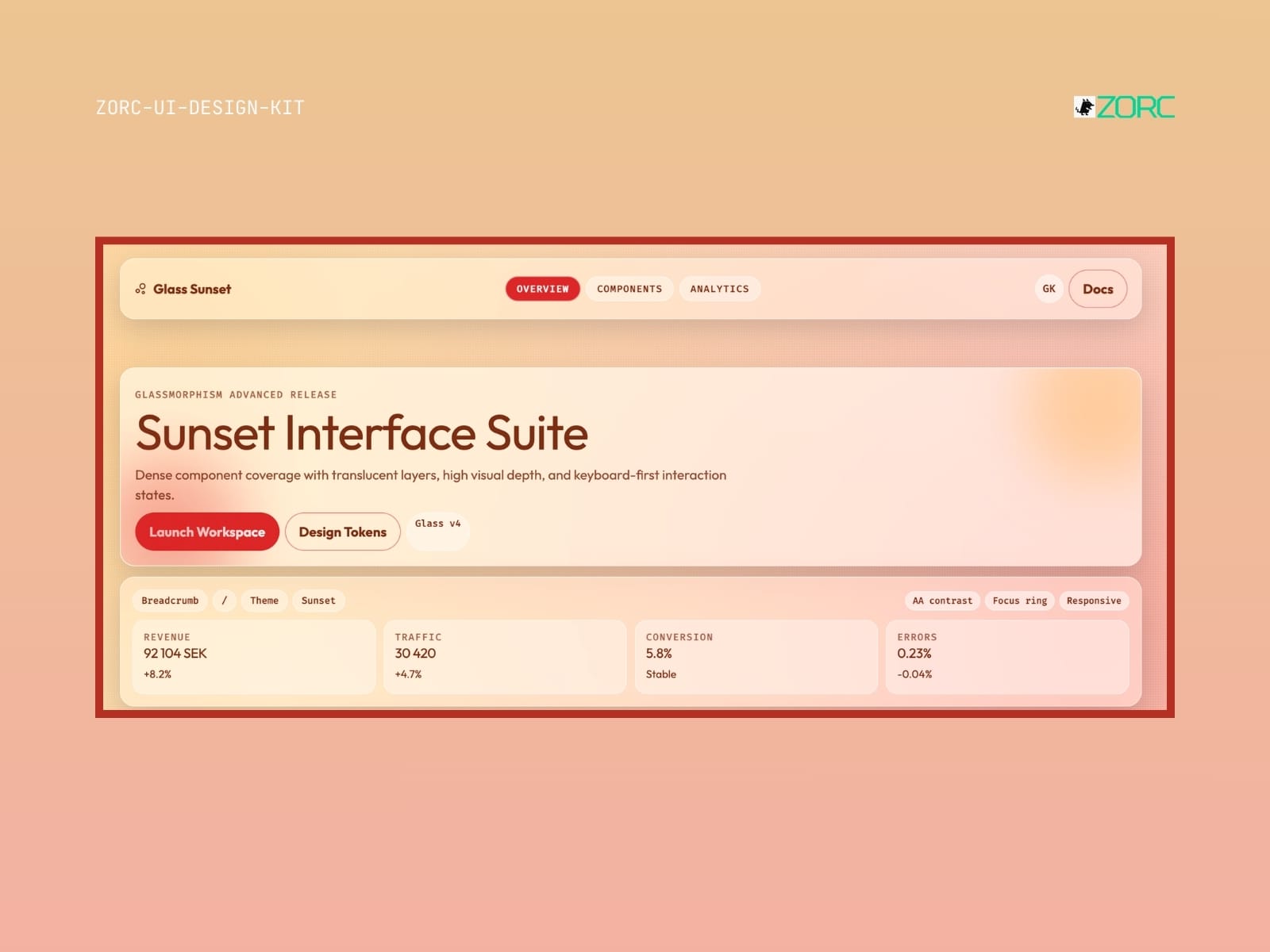
The user interface for ZORC's Sunset Interface Suite with statistical presentation and design tools
Glassmorphism

Glass Sunset

Glass Sunset-style design system for AI-driven development

10 components
25 SEK
View →
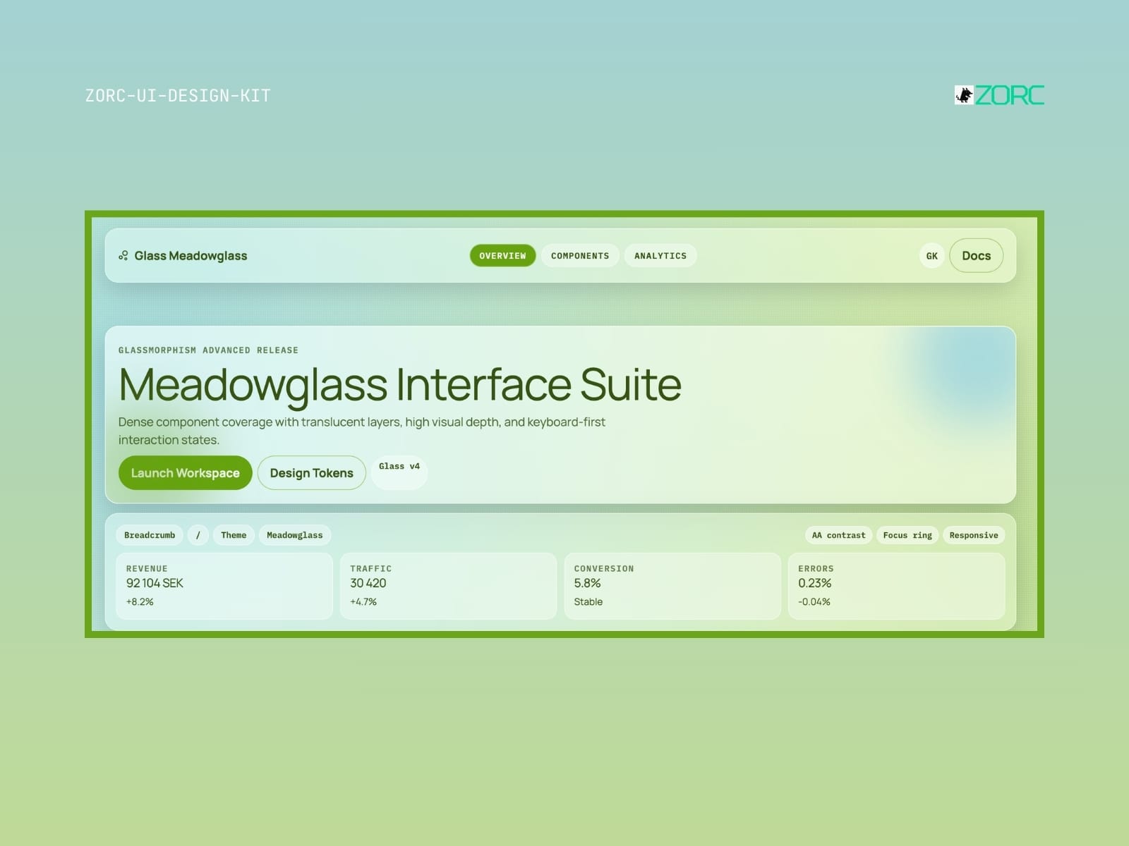
Meadowglass Interface Suite with high visual depth, design components and statistics for web design and user experience
Glassmorphism

Glass Meadowglass

Glass Meadowglass-style design system for AI-driven development

10 components
25 SEK
View →
Glassmorphism

Glass Plasma

Glass Plasma-style design system for AI-driven development

10 components
-12 SEK
View →
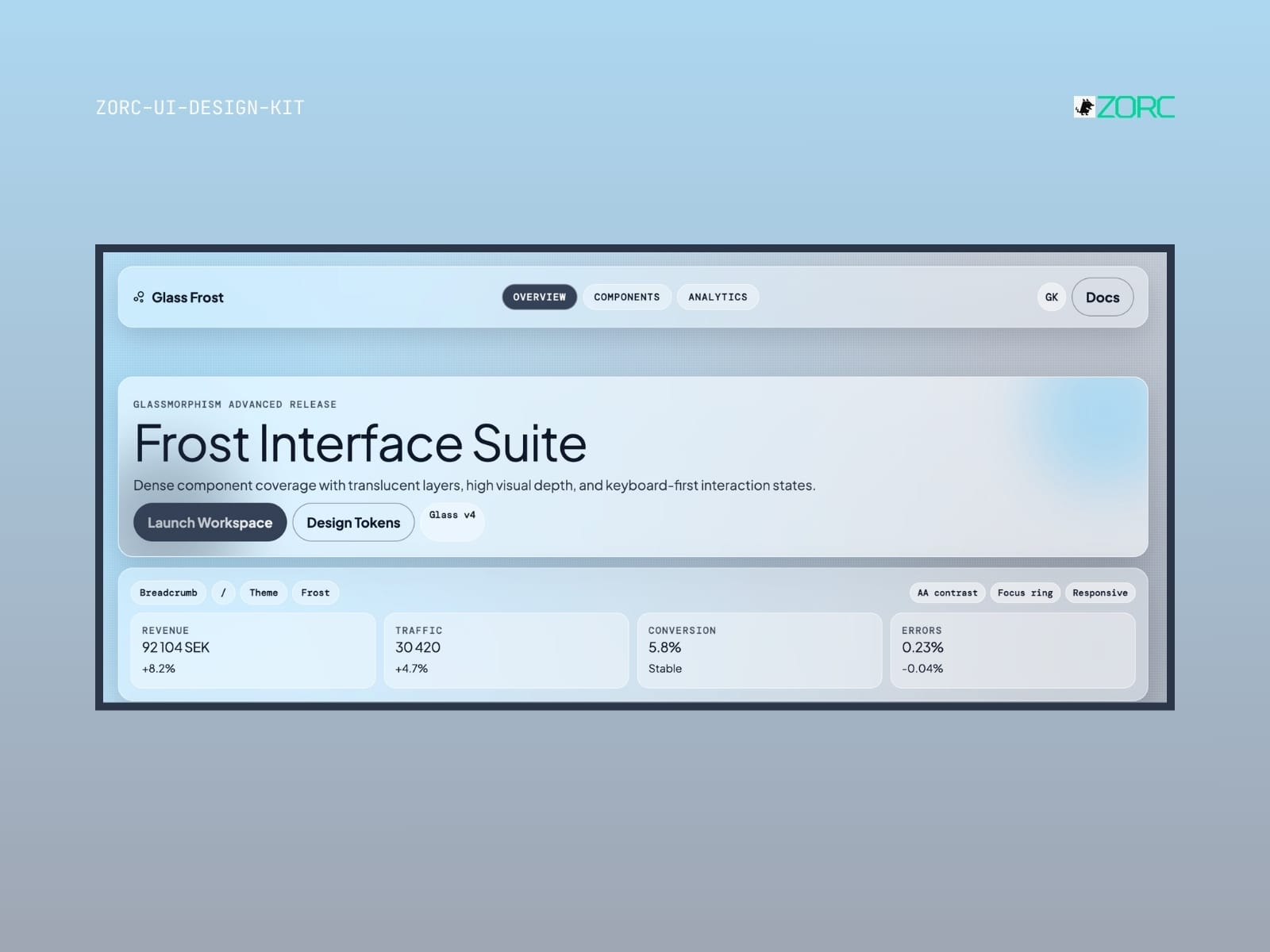
Glass Frost – Glassmorphism UI kit
Glassmorphism

Glass Frost

Glass Frost-style design system for AI-driven development

10 components

25 SEK
View →
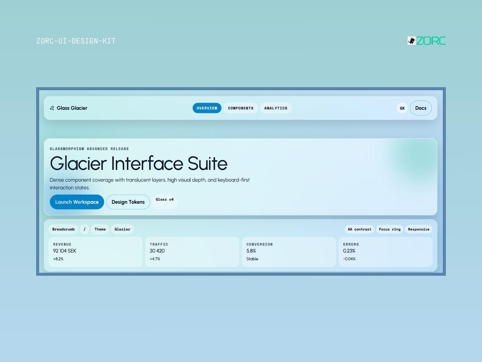
Glacier Interface Suite provides a user interface design with transparent layers and high visual depth for web development and app design
Glassmorphism

Glass Glacier

Glass Glacier-style design system for AI-driven development

6 components
25 SEK
View →
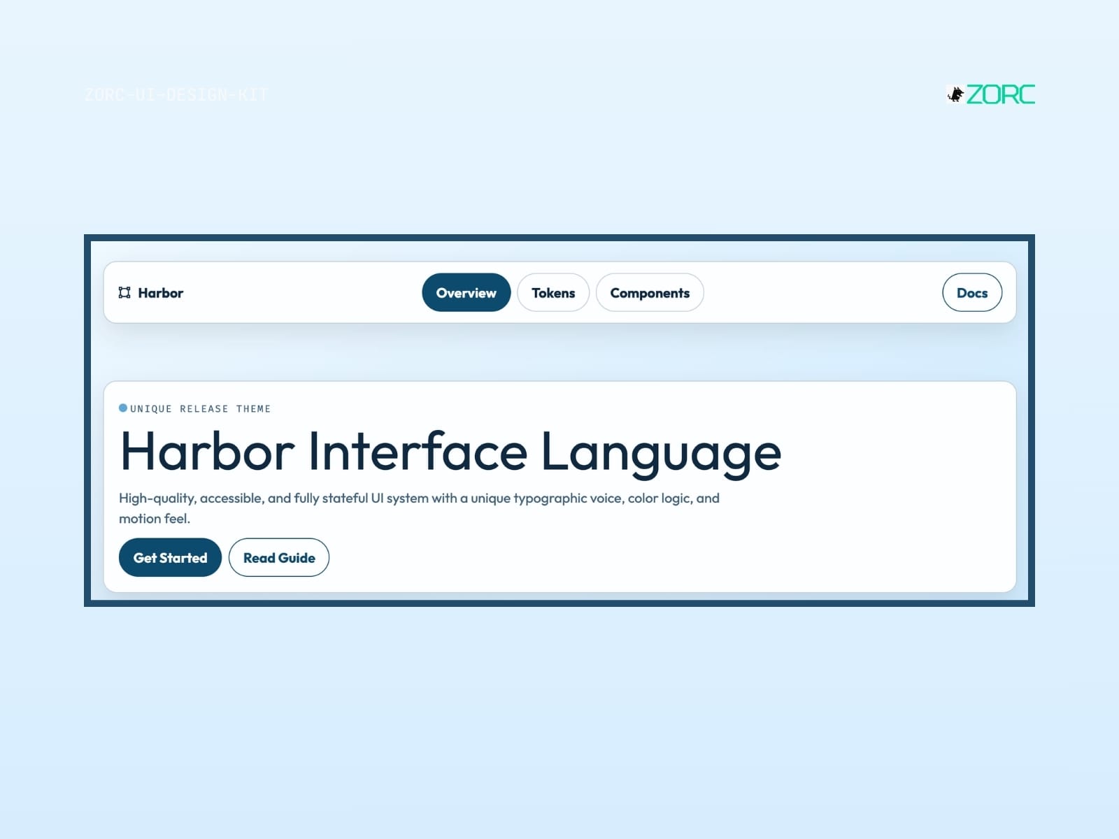
Interactive user interface for ZORC with a focus on unified design, typography and components for web and app development
Glassmorphism

Harbor

Harbor-style design system for AI-driven development

10 components
25 SEK
View →
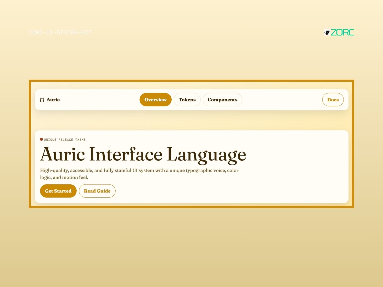
Auric Interface Language shows a modern UI design with buttons and texts focused on web development and design at ZORC
Glassmorphism

Auric

Auric-style design system for AI-driven development

10 components
25 SEK
View →
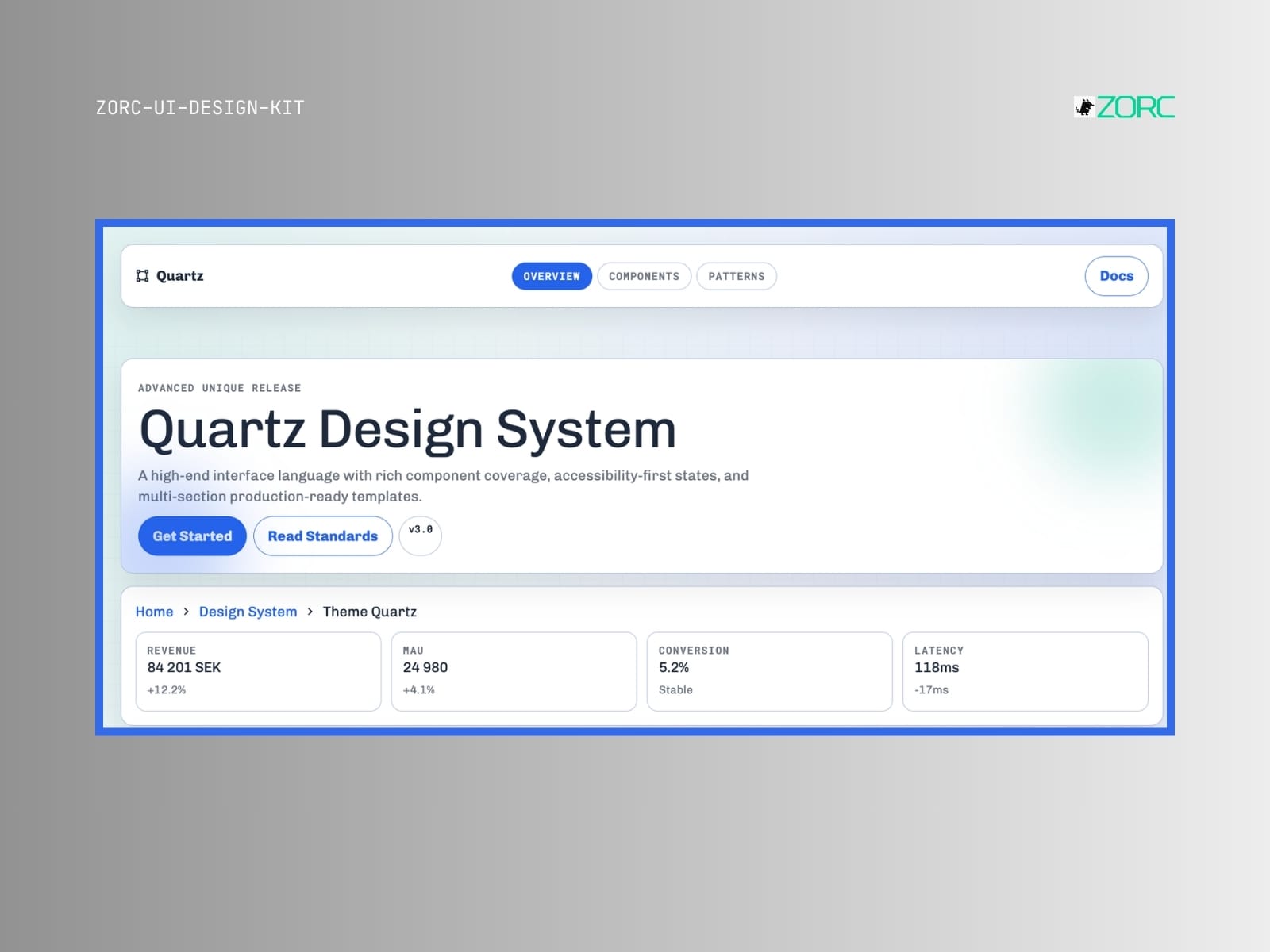
Quartz Design System from ZORC with statistics and features for web development and design
Glassmorphism

Quartz

Quartz-style design system for AI-powered development

9 components
25 SEK
View →
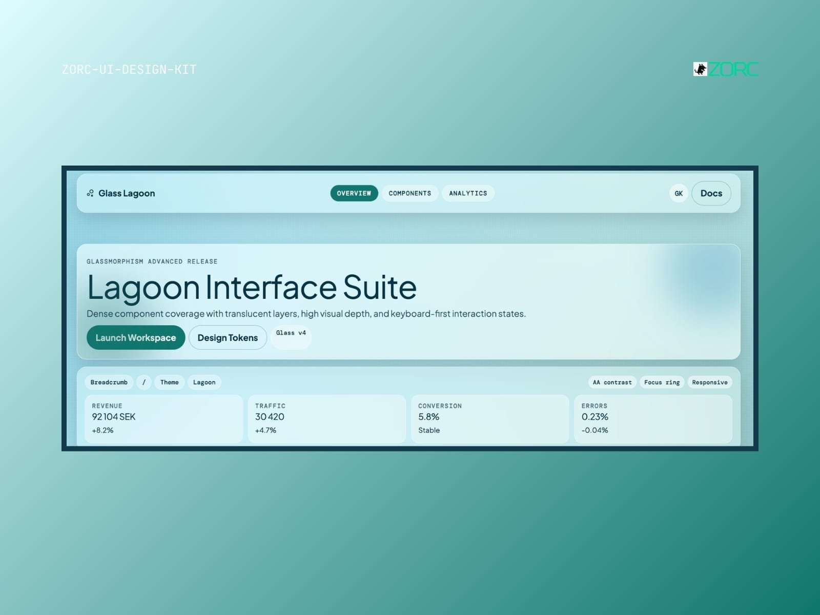
Lagoon Interface Suite presents a user-friendly design with glassy components for web development and app analysis in ZORC
Glassmorphism

Glass Lagoon

Glass Lagoon-style design system for AI-driven development

10 components
25 SEK
View →
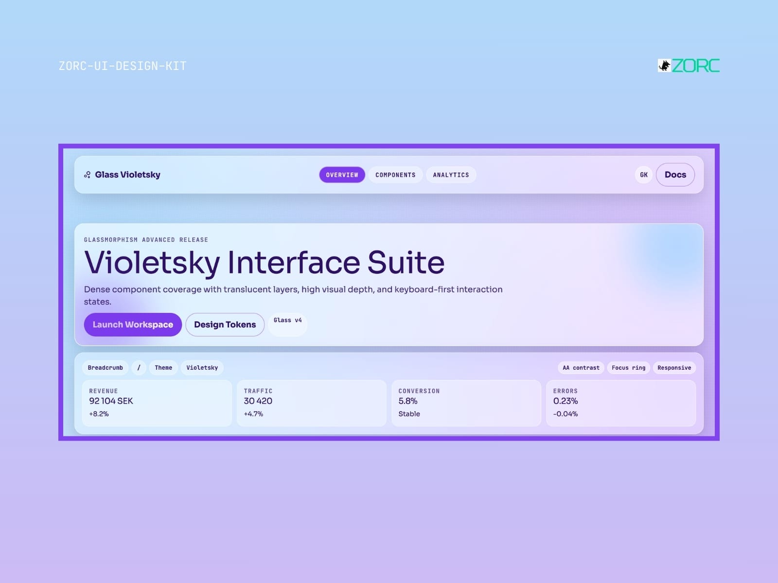
Violetsky Interface Suite shows advanced design with glass formism, user interaction and statistics for web development in the ZORC app
Glassmorphism

Glass Violetsky

Glass Violetsky-style design system for AI-driven development

10 components
25 SEK
View →
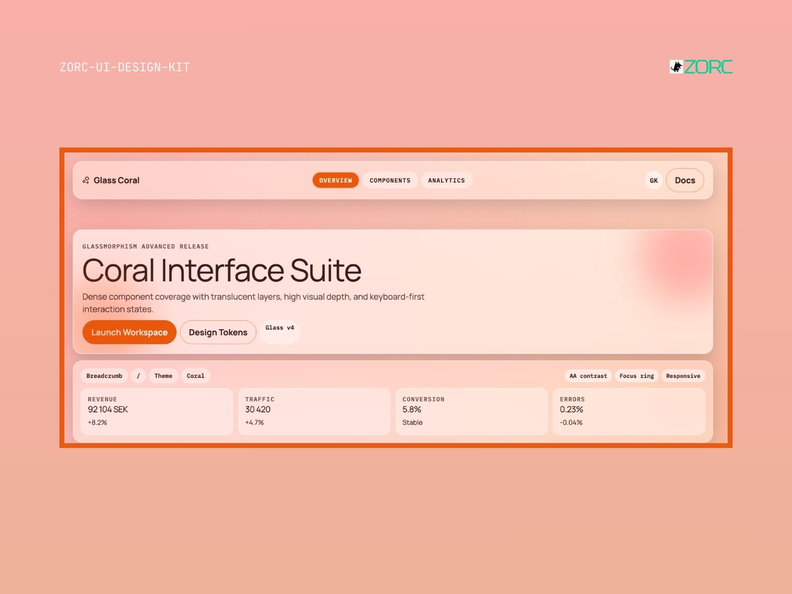
UI design for ZORC's Coral Interface Suite with revenue and traffic statistics and design tokens
Glassmorphism

Glass Coral

Glass Coral-style design system for AI-powered development

10 components
25 SEK
View →
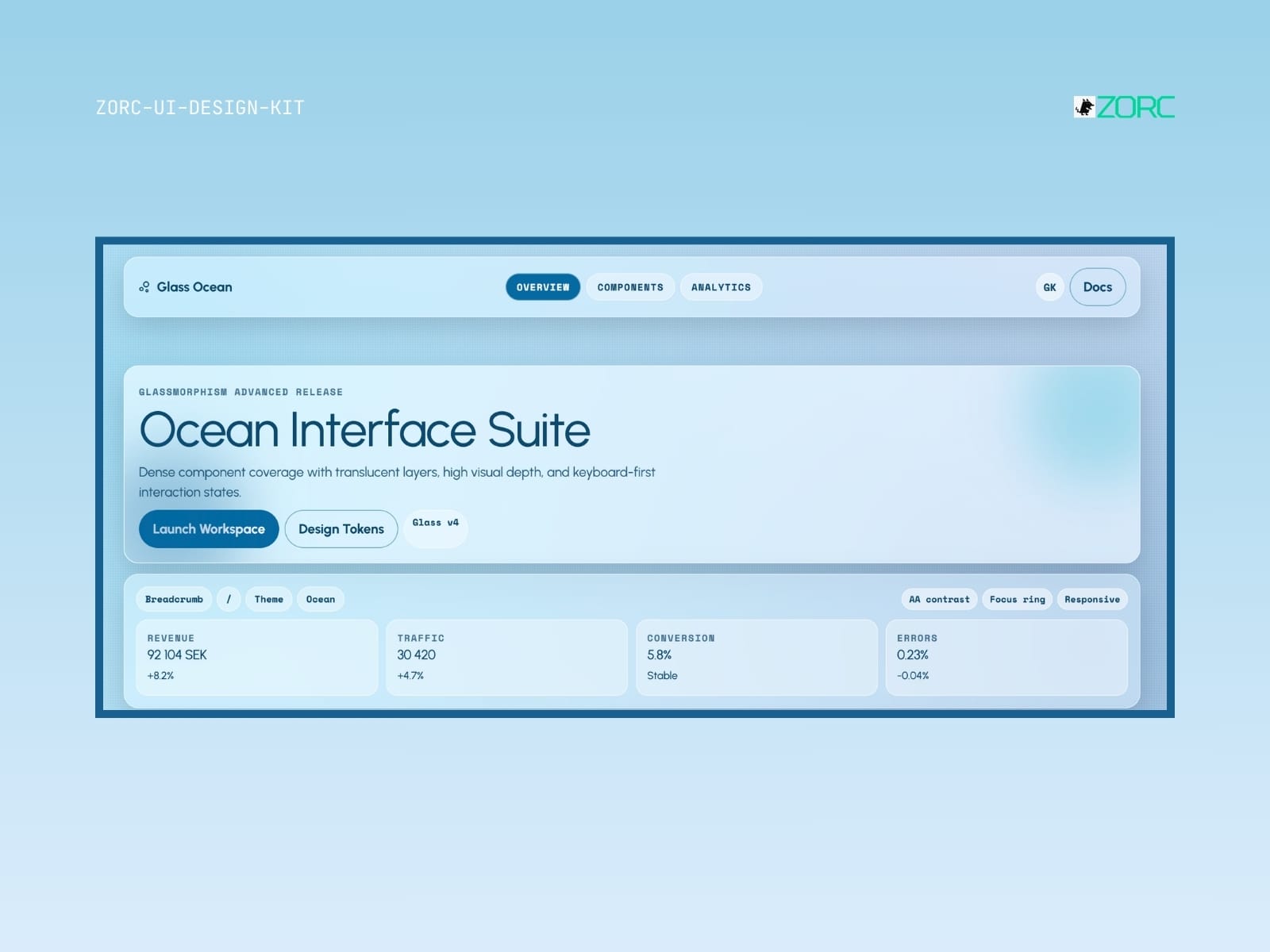
Ocean Interface Suite with glassy design and advanced components for web development and app user interfaces
Glassmorphism

Glass Ocean

Glass Ocean-style design system for AI-driven development

10 components
25 SEK
View →
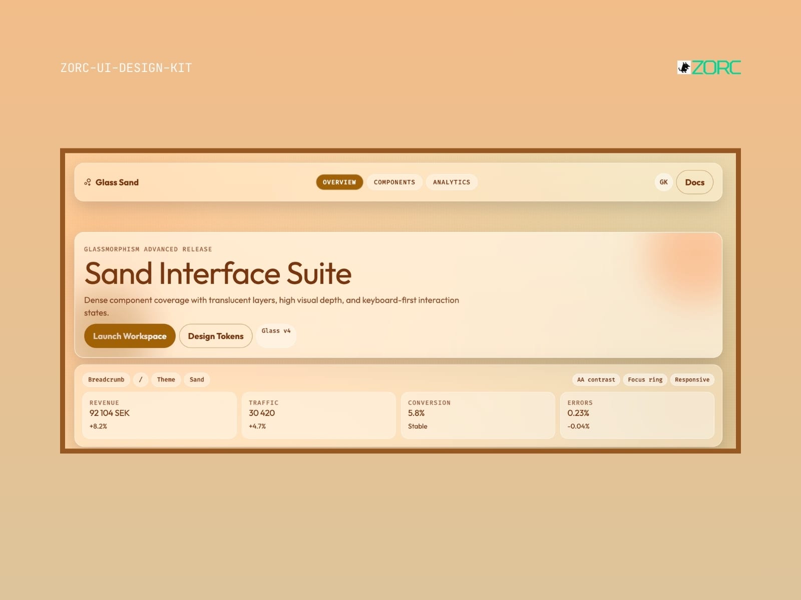
Glass Sand – Glassmorphism UI kit
Glassmorphism

Glass Sand

Glass Sand-style design system for AI-driven development

5 components

25 SEK
View →
// FAQ

Worth knowing before you buy

What is a UI kit?
A collection of ready-made components — buttons, forms, cards, navigation. Copy them into your project and skip building from scratch.
Which frameworks does it work with?
Astro, React, Vue or plain HTML and Tailwind. Each kit states clearly what it is built for.
Can I use it in paid client work?
Yes. You may use the components across your organisation's commercial projects. What you cannot do is resell the kit itself.
Do updates come included?
Yes. All future versions are free for as long as the kit remains in the catalogue.
Are the components accessible?
Yes. Kits follow WCAG 2.1 AA where the content allows — focus rings, keyboard support, ARIA and contrast are tested.