Your design is already manipulating. The question is: does it do well?
Every pixel on your site affects whether the visitor stays or leaves. Here's the science behind design that converts.
Hick's Law: More choices = fewer decisions
The more options you give the visitor, the less likely they are to choose anything at all.Reduce choicesto a maximum of 3 per section.
The F pattern: This is how we read the web
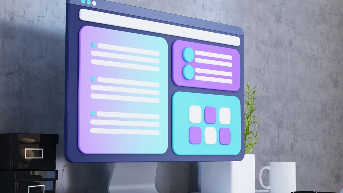
Eye tracking studies show that we scan in an F pattern. Place your most important informationtop leftand in the first row.
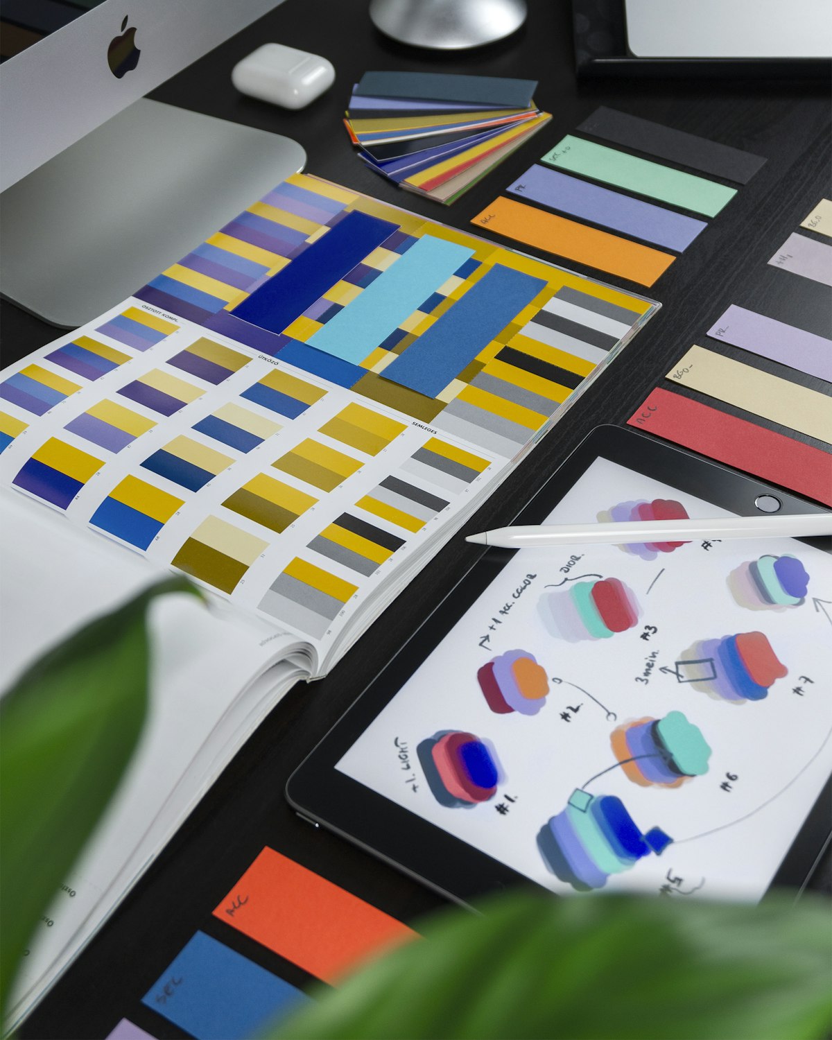
Color psychology that actually works
- Green= safety, growth, go-signal
- Orange/yellow= urgency, energy, CTAs
- Blue= trust, professionalism
- Black= premium, exclusivity
But context beats everything. A red button on a green background stands out — regardless of "color psychology".
Social proof: The brain's shortcut
We do as others do. Testimonials, logos, customer quotes — place them close to your CTAs for maximum impact.
Whitespace: The best design tool
More air = more focus. Apple understood this 20 years ago. Most Swedish companies still haven't figured it out.
Actionable takeaways
- Reduce the choices on each page
- Put the most important message top-left
- Use contrast for CTAs
- Add social proof near conversion points
- Give your design room to breathe