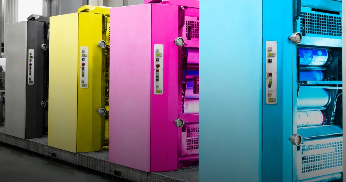
Designing something in the computer and getting it printed on paper are two different disciplines, and it is in the gap between them that most problems arise. A screen glows with light, a printer applies pigment – and that's why a file can look brilliant in Photoshop but be dull and discolored when it comes off the press. Below we go through the four things that most often determine whether a printed matter will be good: color mode, outcome, resolution and file format.
CMYK vs RGB - why it matters
Screens (and digital channels such as web, social media and email) build color with light, in the RGB (red, green, blue) color model. Printing builds color with four ink colors on paper: cyan, magenta, yellow and black – CMYK. RGB has a significantly larger color gamut than CMYK, which in practice means that some bright blues, greens and neon-like shades you see on screen cannot be reproduced with printing ink. They become duller, grayer or change tone.
If you design in RGB and send the file as is, the printer (or their software) will convert it to CMYK for you - but then you have no control over the result. If you convert yourself in advance, you can see the difference immediately and adjust colors that become flat or skewed, for example the exact blue shade of the logo.
Practical advice
Create the document in CMYK from the start if you know it will be printed - not afterwards.
Avoid "pure" black text (0/0/0/100) for large areas - it can become pale. Use rich black (eg 40/30/30/100) for large black fields, but plain black for body text.
Don't blindly rely on the screen for color judgment - screens are calibrated differently. Ask for a digital correction (proof) or a physical test print for important jobs, for example an entire profile series.
Bleed – the margin that saves the edges
Bleed, in English, is extra image area outside the final size of the printed item. The reason is simple but often misunderstood: printing presses do not cut to the millimeter. There is always a small margin in the cut, and if your background color or image ends right at the edge, you risk a thin white stripe along one or more corners.
The standard in Sweden and most European printers is a 3 mm drop on each side that should go out towards the edge. This means that if a business card is to be 90×50mm, your file should be 96×56mm, with background and images filling the entire surface – but text and logo are kept within a safety margin, often an additional 3-5mm in from the finished edge, so that nothing important is at risk of being cut off.
crop marks
Cut marks are the thin lines outside the die surface that show the printer exactly where to cut the finished product. They are added automatically when you export correctly from InDesign, Illustrator, or similar programs, and should never be drawn in manually as part of the design. If you are unsure if cut marks are needed - ask the printer, as some digital printers handle it in their own flow and don't want them in the file at all.
Resolution: 300 dpi is the rule, not a recommendation
Dpi stands for "dots per inch" and describes how many dots an image is printed with per inch. On screen, 72-150 dpi is sufficient because the eye and the screen's pixels compensate each other closely. In prints, where you often hold up the material and look closely, pixelation is seen much more clearly. The industry standard is therefore 300 dpi in the final size.
A common mistake is to take an image that is 300 dpi in small format and then enlarge it in the layout program - then the actual resolution in print drops, even if the file still "says" 300 dpi in the properties. Always check the resolution in the size the image is actually used in, not the original size.
Material | Typical viewing distance | Recommended resolution |
|---|---|---|
Business card | Under 30 cm | 300 dpi |
Brochure, A4/A5 | 30–50 cm | 300 dpi |
Roll-up, 85×200 cm | 1–3 meters | 100-150 dpi |
Large format, scaffolding | Several meters | 30-75 dpi |
Roll-ups and large formats are the exception to many mistakes - there the material is viewed from a longer distance, so a lower dpi is sufficient and the file is at the same time manageable in size. Requiring 300 dpi on a full-scale roll-up produces huge, impractical files without improving results.
PDF/X – the right format to leave behind
PDF/X is a standardized subset of the PDF format, specifically built for print. The most important variant today is PDF/X-4, which correctly supports transparency and ICC color profiles. The advantage over a regular PDF export is that PDF/X enforces that fonts are embedded, that images are in the correct color space, and that no linked (non-embedded) elements are missing - which is the most common reason a file "looks weird" when the printer opens it.
This is how you export correctly
Embed all fonts - otherwise text may be replaced with a different font or become blank boxes.
Flatten transparency and shadows if the printer does not explicitly support live transparency.
Convert to CMYK before export, not during export - then you'll see the result before it's too late.
Save as PDF/X-4 (or whatever variant the printer requests) rather than a generic "PDF - print quality".
Common mistakes - a quick checklist
Design in RGB that is sent directly without conversion to CMYK.
Missing outcome, resulting in white edges after cutting.
Important text or logo placed too close to the edge, without a safety margin.
Images taken from the web (often 72 dpi) used directly in a printed matter.
Non-embedded fonts, which causes the layout to move at the printer.
Wrong color profile in image and document mixed in the same file.
Common to almost all of these errors is that they are not visible on the screen until the file is in the printer's flow or already printed. Therefore, it pays to either learn the basics properly, or have someone with experience in print production – for example, the person who has already created your graphic profile – complete the files before they go to print.
Frequently asked questions about preparing printed materials
Do I always have to convert to CMYK myself?
No, the printer will otherwise automatically convert for you, but you then lose control over how the colors actually end up. For simpler jobs with few colors it usually works fine anyway, but for logos and brand colors we recommend converting and checking yourself beforehand.
Is a 3 mm dropout sufficient for all printed matter?
3 mm is the standard with most Swedish printers and works for business cards, brochures and most smaller printed items. For large format and roll-ups, the requirements may look different, so always check with the specific printer before finalizing the file.
Can I use the same file for both web and print?
No, in practice you need two versions. The web version should be in RGB and optimized for small file size, while the print version should be in CMYK, have a resolution and maintain 300 dpi. Trying to use the same file for both almost always leads to compromises one way or the other.
Are you unsure whether your logo or graphic profile is ready for print - or need help setting up correct print templates from scratch? Book a free review with us at/book, and we'll go through your files together.